Branding & Packaging Design for Rootine CBD Drink


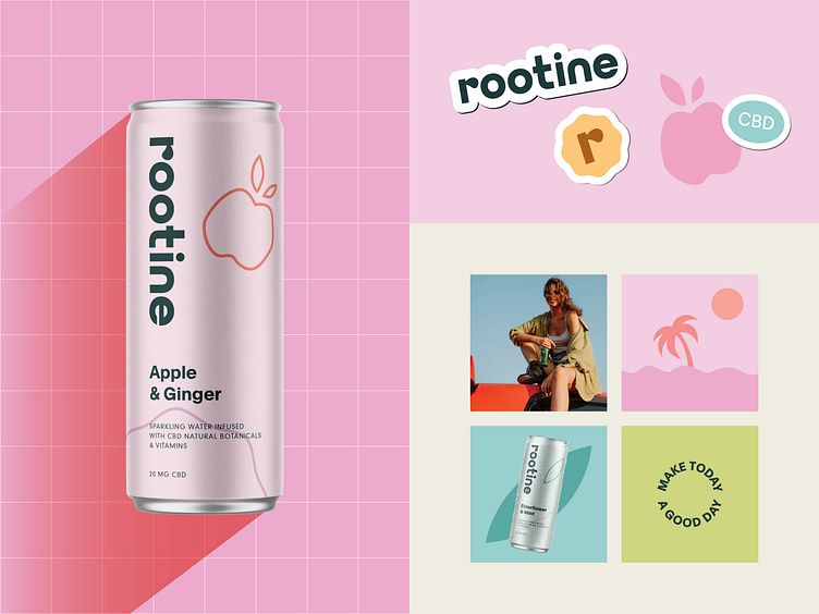
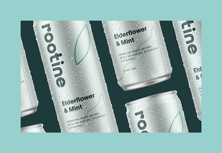
🍏Do you like that the product shows its flavour as an illustration on the label🍃?
For some of us, it brings clarity about the product and lets us pick the right one in a hurry🏃🏻♂️ without needing to read all the labels carefully😵💫. At the same time, soft pastel colours give hints about tastes as well❕.

However, the colour palette doesn't just represent flavours but evokes feelings of care🫴🏻, love, and a whole spectrum of warm feelings🤭. The colour sets for each product were chosen carefully☝🏻 to create minimal packaging designs without losing their main message and uniqueness✉️.