Settings Page | Daily UI 007

Daily UI Challenge | 007
Today I took on a challenging task: to design a settings page that's not only functional but also visually appealing. And boy, did I have fun! I used a similar concept as a job board I designed for Day 006 as inspiration and ended up with a design that I'm pretty proud of.
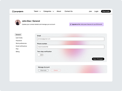
The problem was simple: settings pages are often boring and lack visual appeal. I wanted to change that by adding a light layer of noise and modern gradients to the background of the content sections, giving the design a little more depth and interest. And let me tell you, the overall branding turned out to be one of my favorite parts of the design.
Another design feature I'm excited about was proud of, was the inclusion of an upsell to upgrade to a pro account.
On the left, you'll find the vertical settings navigation bar made up of setting categories as options. I kept in mind information hierarchy when creating the order of the options and placed what I thought would be the most frequently used options at the top.
Under the page heading, I provided a clear summary of what the particular setting page is about.
For the UI control of the two-step verification, I went with a toggle switch instead of a checkbox or two separate buttons. I believe this helps the user quickly understand that this is a setting that can be turned on and off, and I didn't want to overload the page with similar-looking buttons.
I also designed the delete button to be red to prevent errors (usability heuristic #5). If the delete button is clicked, it would be good practice to include a warning message. This would give the user a chance to avoid high-cost errors if they accidentally click the button.
Other UI elements I would include to provide a good user experience for a settings page would be status indicators and saved success messages (usability heuristic #1).
After finishing this UI challenge, I reflected on how I would approach a redesign of an existing settings page. My thoughts are to begin the process by reviewing the information architecture, using exercises such as card sorting to get insights into how users would group settings. This would help create categories and hierarchy for the settings page.
I would also design user flows for each setting, limiting the number of setting categories in the settings navigation bar to prevent overwhelming the user. To further help keep the experience minimal, I would consider including an advanced section to hide lesser-used setting options.
Let me know you think I went with this UI challenge.


