Match Cards: App branding

Match Cards is a memory game built as a PWA (Progressive Web App) and available on desktop, App Store, and Google Play Store.
To make the game more playful and user friendly, we've conducted a short branding exercise: we created a mood board, then several visual concepts to find the best key visual and finally we created a new visual style.
____________________
Typography:
Space Grotesk — this monospace font is easy to read and offers a playful tone when animated or used in combination with colors.
____________________
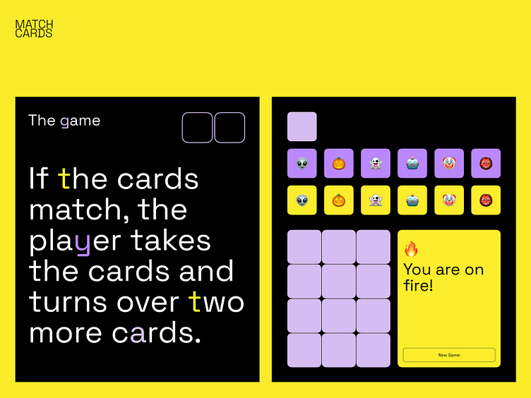
Color:
To keep the focus on the game, black is used as the main background, while expressive colors like yellow and purple are the key colors for the cards.
Black as a background color is used to create a calm atmosphere for a user and allow him to better focus on memorizing the cards.
We use yellow to make an opened card to be more attractive for a user. This color makes an opened card always as a reward for a player and keeps the motivation to open all cards.
Soap is used to keep a mystery as it’s always a secret what is hidden behind the next card. It’s a bit muted to make it silent and give better contrast with already opened yellow cards.
Pale violet is used for the currently opened card. It is brighter to intensify a feeling of mystery and create intrigue as a user doesn't know what's hidden behind the 2nd card.
____________________
Interested in developing a brand style or re-branding?
Drop us a line: hi@tinloof.com


