Match Cards game: Case study

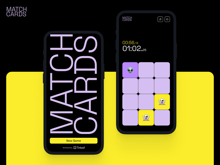
Match Cards
Match Cards is a memory game built as a PWA (Progressive Web App) and available on desktop, App Store, and Google Play Store. The goal of this build was to show how from one single codebase it is possible to create and distribute an app on both desktop and mobile platforms.
How did we create it
We first started by designing the game's user interface, and then came up with an animated splash page and a promotional YouTube video.
After completion of the design phase, we then began with the development of the app using Remix and TypeScript, and later, deployed it on Vercel.
Once the web app was live, we went ahead and distributed it to the App Store and Play Store with PWA builder, a Microsoft tool used by brands like Pinterest and Tinder to distribute PWAs.
Design Approach
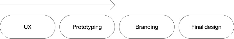
We went through all steps of the design process starting from creating UX maps & Prototyping, then we created a new branding concept and applied it as a final design to the prototype created, and finished with creating animations for promotional videos and a landing page.
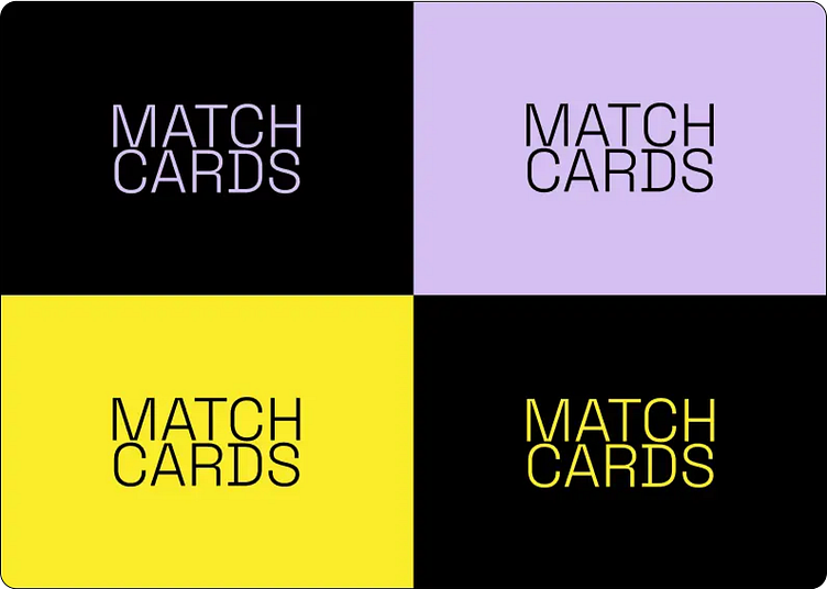
Color scheme
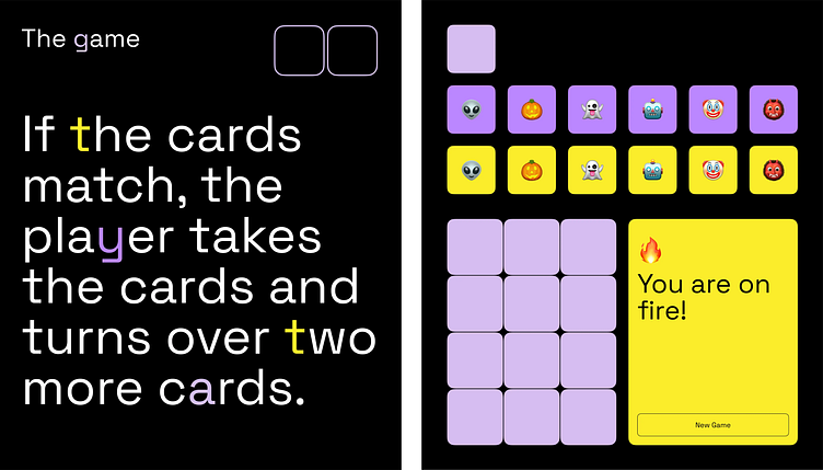
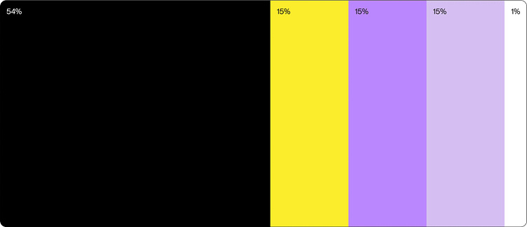
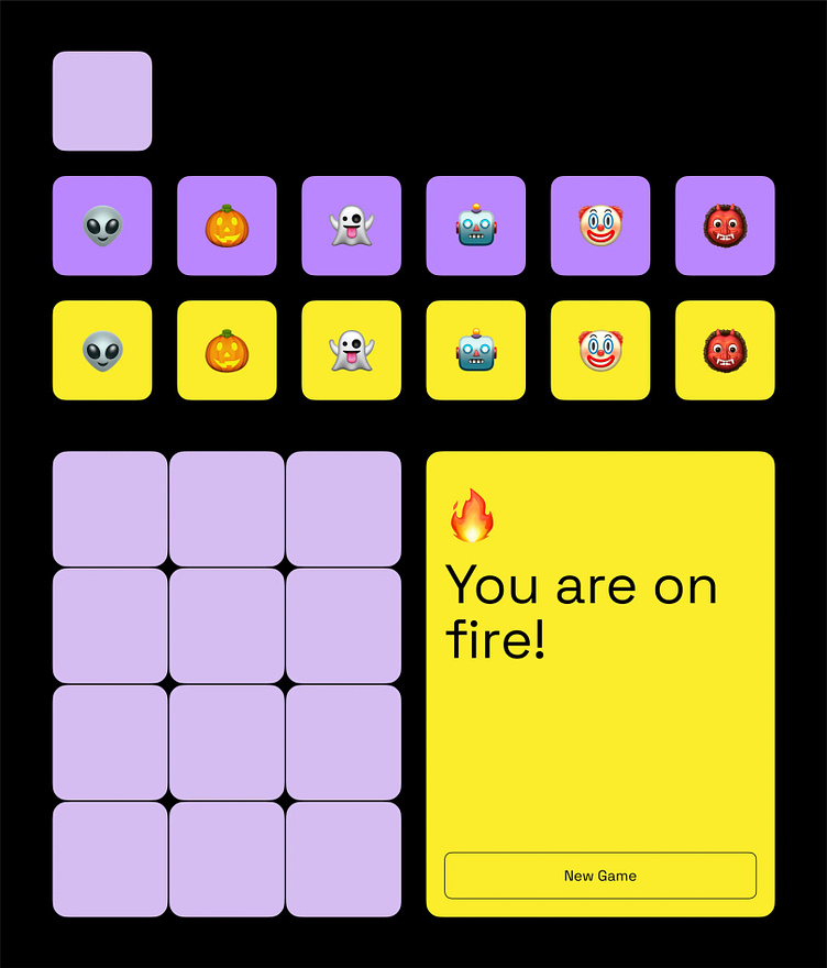
To keep the focus on the game, black is used as the main background, while expressive colors like yellow and purple are the key colors for the cards.
We use black as a background color to create a calm atmosphere for a user and allow him to better focus on memorizing the cards.
We use yellow to make an opened card to be more attractive for a user. This color makes an opened card always as a reward for player and keep motivation to open all cards.
Soap is used to keep a mystery as it’s always a secret what is hidden behind the next card. It’s a bit muted to make it silent and give better contrast with already opened yellow cards.
Pale violet is used for the currently opened card. It is brighter to intensify a feeling of mystery and create intrigue as a user doesn't know what's hidden behind the 2nd card.
White is used for text to create a strong color contrast and a sharper feeling of minimalism
Imagery
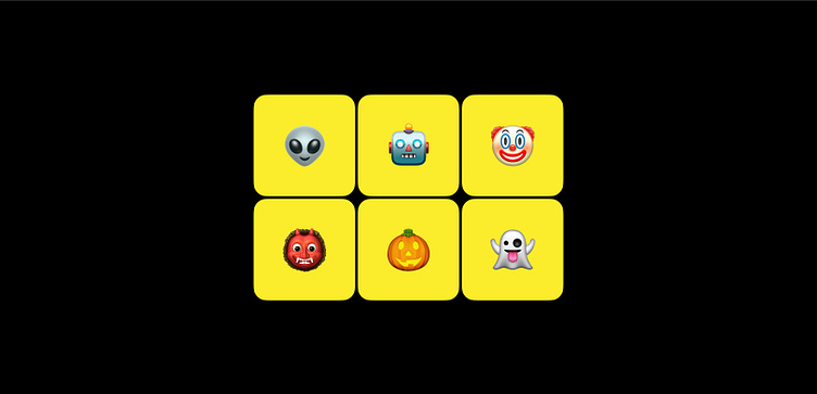
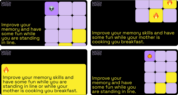
To create a familiar atmosphere for the player, we used something that everyone has long been familiar with — emoji.
Typography
Space Grotesk — this monospace font is easy to read and offers a playful tone when animated or used in combination with colors.
Design mockups
After we found a perfect visual concept, we created the new interface for Match Cards on Figma, ensuring responsiveness and ease of use. Below, you can directly inspect the Figma file that was handed over to developers.
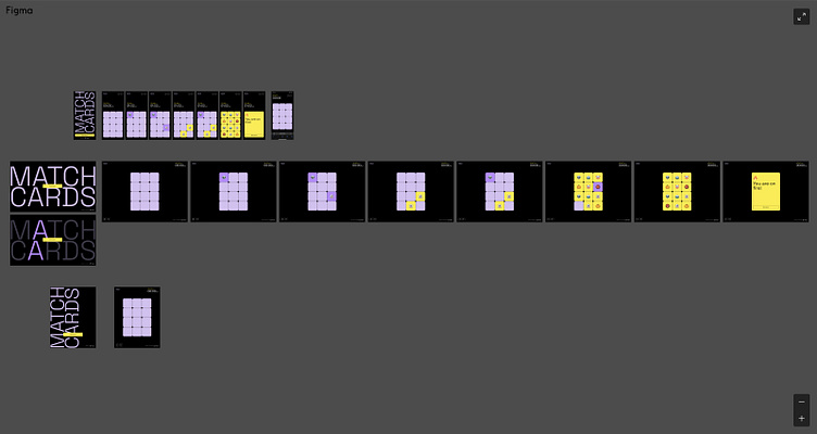
UI Kit
To ensure consistency across the game, we created this UI kit. This comes in very handy as well in development, to avoid duplicated code and different styles.
Logotype & App Icon
The logotype is a bold and simple textual adaptation of the app's name. Considering how the main recognition indicator is the favicon, we opted out of having a separate icon logo.
Animation
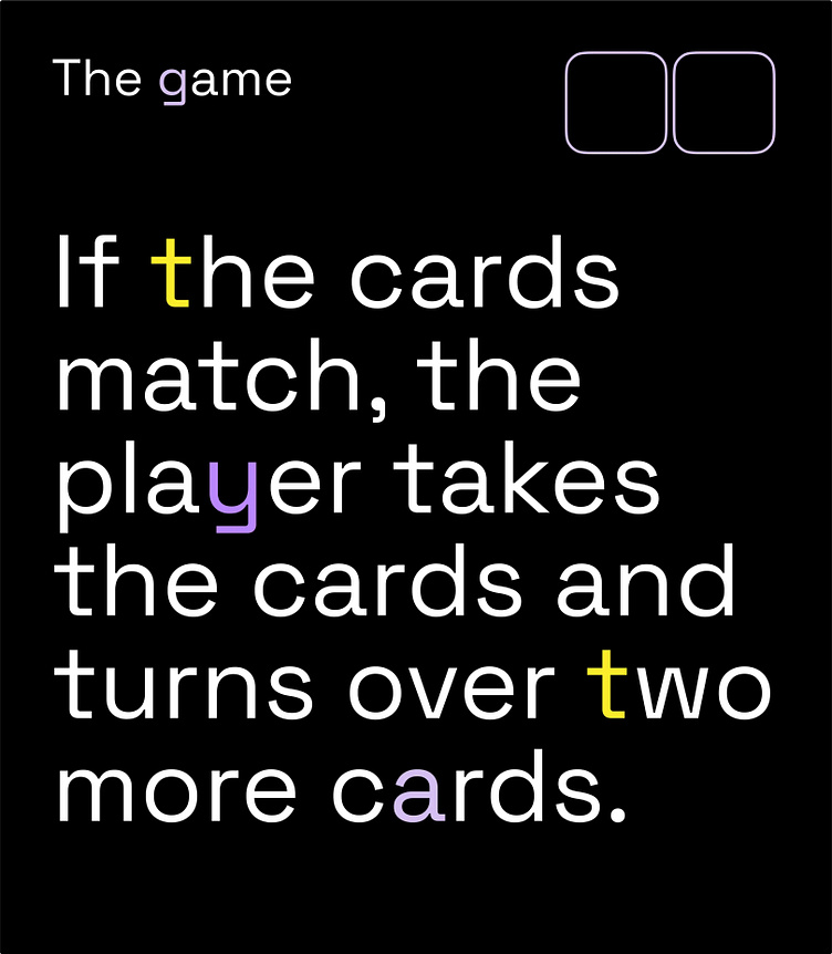
This animated splash homepage is based on the flipping cards mechanism. The letters would only highlight if they match.
Banners for social media
To ensure consistency and encourage users to download the app, we've leveraged the UI kit to create templates for social sharing images.
Thanks for watching!
Looking for a reliable web design and development partner?
Drop us a line: hi@tinloof.com


