Adidas- App Redesign


🙋 Hello Creatives! 🙋♀️
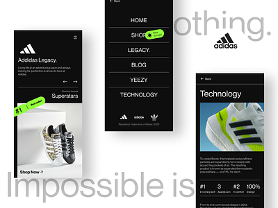
Adidas is a globally recognized brand that specializes in the production of high-quality sports and fashion apparel. Our redesigned app is focused on enhancing the user experience and providing a seamless platform for customers to browse and purchase products.
The Ui sits between being very aesthetic and giving it that bold, sportswear brand feel. The colors are electric and bold. The app features a clean and intuitive interface, with easy navigation and a variety of customization options to personalize the user's experience.
I hope you like it. !! ✨
--------------------------------------------------------------
Download the file link here
--------------------------------------------------------------
Have an idea? Let's talk here or WhatsApp
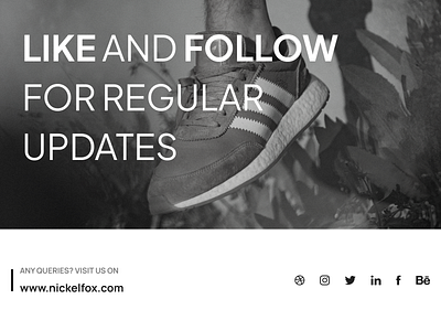
Follow us here:
--------------------------------------------------------------
Colors
Good O'l White - #FFFFFF(Used Headings and Nav)
Not Black- #212121(Used as a BG )
No Nonsense Grey- #808080(Used as subtext and other details)
Not White Maybe Grey- #DDDDD(Used as borders and sub texts)
Ultra Electric Green- #FF553E(Used as accent colors)
Fonts
Neue Montreal |Regular, Bold | Used for Headings, Body Text, and Accents
Asset Link or credits
Figma, Unsplash, and Adidas 🙌🏼
Techniques
1. Minimal Design
2. Typography
3. Modern Touch
4. Redesign
5. Pop Accents
Our designer says
This design potrays a fresh and modern take on the Adidas's brand visuals and Ui. The design is bold yet aesthetic and has a pop color which catches user's eye. This redesign is the first of many of the Redesigning A Brands Product series. Thanks :)


