AmberDAO - Redesign Concept

AmberDAO recently launched the first iteration of their website and I thought I'd use it as a boilperplate for a bit of UX and UI feedback and suggestions. Not only for their website, but for crypto projects in general, that are kickstarting or launching their website.
Portioning content makes it easier for people to digest information, gives agency to users and leaves them the choice to read or not read specific data. It can also save valuable space, give structure to surrounding content and improves
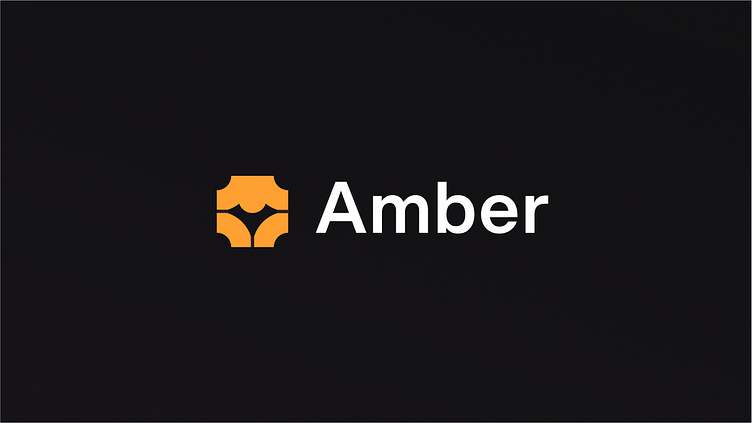
AmberDAO launched without a set-in-stone branding. That can make it harder to market content down the road. A modern set of fonts, colors, a recognizeable logo that is compatible with most media and is modifiable/flexible can help a lot on the way to a marketable (web3) product.
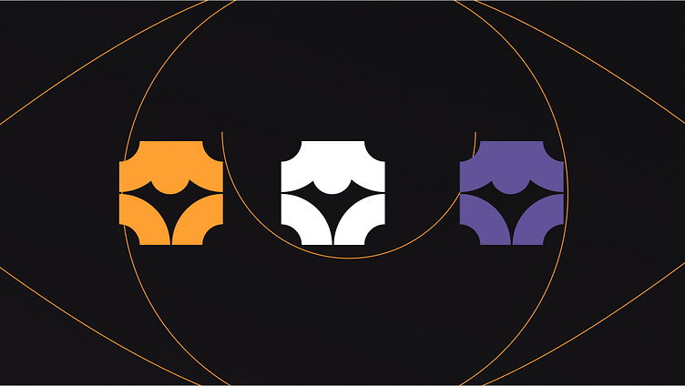
If advertising a bonus or advantage for holders, theres room to give that advantage a face, emulating emotes or other characteristics of the Amber community. A singular, limited NFT could offer more incentive than sterile numbers, especially if its properly branded and designed.
Fullscreen Preview