Mailchimp logo redesign

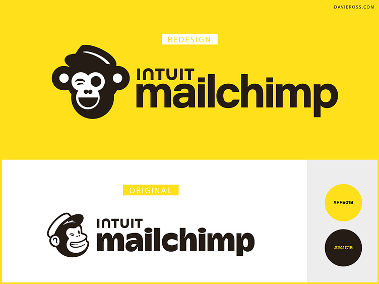
My own take on a logo redesign for Mailchimp. Using the same color pallet synonymous with Mailchimp, I took the Freddie icon and typography and modernized and simplified for a more current look.
Their name
“Mailchimp” is one word, spelled with a big M and a little c. It used to have a big M and a big C, but the times have changed.
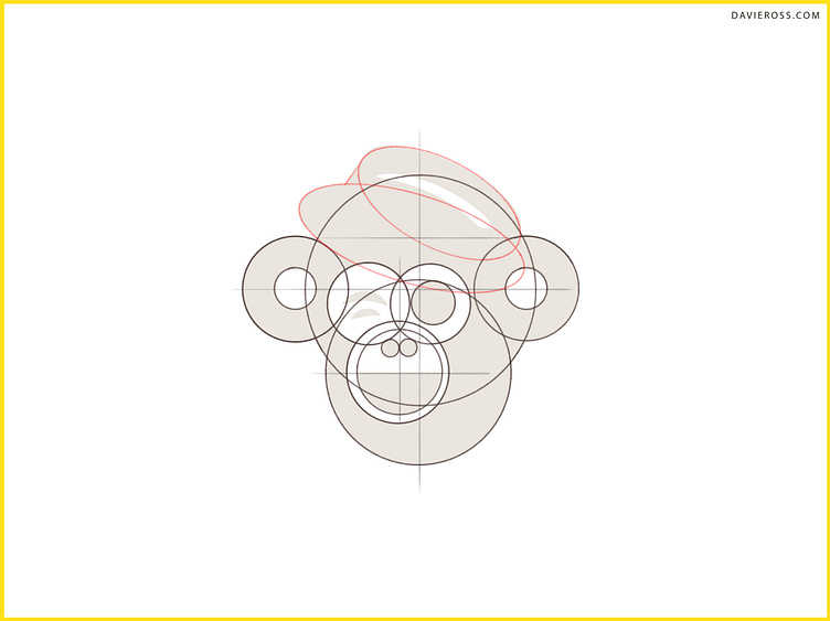
Their logo
We always pair our company name with the Freddie icon. And Freddie's always winking because he has a great attitude.
Need work? davie@davieross.com contact me
• Logo Portfolio: davieross.com/david-lookbook
• Personal Portfolio: davieross.com
• Dribble Portfolio: dribbble.com/davieross


