Aura Sign Up

I've partnered with Aura to help them with several website and marketing projects.
This signup flow is one of them.
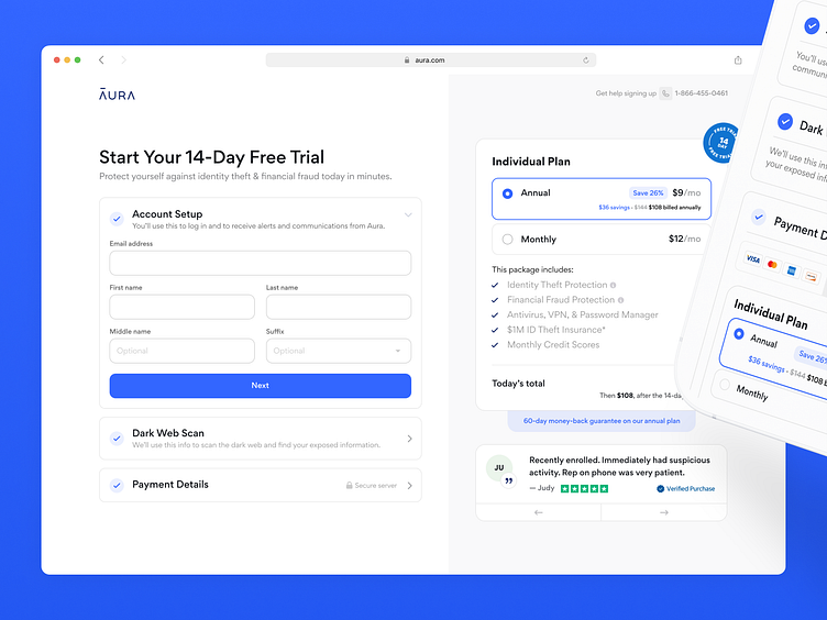
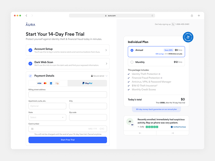
The main goal was to speed up the registration process and allow users to preview their chosen plan.
Our approach was to remove multiple screens sign up and fit everything into one screen.
The tricky part was to fit all the necessary information on the screen so that users didn't have to scroll or load other pages.
I went through a lot of explorations that contained different layouts.
The left/right layout approach was chosen because it can fit a lot of inputs and text. That way, the user can preview their plan and quickly fill out the inputs on the left.
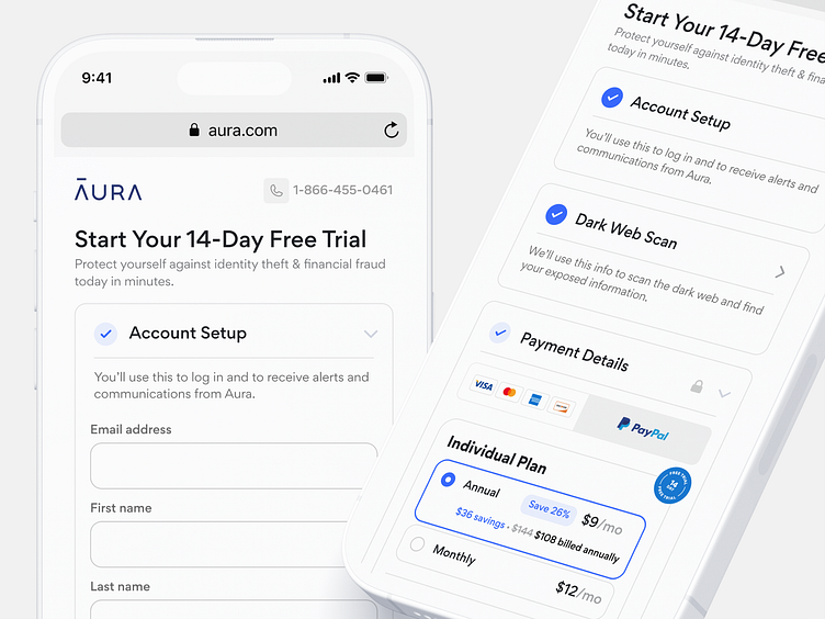
With mobile, I reconsidered the priorities.
So all the inputs went to the top of the page; the plan preview is embedded within the payment details, and testimonials are at the very bottom.
📨 Get in touch 👉 hello@markoilic.co
💛 Follow on Twitter


