Dewsbury School logo design

Dewsbury is a minster and market town in West Yorkshire, England. From the brief, I needed to make sure I referenced Yorkshire in the design in some way but it needed to be modern and approachable to attract new students. However, it was important the logo wasn’t too friendly as to dilute the prestige of the school.
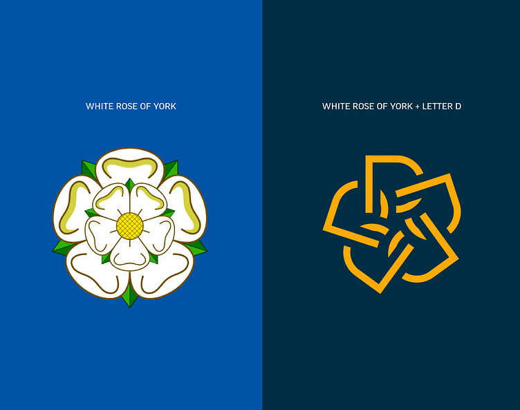
A key visual element of Yorkshire’s identity is the White Rose which I thought could be an area to explore further. I started coming up with modern versions of the rose but I felt it was possible to squeeze more meaning into the design. This proved true as I tried tessellating 5 capital letter D’s evenly along a circle which created a beautifully simple flower shape. Although the idea had legs, it needed to be tweaked to make the logomark more dynamic as it felt quite flat. To combat this, I tried making each of the shapes interlink through the use of cutouts which nodded to the relationships built at the school. This was what the design was missing and the logomark was now finalised!

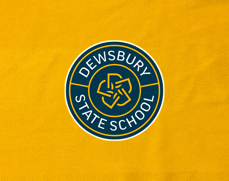

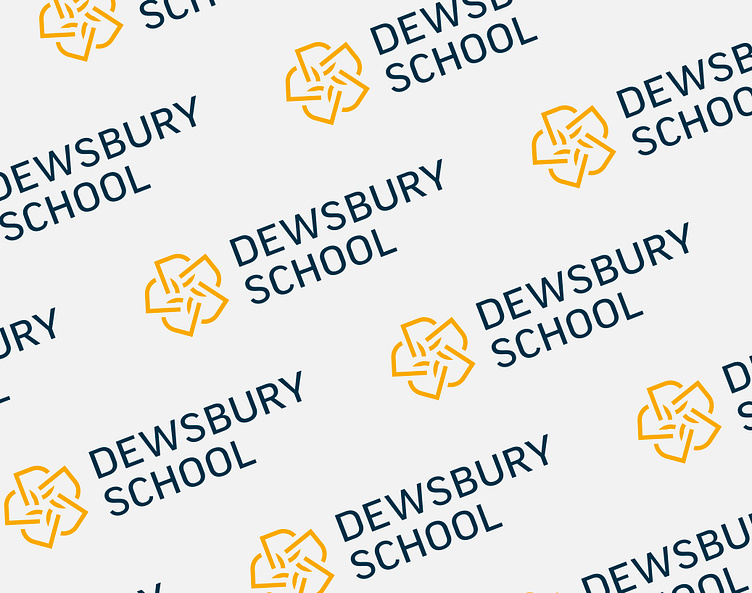
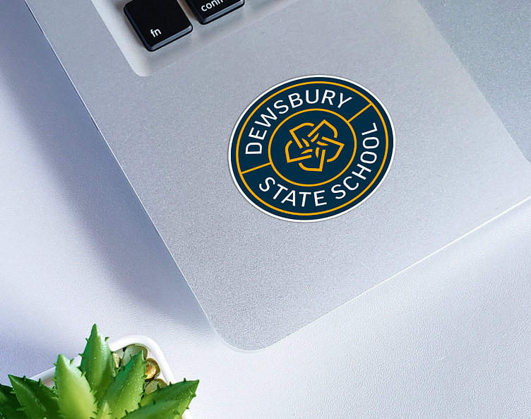
Once I refined the logomark, I set to work pairing the type. I looked back over the key words in the brief to help narrow down my typeface search and find something modern and approachable but not too friendly. I found this in all caps, widely tracked Good Pro. The final step was selecting a colour palette but the bulk of the work was already done thanks to The White Rose of York palette. I simply picked a couple of the colours that worked well together and adjusted the hues to better reflect the prestige the school had earned - a more royal, deeper blue, a golden yellow and a subtle off-white. This finalised the identity and created a timeless, beautiful face for the school.


Fancy creating or refreshing your brand's identity?


