Airbnb Use Case - Post '22 Design Update

Disclaimer
I did this use case as a personal side project. I was not a member of Airbnb and had no access to inside info or resources. All designs are made from scratch.
Intro
Airbnb had a recent update that, in their own words, changed everything:
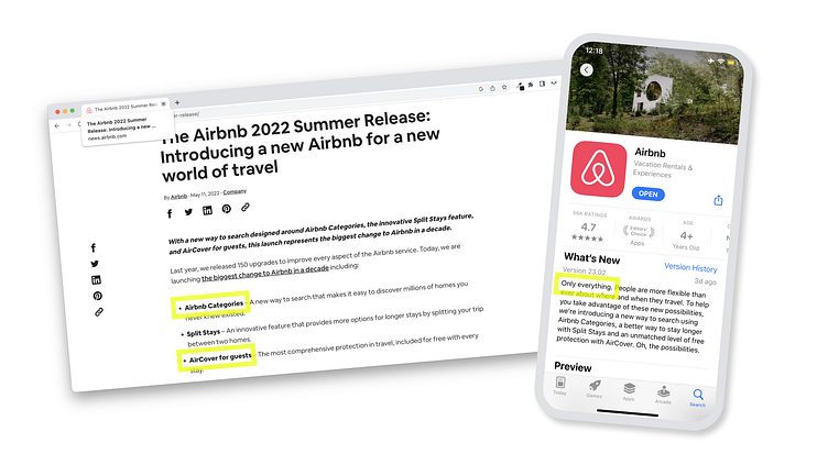
Trying to adapt to the 'new normal', the post-covid reality of travel, Airbnb redesigned their search to a search by category. Among other things, they further implemented mandatory insurance for all bookings and called it 'aircover'.
Empathise
What sounds promising, actually caused a shitstorm among users:
1. Quantitative metric: App store reviews crashed, and since the re-launch, there are almost only 1-star comments.
Quantitative
App store reviews crashed, and since the re-launch, there are almost only 1-star comments.
![[Image] App Store Review Extracts](https://cdn.dribbble.com/userupload/4917491/file/original-b09eab08b6b03cbe332e0f5957b10fa5.png?resize=752x)
Qualitative
In a recent series of interviews for Omio, I talked to people about their favorite travel planning tools. A lot of them mentioned Airbnb, and that they’re no longer using it because of price increases and an overall lack of transparency in pricing.
![[Image] User Interview Extracts.](https://cdn.dribbble.com/userupload/4917494/file/original-c4ee22c097ba5b267f7486c0079b36ec.png?resize=752x)
Define
Combining quantitative and qualitative research, the main pain points of users seem to be the following.
![[Image] Grouping of user pain points, extracted from the research phase.](https://cdn.dribbble.com/userupload/4917490/file/original-18142d02de16c4f6738972adf10933d5.png?resize=752x)
Since the brief of this use case focuses on the PDP, all PLP/ homepage and search related points, as well as non-design related user pain points are set aside for the moment. This creates a clear focus on the pain point that is pricing on Airbnb.
![[Image] How might we rebuild trust in prices on Airbnb?](https://cdn.dribbble.com/userupload/4917488/file/original-6c93adf7eb695c09a891e2ee6cc45689.png?resize=752x)
Slight price increases happen everywhere without creating waves most of the time. They are normal and don't automatically upset users.
The cause of the massive customer rage is therefore not a mere price increase. It is how the price increase is communicated.
![[Image] Examples of Inconsistent Price Info, as well as ambiguous service fees.](https://cdn.dribbble.com/userupload/4917492/file/original-b93ccb6a9a106480f3ab7e3739fb8a06.png?resize=752x)
Across PLP, PDP, and Confirmation pages, we see inconsistent price info. Also new is an ambiguous dynamically increasing service fee, with no perceived benefit for the customer. This is what is upsetting millions of Airbnb customers.
Loyal Airbnb customers, who can compare the before and after the update, describe a combination of a decrease in user experience quality, and ambiguous prices and extra fees.
So, how might we rebuild trust in the prices on Airbnb?
![[Image] Two groups of action items: UX Design and UX Writing](https://cdn.dribbble.com/userupload/4917496/file/original-c82f3cd1aced437011009f5948086723.png?resize=752x)
Action Items
Breaking down the definition of the problem space, two action items emerge. One is for UX Design, and one is for UX Writing.
Unify Price Display across the user flow
Communicate the benefits for the user (free insurance, 24/7 support, and more) instead of for the business (this fee helps us run our platform).
Ideate
![[Image] Unified Price Display](https://cdn.dribbble.com/userupload/4917493/file/original-548cc039a9497c3eaf58167337e0ad93.png?resize=752x)
![[Image] No more service fees](https://cdn.dribbble.com/userupload/4917489/file/original-9eed332fb19e6243ad63cabd88ace065.png?resize=752x)
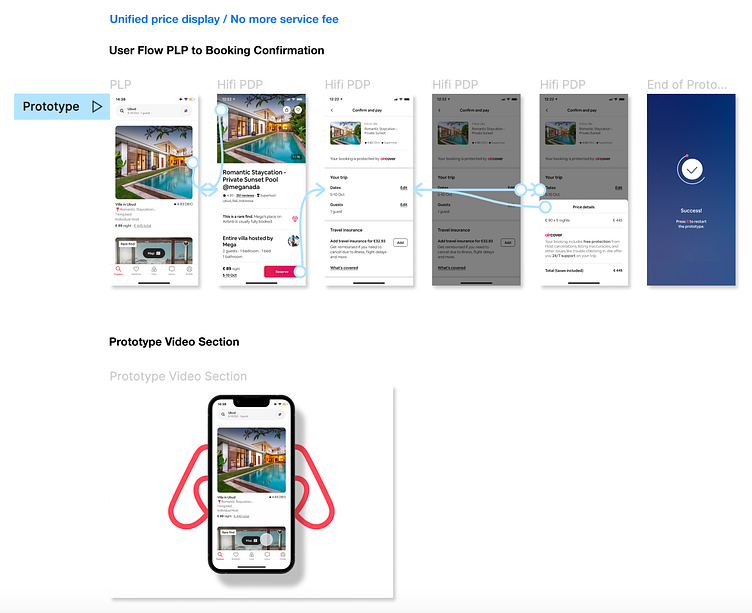
Prototype
Test
Due to the nature of a theoretical use case, the testing of this remains the next possible step.
The solution I proposed here is cheap to test, even live. This was an important factor I considered when designing this solution. From my experience, it's better to test hypotheses quickly and cheaply, before investing in expensive design changes.
Conclusion
I would be curious to see whether Airbnb could successfully turn its flopped revamp around with some small but well-founded UX design and writing changes like these.
Deliverables
To round up this post, I am adding my file structure at the end to provide insight into how I structured this use case in Figma.
Design Tokens
In order to recreate a realistic 'improved' Airbnb experience, I assembled the basics before anything else.
![[Image] Design Tokens](https://cdn.dribbble.com/userupload/4918648/file/original-ca39421815454b7891b384be07941d58.png?resize=752x)
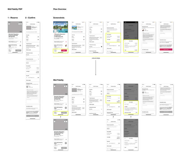
Mid-Fidelity
As a next step, I built mid-fidelity page scrolls, to be able to easily assemble the user flow I wanted to showcase from there. I highlighted the inconsistent price display, as well as the non-ideal service fee communication here, which is where I altered the existing design on Airbnb.
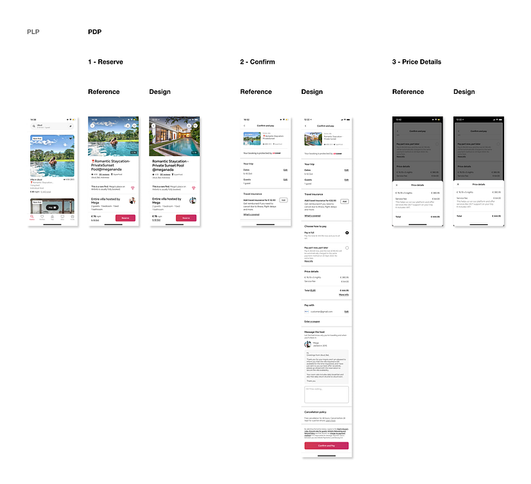
High-Fidelity
Next up, I modeled High-Fidelity screens from real-life references, to match the Airbnb iOS designs perfectly.
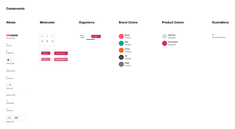
Components
No matter how small the project, properly using components, auto-layout, automation, and more Figma perks will always speed up the workflow, and ensure better quality outcomes.
Prototype
Lastly, I created the animated Prototype in Figma.
Presentation Slides
Just like many regular projects, this use case had to be presented to stakeholders. I created the presentation slides in Figma as well.
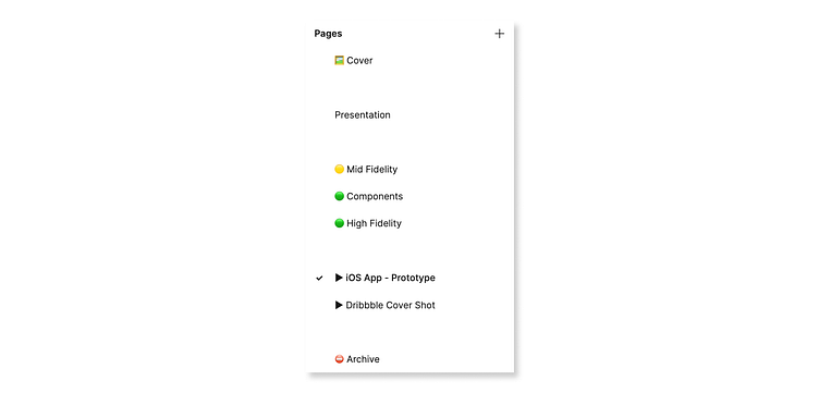
Page Navigation
To make sure my colleagues and collaborators are able to navigate my files at ease, a clear file structure is essential. I like to use emojis to make the page navigation scannable, which is especially important for larger projects.
You made it!
This is the end of this use case. Thank you very much for your interest in my work.


