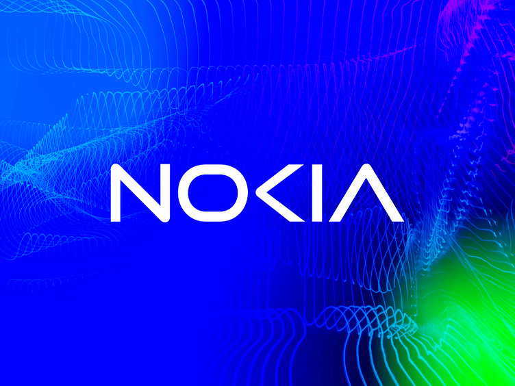
Nokia Redesign Logo
The redesign of the Nokia logo aimed to create a modern, minimalist, and timeless design that honored the brand's heritage while appealing to today's tech-savvy consumers. The end result is a logo that captures the essence of the Nokia brand and is a true reflection of its reputation for quality and innovation.
Have a nice day.
Thanks
Dipankar
Do You Need Help Building Your Brand & Growing your Business?
LET'S TALK ABOUT YOUR PROJECTS
Email: dipankarnathsms@gmail.com
✅ Whatsapp: +8801813187517
Follow Me On:
Behance | Instagram | Pinterest | Linkedin | Twitter
Don't forget to Appreciate & Comment.
brand guide
brand guidelines
brand identity
branding
branding design
flat
graphic design
icon
logo
logodesign
logo design
minimalist logo
modern logo
nokia
nokia redesign logo
rebranding
redesign logo
typography logo
ui
wordmark logo
View all tags
Posted on
Mar 1, 2023
More by Dipankar Debnath View profile
Like


