Case Study: JobAdder Mobile App 2017-2021

Introduction
JobAdder is a cloud-based recruitment software that automates the hiring process for recruitment agencies and in-house recruiters. With an increasing number of users accessing the platform on their mobile devices, JobAdder decided to develop a mobile app to provide a seamless user experience on-the-go.
When I joined JobAdder in October 2017, the mobile team had a huge task of auditing the current app and identified many opportunities for improvement, both in terms of technical and design aspects. Some of the key items that we’ve highlighted were:
The current UX was inconsistent and not intuitive
It was difficult to add new pages or introduce new flows due to the legacy code that was used
Difficult to create a seamless interaction between pages because of the existing different frameworks that were used (Xamarin Forms & Xamarin Native Pages)
Is not testable, therefore not possible to automate testing
There were no previous data or analytics on how the app was being used before
Many unhappy users due to the lack of features compared to the web app
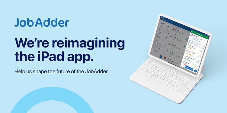
Between 2017 and 2021, the mobile team worked to create one of the best mobile recruitment apps in the world. They introduced features of varying development scale, both small and large. My role was to improve both the mobile (iOS and Android) and iPad app. This involved conducting research, analysis, and testing, as well as conceptualising, creating wireframes, user flows, interface designs, and prototypes. I also helped the mobile engineers with some front-end development coding.
Milestones
During my tenure with the JobAdder mobile team, we achieved several milestones and introduced numerous features which I have been directly involved in (from research → visual and UI design → prototyping → front-end development → testing) such as:
Introduced the Floating Action Button
Improved login experience using magic links
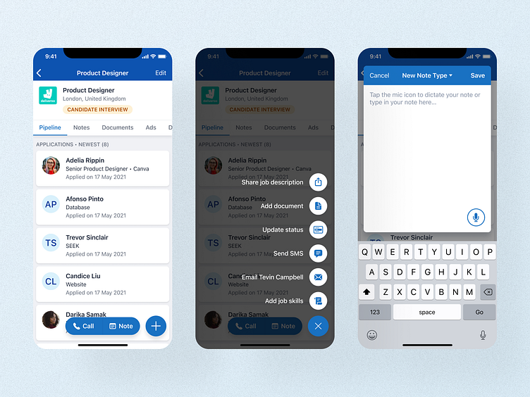
Voice notes
Add Documents
Introducing Zoom call option
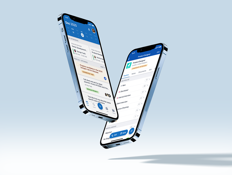
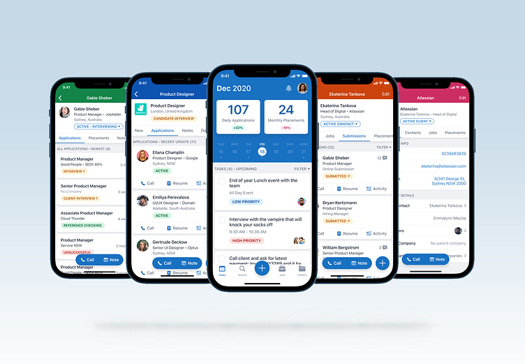
New Job’s homepage
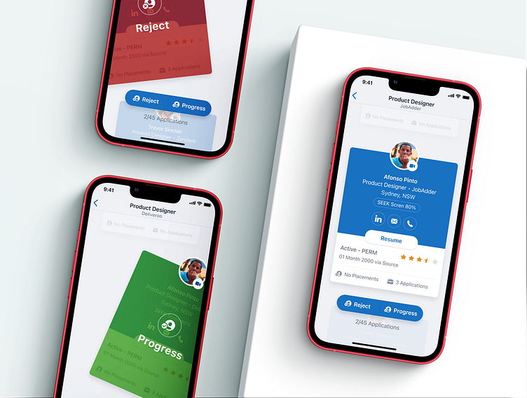
Job application tinder interaction
Improved Add Notes UI & Interaction + @mentions
Updated UI for Job, Candidate, Company & Contact details
Migrating from a cross platform framework to a native development environment for both iOS and Android
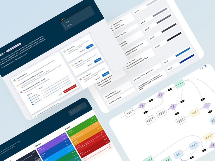
Helped the design team create a JobAdder Design System which flows through the Mobile Design System
Research
Working alongside the mobile product manager, Kim Boutard, we set out to conduct an extensive research study to gain a deeper understanding of our users' behaviours and preferences. Our goal was to identify pain points and areas for improvement within our existing mobile app.
To gather quantitative data, we used TypeForm to create surveys, which enabled us to collect insights into our users' behaviors and preferences. The feedback we received was instrumental in helping us understand what our users loved about our product and what could be improved.
To gain more profound insights into our users' needs and expectations, we conducted interviews via Zoom. These conversations gave us an opportunity to connect with our users on a personal level, which enabled us to better understand their motivations and desires.
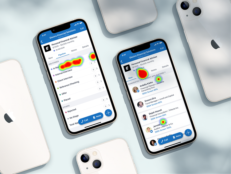
We also conducted usability testing on our existing app, which allowed us to identify pain points and areas for improvement. This process helped us to understand how our users interacted with our app and gave us valuable insights into what they were looking for in a mobile app.
Overall, this research study was an illuminating journey of discovery that helped us improve our product to better meet our users' needs and preferences. By gaining a better understanding of our users, we were able to make significant enhancements to our app, providing a more user-friendly and enjoyable experience

Design Process
Based on research findings, the next step in my design process is to create user flows that are frictionless and viable from a development standpoint. After obtaining approval from the PM and developers, I typically create simple wireframes or high-definition user interfaces and gather feedback from the mobile team and other designers within the organisation.
Next, I connect the designs and create a working prototype with all the necessary interactions for developers to use when building the feature. Depending on the complexity, I may use Figma, Framer, Origami, or XCode (SwiftUI) to build these prototypes.
The prototypes are tested with a small group of users, both internally and externally, using tools like Maze to identify any usability issues and gather feedback. The results from the tests are then analysed to refine the design and improve the user experience. The final design is tested again to ensure that it meets users' needs and expectations.
Once the design and interactions are approved by the PM and mobile engineers, I hand off the designs and assets (such as images and icons) via Figma. I also share a handoff document that includes all the research and findings, use cases, and relevant information with the entire team to close the loop of the design phase.
Key Design Decisions
As a mobile team, we've prioritised designing a user interface (UI) that feels native and intuitive. Our aim is to make our users feel at home on our app and to streamline their workflows as much as possible.
One of the most successful features we've implemented is a simple voice-to-text button, represented by a microphone icon. While most mobile devices have built-in voice-to-text functions, our users were still typing their notes during calls or while on the move, leading to missed or forgotten information. With our new feature, users can dictate their notes quickly and accurately, which has proven to be highly popular. Within the first week of release, almost 80% of our users had utilised the feature more than once.
We've also introduced a Tinder-style swiping interaction for processing applications, which has improved the experience of our users. By incorporating a familiar and enjoyable interaction from dating apps, we've made our app more engaging and user-friendly. However, we recognise that some users may not be familiar with this interaction, so we've made sure to keep it intuitive and easy to use.

Conclusion
Designing a product as complex as the JobAdder mobile app requires identifying the features that can provide the most significant impact with minimal effort. Despite users' desire for all the desktop app features, focusing on quick wins is essential.
By involving the team in the end to end design process, we can quickly determine if a feature can achieve these quick wins or if we need to reassess the problem we're solving for our users.
During my brief tenure with JobAdder's Mobile team, we've increased our user base from around 4,000 to 12,000 at its peak before Covid, with almost 60% of them being active on a monthly basis.
Finally, as a product designer, working closely with other team members (Designers, Product Managers, Engineers, Testers) is crucial to building an outstanding product.


