Knox Haircare Packaging Design

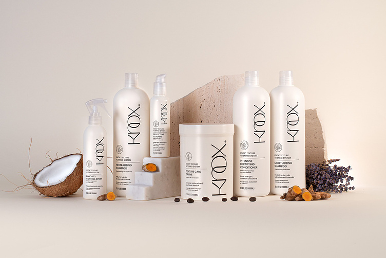
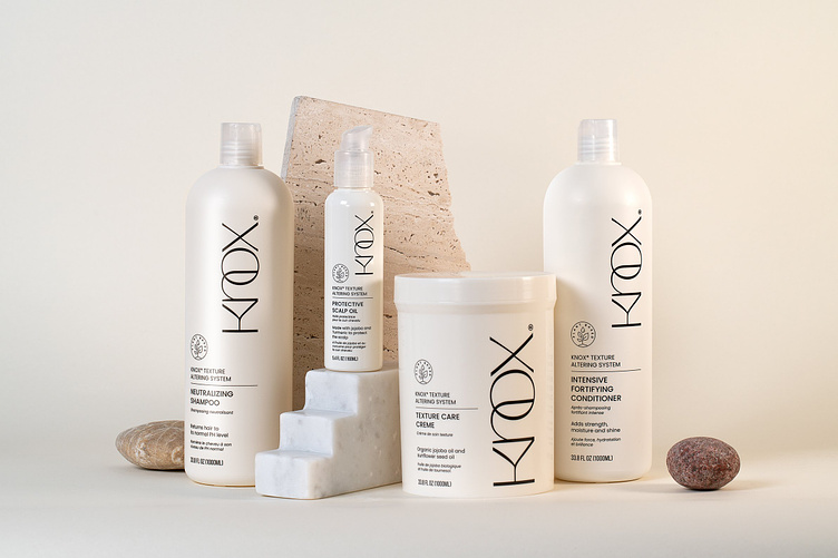
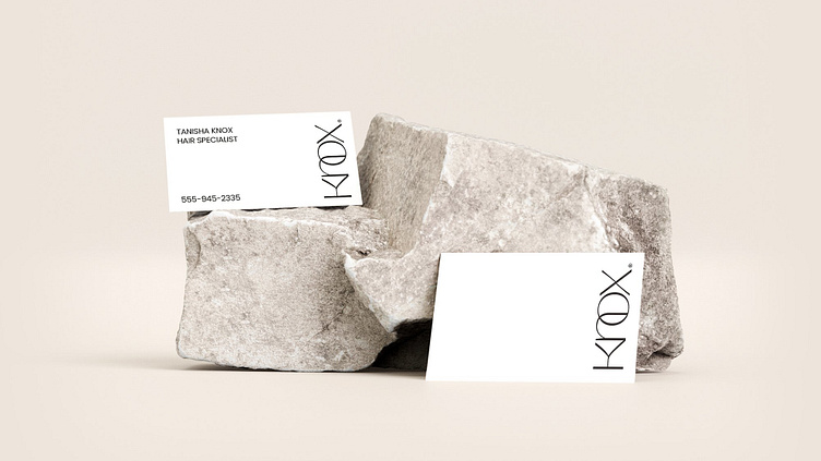
Once the logo design is approved, we proceeded with packaging design. For the containers, we chose a matte white color with a subtle touch of beige to create a more natural overall feeling. We intentionally kept the type completely monochromatic, and stayed away from incorporating colors, to establish the professional and scientific look the client asked for.
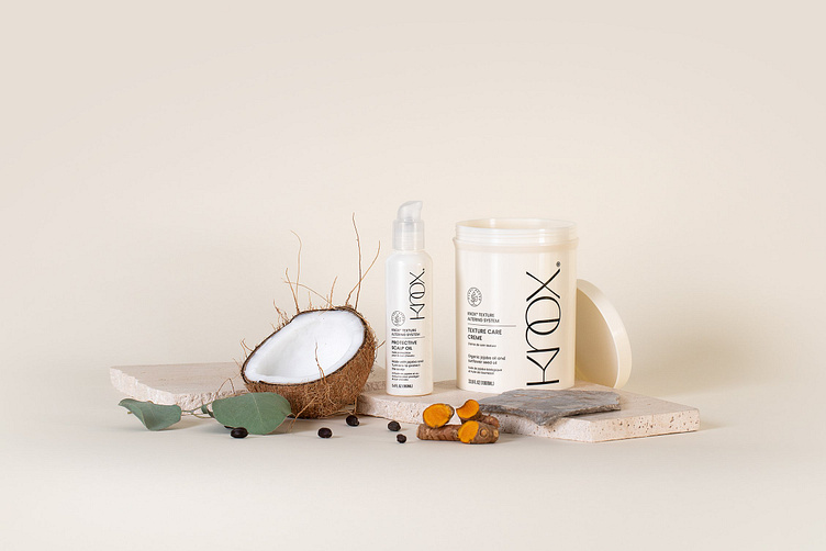
After the packaging designs were approved and the containers were produced, we organized a special photoshoot for a strong and distinctive visual representation of the products. Our goal was to convey the unique characteristics of the KNOX brand. The product line should have looked professional and sophisticated, yet organic and approachable. We also wanted to emphasize the aspect of the product being plant-based. To achieve all that, we created a simple and minimalistic overall atmosphere, while spicing it up with beautiful stones and natural ingredients. We used warm tones in the background and a matching lighting setup to create a warmer first impression.