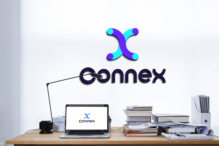
Connex Logo and Branding design

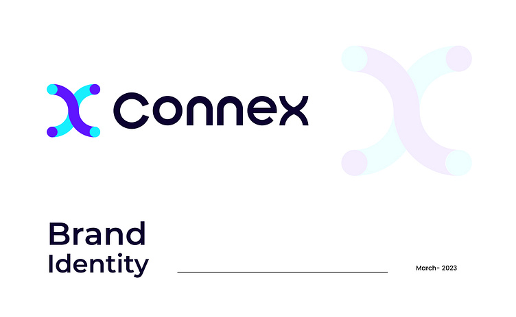
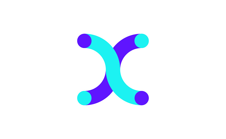
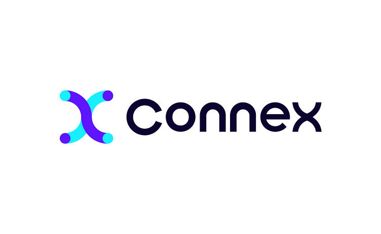
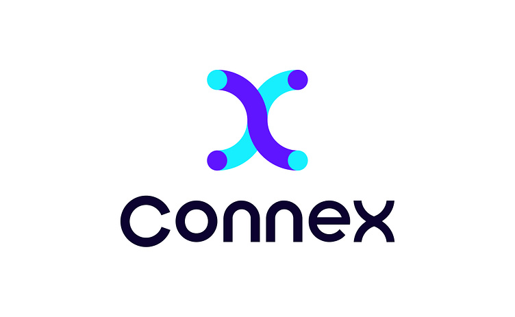
Enter your text here...Connex is a logo that works for technology. The logo has been developed in keeping with the current technology. The logo is very simple and memorable. So customers can remember it very easily.
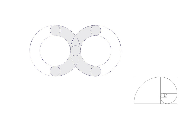
I didn't have any trouble to make the logo but it took a lot of thought to make a logo like this. I had trouble creating a logo that researched. I thought the logo would have a technology and feel and be simple and memorable.
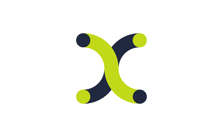
So I used two letters to create the logo. Those with C & X are the magnet symbols used.
Connex Construction
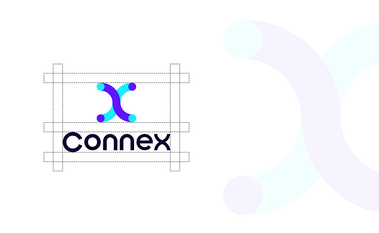
I tried to keep the logo simple. So I used the golden ratio to make it, so that others can easily master the technique of making it.
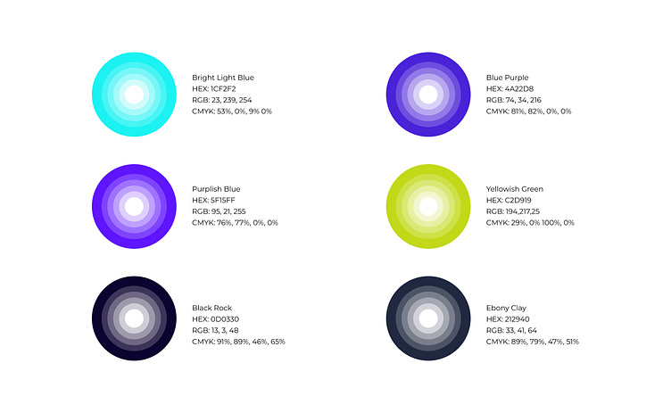
Connex Color
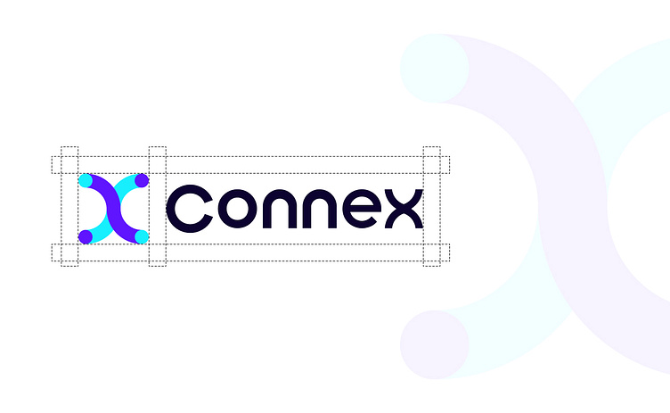
It is mandatory to keep minimum white space around the logo, so that the logo stands out exactly where it will be used.
Logo Space
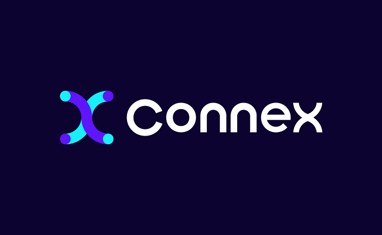
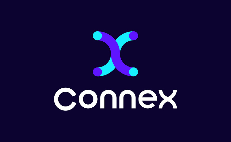
'Connex' logo stands out beautifully in two colours. So it is not important to use more or less than two colors in the case of using the logo. Must use two colors.


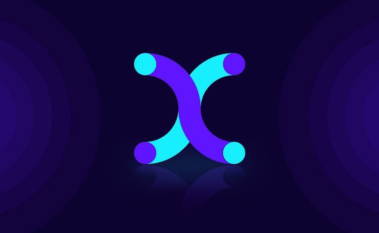
Hi Creative People.
Now, I create a modern technology logo design. This logo name is 'Connex'. The logo is perfect for a technology company. It's a simple and memorable logo for the audience.
Need help with a re-branding or a whole new identity? I am available for new projects.
💌 Email - rsofiqur316@gmail.com
💌 Telegram - +88 01758696457
💌 WhatsApp - +88 01758696457
🤝 Thanks for your time and have a good day


