OctaRealty
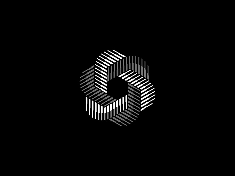
Logo concept for a real estate company.
The octagonal shape of the logo suggests stability, structure and balance which are all qualities that are highly valued in the real estate industry. The lines going from thick to thin create a sense of depth and dimensionality, which could be seen as a metaphor for the multi-layered experience of buying or selling a home.
Overall, the logo exudes a sense of professionalism, attention to detail, and precision which are all qualities that are essential in the real estate industry. It also has a modern, sleek aesthetic that is both visually appealing and memorable.
3d
brand
branding
building
fold
identity
illustration
logo
logodesign
logodesigner
minimal
octagonal
octogon
property
realestate
trust
View all tags
Posted on
Mar 18, 2023
More by Shyam B View profile
Like


