Harrowgate - Sketches/Concepts

Harrowgate is a start-up focused on human resource management and associated technologies for high-performance teams.
Their target market exists primarily within the special forces community and other government agencies.
Harrowgate are designing the management systems and software that support the development of exceptional individuals, forming cohesive high-performance teams and supporting their associated leaders with making impactful decisions.
Considering the goal and the company background, here are my initial concept explorations for the Harrowgate logo:
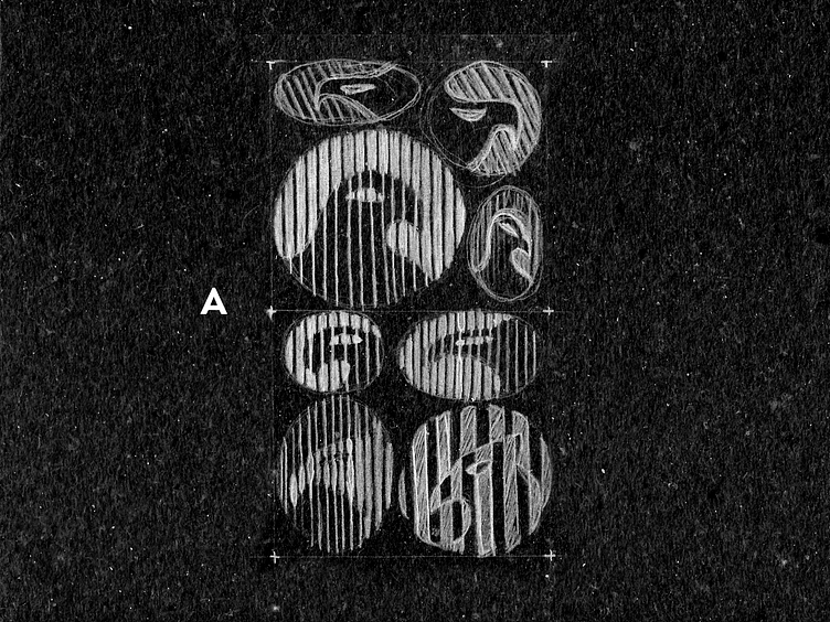
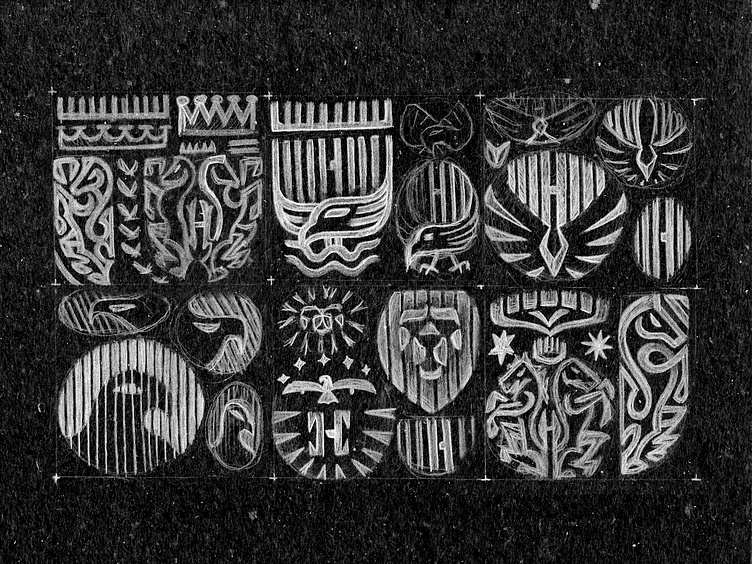
A - The eagle of course is a desired symbol in this case, I tried here to convey the eagle head profile plus the gate's bars.
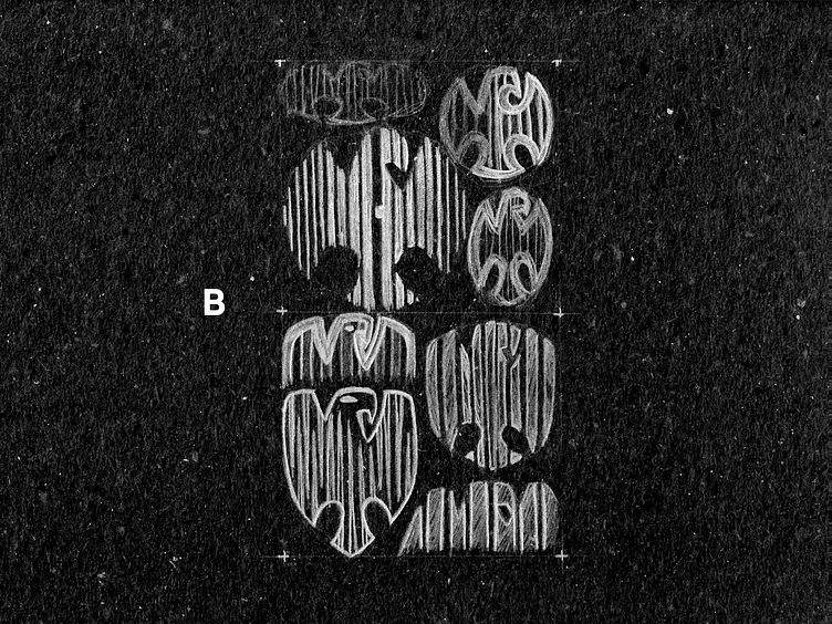
B - Still aiming an eagle plus the gate's bar, this time I was looking for a more full-body eagly with the overall shape of a shield.
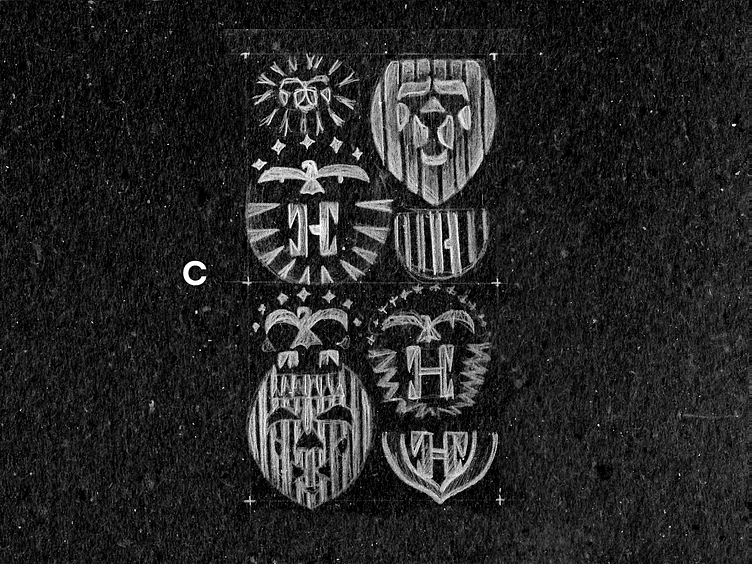
C - Client ask me to explore also another animals, so the lion came to mind or course, some of the options already have the H and the shield shape included.
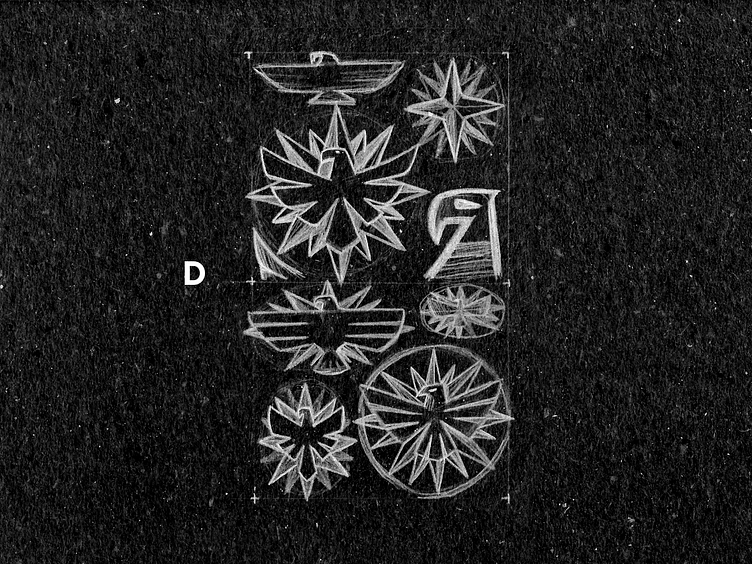
D - The ideia of a compass paired with the bird of prey also seems a good option to me, specially when overlaped as a sun or just rays coming from it's center.
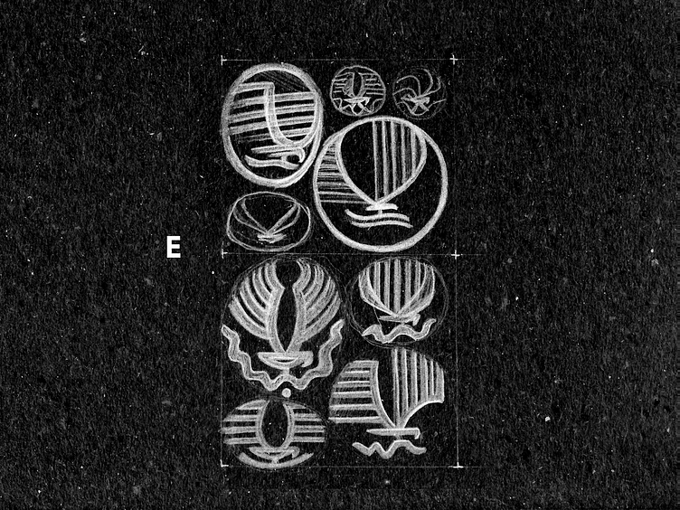
E - I feel like there would be interesting to have a more aggressive representation of the eagle/bird, as if it's on attack mode or grabbing the prey; also not missing the gate embeded on the wings.
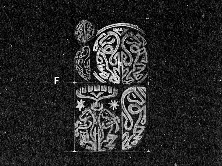
F - The classic representation of rampant horses hback to back also is desired, so I tried my best here to make it in a more modern style, still complex thought.
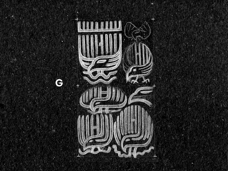
G - Here I think the special feature is to include the opening of the gate as a subtle H and make easier to recognize the eagle profile.
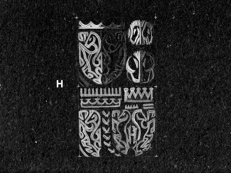
H - I've tested the crown as well on top of the horses as a symbol of power also aiming the gate style for it's spikes, maybe too complex to be honest.

I - I know this one isn't really a successfull take, but worth the explanation that I tried to put together a frontal eagle face that also looks like the full-body eagle flying. My mistake here possibly is to try including too much ideas at the same time, but for some reason I like this abstraction.
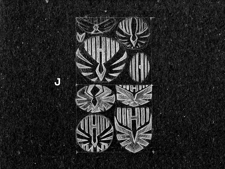
J - This is kind of a remix o the last direction, trying to make is cleaner and exploring different overall shapes.
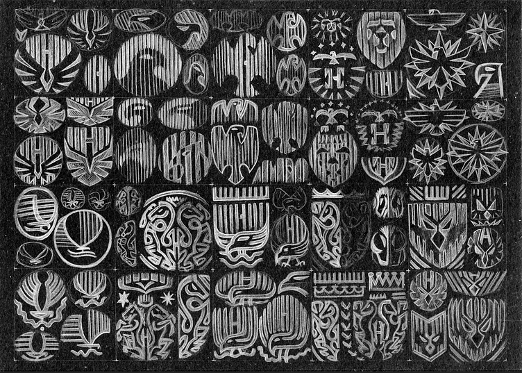
I hope you'd liked this initial round of sketched concepts!
(more refinements yet to show in the few days, stay tuned)
Also I'm available for new projects, so feel free for ask me!
Need a logo, illustration or other crazy stuff? Email me now :)
Follow & Connect!
Behance • Instagram • Facebook • Twitter • LinkedIn
/bitencourt or /allopoietic over any networks!


