Proton - Brand Guidelines


Hi there! 👋🏼
Here's a exploration Proton - Brand Guidelines
Proton is an IT services, consulting, and business solutions company that has helped clients achieve enterprise transformation by using innovation and emerging technologies.
We make using a modern design style, while still maintaining a professional and friendly impression. Scroll down to view more!


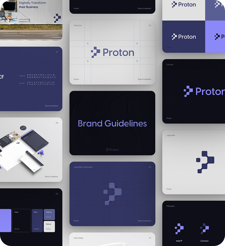
Philosophy
Proton’s logo is designed in such a way to be easily remembered by combining the letter "P" and the Network/Technology square element

Color Palette
Proton use of these colors in its branding and visual communications, creates a sense of elegance, innovation, and balance.

Typography
We made the decision to adopt Visby CF as the primary typography for Proton's visual identity. This choice effectively communicates professionalism, dependability, and enduring qualities. Not only is it legible and adaptable, but it also contributes to a unified and consistent appearance throughout all of the company's communications.

Thank You 💜
Hope you enjoy our work! Comments, ideas, and wishes are highly appreciated
Have a great day!
-----
Ready to Craft your Big Ideas? Drop your design inquiry to hello@nijaworks.com
-----


