Pepsi | Redesign Concept

Hello everyone! First, would like to say that it's been a long time before I've finally decided to move on with my dribbble account, and now I'm here exploring the community and sharing my works (old and will certainly share something new soon). This warm-ups concept is just brilliant, and I will certainly check the task next week as well :)
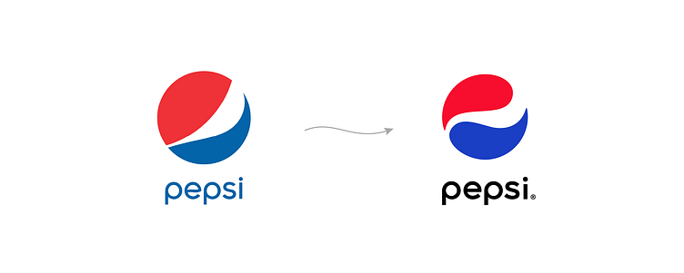
So, the topic of this week's warm-up was Pepsi redesign and, to me, their solution to redesign to something kinda they had in the 1970s was honestly confusing. Yes, they have now more vivid colors and bold design, but let's think what they've lost with this "new" logo. In the early story of their brand, Pepsi dropped off "cola" from the name, and it was a "bold move". The second "bold move" was to separate the logomark from the wordmark in the 2000s, keeping making the logo simpler and cleaner (what obviously their main competitor can't afford as smoothly). Of course, I can't see the whole picture, I'm not in every detail, but I feel just like they turned in the wrong direction with this new logo.
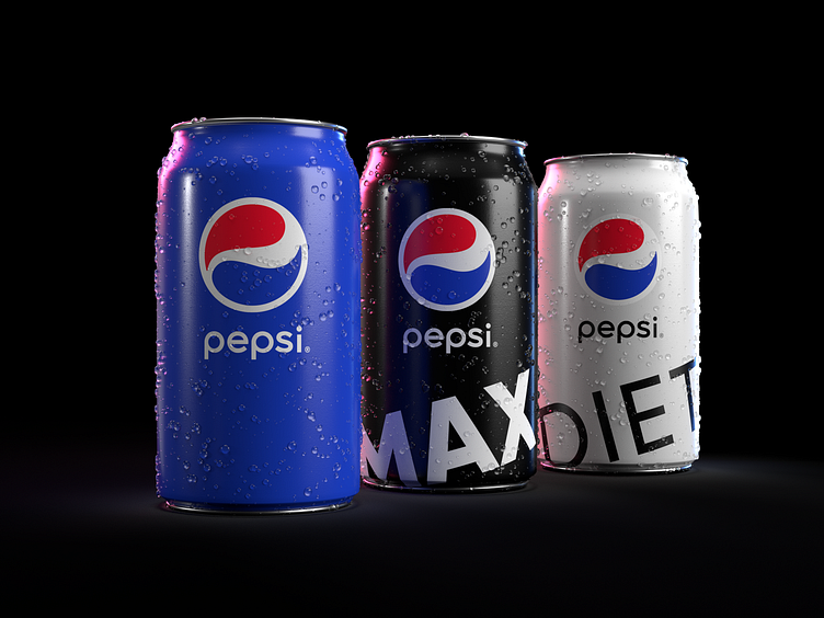
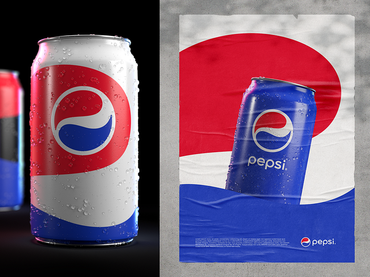
I would rather suggest some rebranding as suggested: more vivid colors, cleaner shape and typography, possibility to explore shapes of the logo in advertisement materials etc. As rebranding is not only about changing design, I'm confident that Pepsi follows some certain marketing goals, but who'd they like to appeal with this new image?
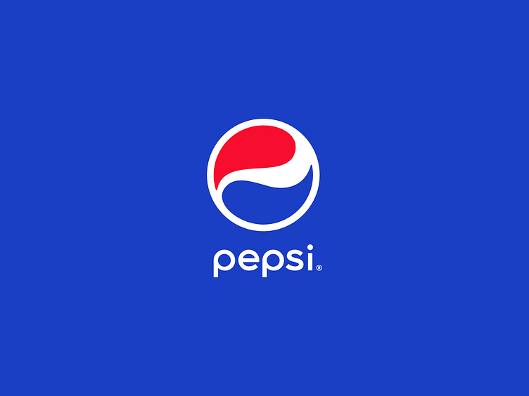
In my suggestion, since I believe that a brand should always resonate well with their audience, I've included an idea of balance between shapes, referring to some sort of Yin and Yang concept. Nowadays, there are plenty of possibilities as well as a lot of noise and distraction, which makes life balancing not as easy as before. But yeah, you can always take a sip of Pepsi while spending time with friends or working 12th hour, walking in a park or riding to catch the train, slowly enjoying life or catching it in a sprint... I believe some sort of the same message would find an echo in many hearts. What do you think?
Maybe I'm incorrect, as I'm not in all the details of the Pepsi, but it's just what I would expect from such a big and spread brand. Do you know any reasonable arguments about their new logo? I'd be glad if you'll share!
Don't miss a few shots in the bottom :)