Paradox - Branding & Web Design

A brand based around beauty and innovation.
THE MISSION
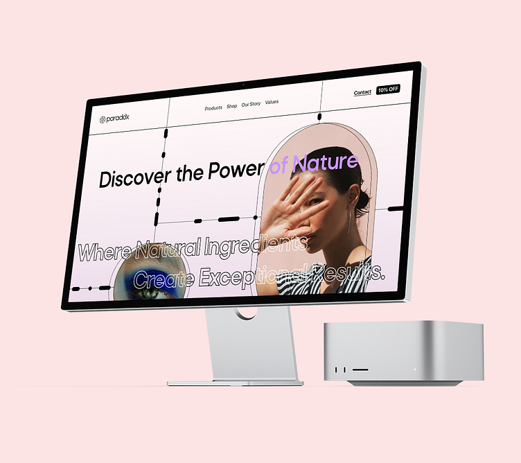
Creating a visual identity that reflected the brand's commitment to natural and effective skincare solutions. I aimed to create a design that would appeal to the brand's target audience of sophisticated and health-conscious individuals, while also emphasizing the brand's unique selling proposition of using high-quality, natural ingredients.
THE OUTCOME
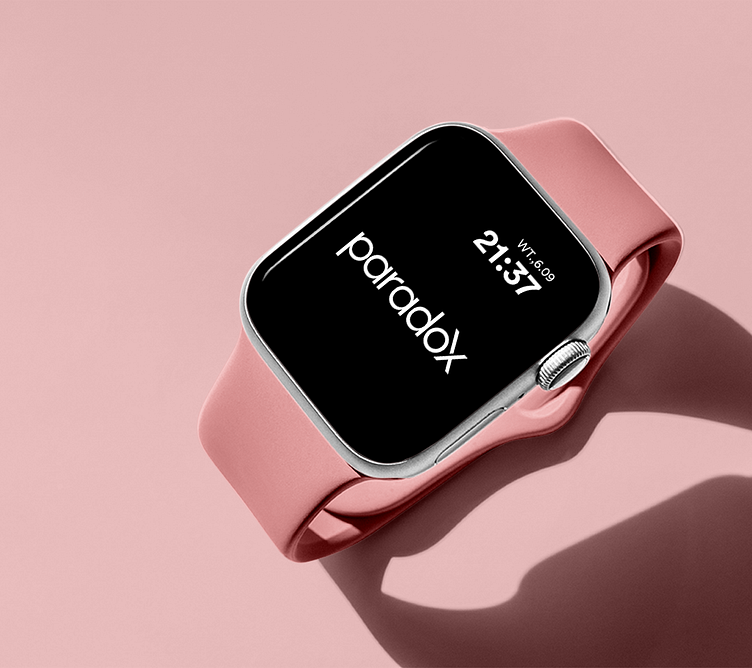
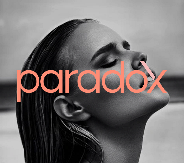
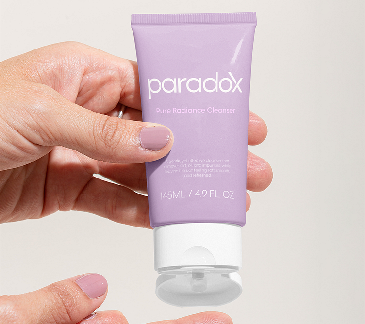
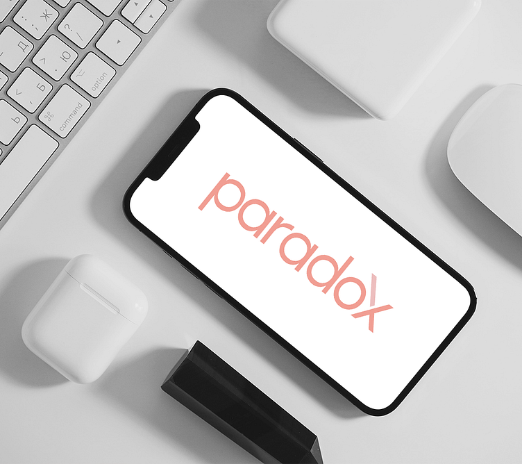
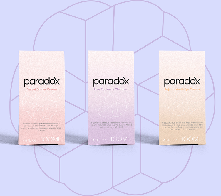
Through collaboration with the Paradox team, I was able to create a visual identity that met their goals and aligned with their values. The logo mark I designed features an abstract representation between the sun and a leaf, which symbolizes the brand's natural and organic approach to skincare. The color palette I selected includes neutral tones and muted pinks and purples, which help convey a sense of sophistication and relaxation. The typography I chose is clean and modern, which fits with the brand's emphasis on effectiveness and quality.
THE IMPACT
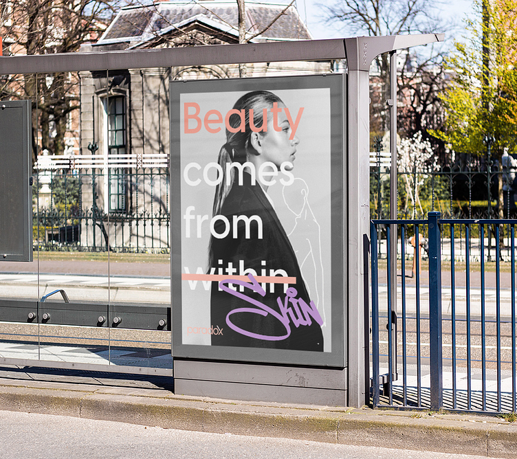
The new visual identity I created for Paradox has helped the brand establish a clear and cohesive brand image across all of its marketing channels, from its website to its social media profiles. The logo mark has become instantly recognizable and memorable, helping to build brand recognition and trust among customers. The color palette and typography have helped to create a calming and inviting aesthetic that reinforces the brand's commitment to natural and effective skincare solutions. Overall, the new visual identity has had a positive impact on Paradox's brand perception and has helped the brand stand out in a competitive market.
SERVICES
Logo Design Iconography
Colour Marketing Materials
Typography Print Materials
Web Design/Development. Packaging Design
Visual Identity