"Spark" Brand Guidelines


Hey folks! 👋
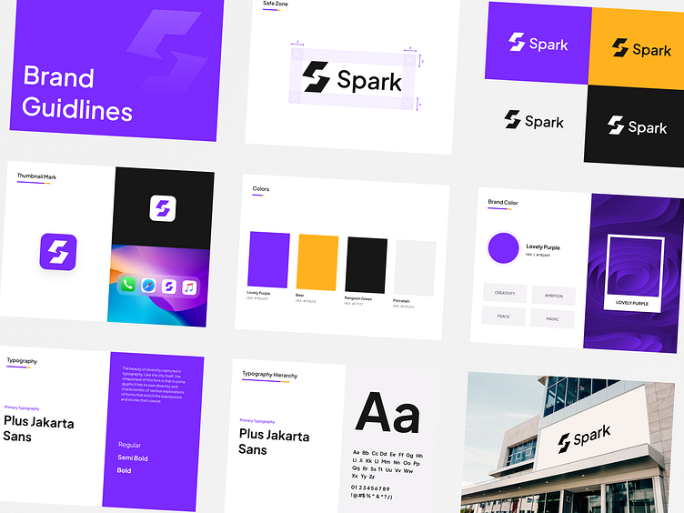
Today we're gonna be showcasing a collection of brand guidelines for "Spark," from the logo, colors, and typography. If you have any suggestions or comments, don't be shy to tell us, enjoy!
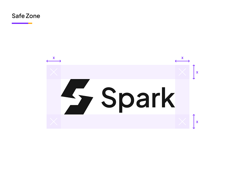
Safe zone for this "Spark" logo.
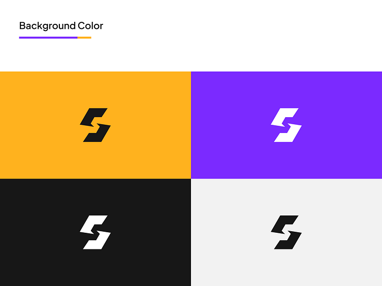
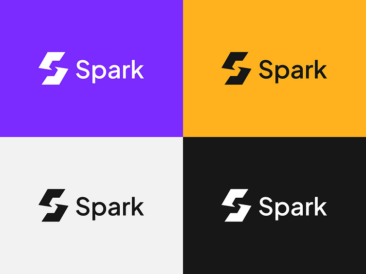
Some background color variations.
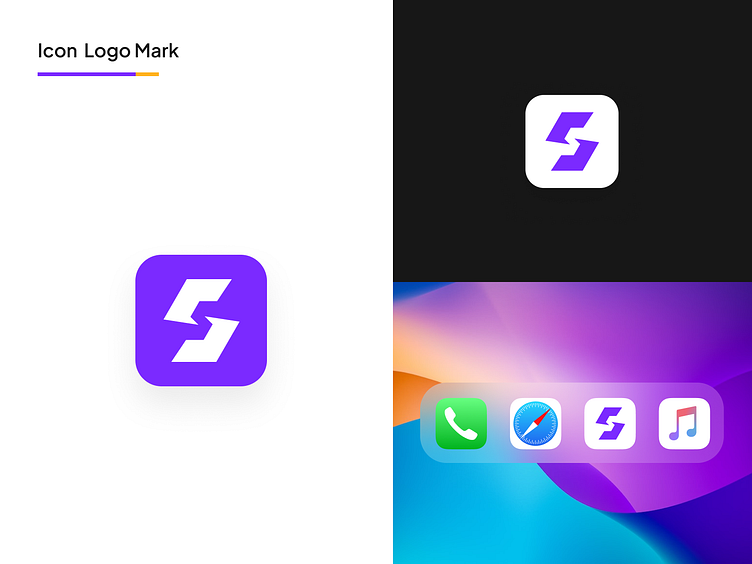
Here's what "Spark" as an app would look like on your home screen.
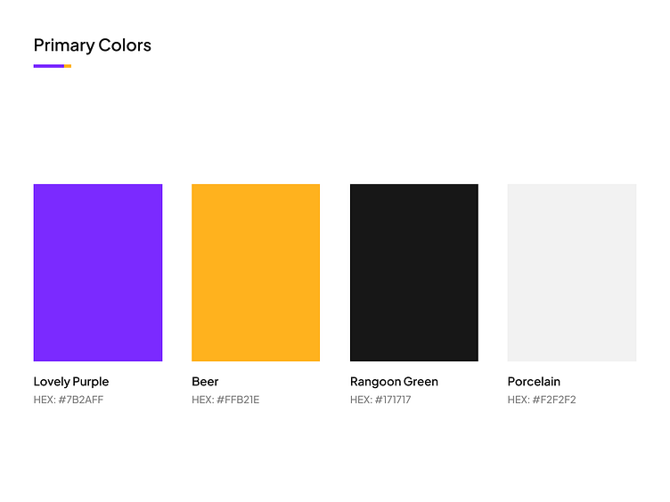
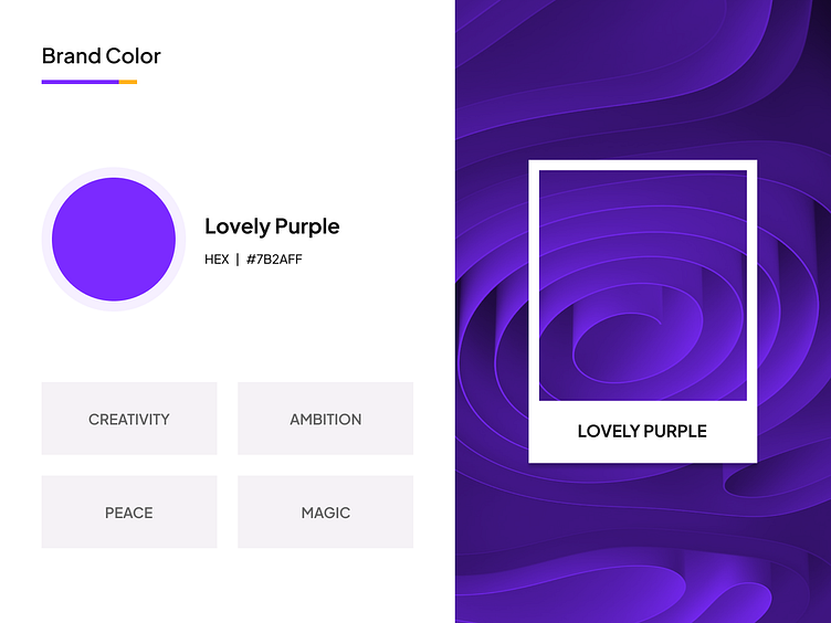
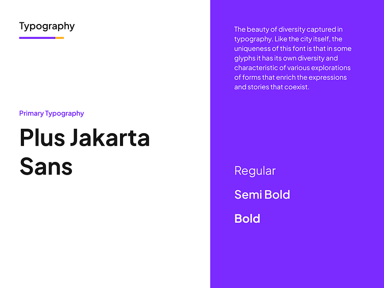
We all know that colors, aren't just colors.
The "Spark" brand color, utilizes a shade of purple which implies feelings such as creativity, ambition, peace, and magic🔮
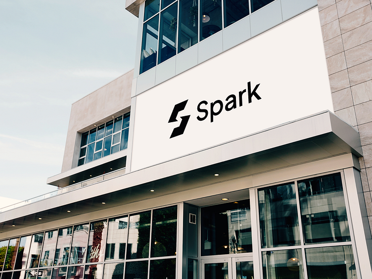
What the "Spark" logo would look like on a billboard.
Hello there! 👋
We are Nimu Design. A digital design agency building useful digital products and experiences for different brands. Offering full process from branding, UX strategy, visual creation, to launch. Our members have a growth mindset in mind to shape the products and services that improve the lives of thousands one day at a time.
Check us out at www.nimudesign.co
We’re open to hearing about your next project, give us a shoutout here hello@nimudesign.co !


