iComics 2.0


While no where final, this is a potential design I'm looking for a complete revamp of the library UI for my comic reader app.
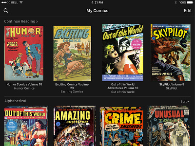
Some noteworthy design points:
-RIP Hambuger Menu
Looking to minimize the amount of taps needed to access critical information, the "hamburger menu" has been removed in favor of adding all of the critical buttons to the landing screen.
- Dark theme
As the majority of comic thumbnails end up being predominantly white, a dark theme allows for much greater contrast without needing to resort to borders or drop shadows.
- Unified comics and collections list
This aligns the underlying storage pattern with the conventional file/folder file system, causing less confusion for users.
---
Let me know what you think! And be sure to check the attached file for a full size preview! :)


