Simple Note

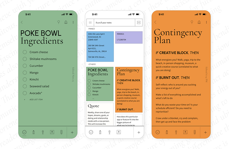
Every month I challenge myself to choose an app I often use and redesign its UI and fix some UX problems. For this month, I chose my note app. I love the simplicity of the app design and mechanics, however, there is one feature that I constantly find missing—hierarchy. Nothing complex: just a couple of levels of headings and a highlight. So I redesigned my note app with updated typography, iconography, colors, and added hierarchy options.


