TBF: Print & Digital - Part 5/6


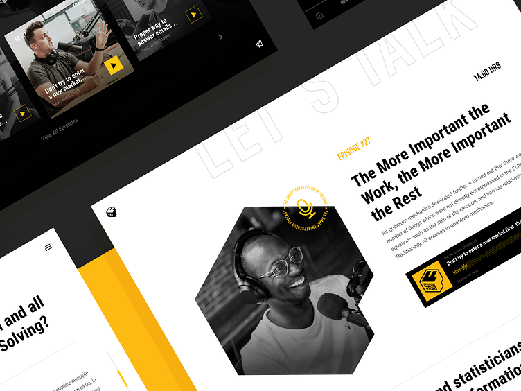
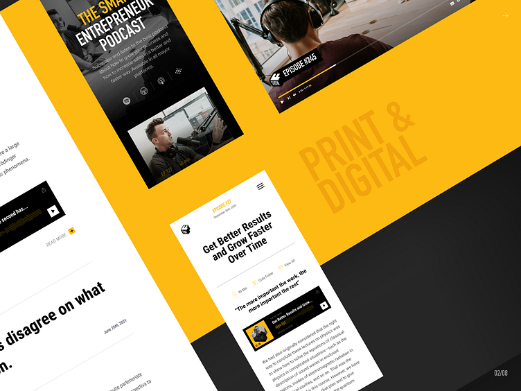
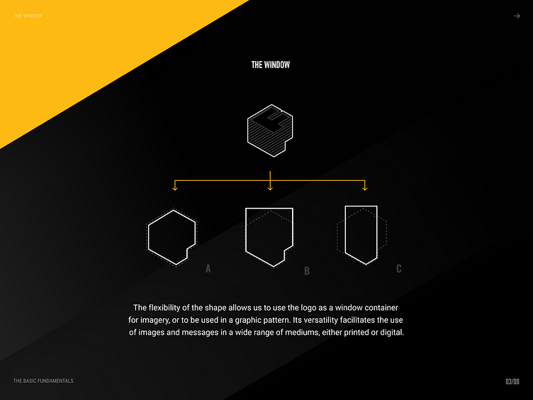
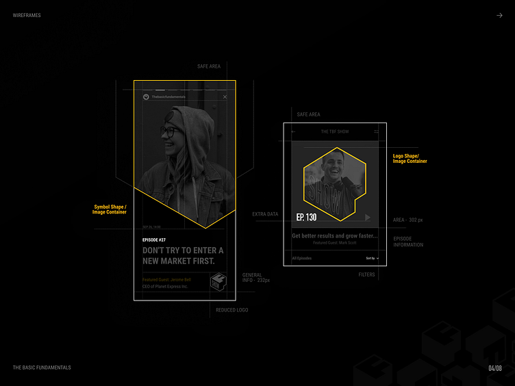
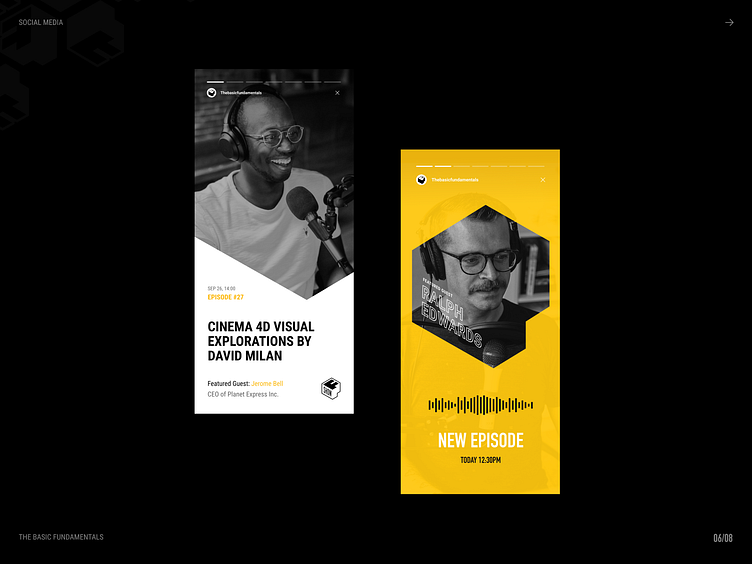
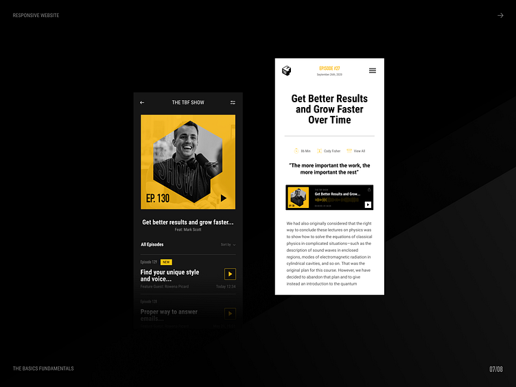
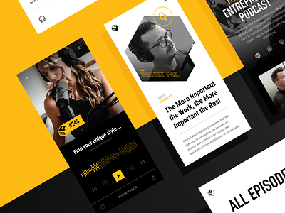
An app must have brand communication guidelines of its own, and we designed just that when it comes to the TBF Show podcast. A consistent digital palette has accordingly been put in place for the podcast app, whose primary colour remains TBF's distinctive shade of orange. In order to reinforce brand recognition, we also utilised the shape of TBF's symbol as an image container for the podcast's episodes cover.
The result is a digital design alluding to the brand in multiple fronts and users are thereby permanently immersed in TBF's branding. Ever-present brand recognition requires a solid branding foundation!
Find more of our work on our Website, Behance, Instragram, Facebook, Twitter and Pinterest. Interested in working with us? Book a call here, we would love to chat! Are you a talented designer? Check out our Careers Site!