Brochure Flyer Design for Amero

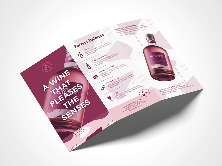
Hello! This is a Brochure/Flyer Design for Amero their wine. The color palette chosen for this flyer exudes luxury and refinement. Deep burgundy and light shades of pink, evoke a sense of opulence and indulgence associated with fine wines. In terms of layout, I have employed a balanced and symmetrical composition to achieve a sense of harmony and order. Each element is thoughtfully placed, guiding the viewer's eye through the flyer effortlessly.
What do you think about it? 👀
-----
If you like my post feel free to follow me and leave a like 😃
-----
I am available for new projects, so feel free to reach out.
-----
Let's work together! Contact me at f.krotzer@fabiandesign.de


