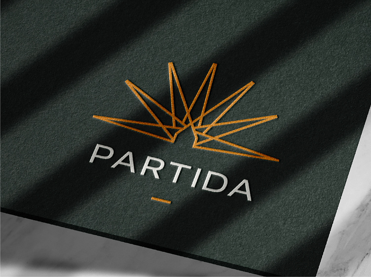
Partida logo design
Jordan had a very clear focus for how he wanted his brand to look and feel to his clients. It needed to reflect authenticity, reliability and professionalism. In the brief, he mentioned his love for vertically stacked logos such as is seen in the Casamigos identity as well as clean monoline designs.
After conducting competitor research and mind mapping, I started to look into native Southern Californian plants to draw inspiration and bring in the notion of authenticity to the area. I found various interesting looking plants but was quickly drawn to the Caliandra. I began sketching some different executions of this and realised it could also represent the consistent sun L.A. receives year round. I thought this was a promising direction but I wanted to squeeze in more meaning. I was very cautious not to be cliché in its execution but I managed to bring in a house shape where the rays of the sun converge subtly nodding to Jordan’s profession.
I was super stoked with this design, I just needed to pair it with some type. After disregarding a subtle-serif typeface after a few attempts, I settled on a bold and professional sans-serif in all caps. This brought with it the elements of reliability and confidence we needed. This however, brought with it it’s own problem. The logo now felt very top heavy and unbalanced. To rectify this, I added a small line (as if taken from the bottom of the house in the logomark) to sandwich the logotype between the symbol.
Jordan also mentioned the desire to bring in his tagline somewhere - this worked really well when swapped out for the bottom line and now he had two logo variations to use for different applications. Finally, bringing in earthy tones helped further cement this identity in authenticity as I leant on colours found naturally in L.A. flora. Super happy with the final result and I can’t wait to see it out in the real world!
Testimonial
“This year I decided to take my business to the next level by introducing professional branding. After searching and consulting with multiple companies I finally came across Jack at Chittco and I am so glad to have found him! His process is clear, direct and inclusive every step of the way. Jack was extremely professional all throughout, but always remained welcoming enough to answer each of my questions and patient enough to allow me to decide on things when I needed to. I never felt rushed as I have with others in the past. I am SO proud of my new logo and branding! Jack’s expertise asked all of the right questions and used my answers to create a logo that fully embodies exactly who we are and strive to be! Do yourself the favor and work with Jack, you won’t regret it. Thank you Jack!”
Ready to create or refresh your brand's identity?


