


Ooredoo app icon - Redesign exploration

Hi community,
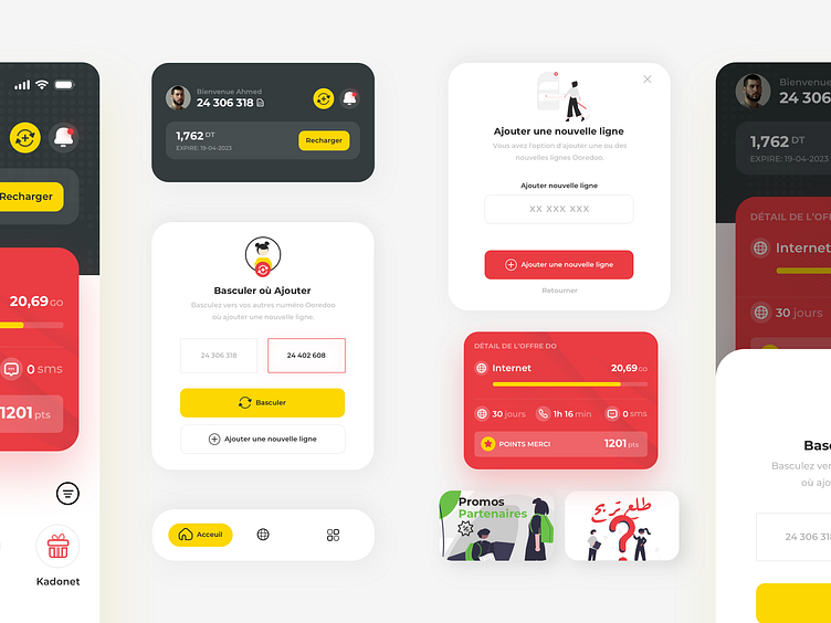
I never liked the visual appeal of the Tunisian Ooredoo app. I use it most of the time because it's my cellular provider.
The app lacks the basics of visual appeal as well as the basics of user experience. I think such a big company deserves at least such an exploration.
Yecer te3ba la3bed 😪
Wanna work together? I'm funny btw, DM me on Twitter or shoot me an email at bousrih20@gmail.com


