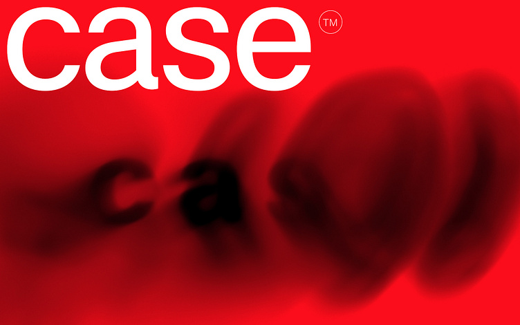
Case 2.0 Typeface Collection

Case™ is a matter-of-fact Neo-Grotesque with surprising nuances – a welcome and refreshing alternative to the classics. To make it even more versatile for complex branding projects, we have revised it from the ground up and doubled the number of fonts and characters.
Custom type designers know this scenario well: their clients want something ‘new’, ‘unique’ and ‘independent’. The demand for an exclusive typeface that helps brands stand out from the competition is enormous. However, when it actually comes down to it, in reality they just want their own version of a Neo-Grotesque in the style of Helvetica® or Akzidenz Grotesk®.
Erik Spiekermann, Anja Meiners and Ralph du Carrois are all too familiar with client briefings of this kind and have regularly found themselves working on a variation of the omnipresent Neo-Grotesque. However, each time, they aspired to replace the classics with significantly better concepts – with timeless yet forward-looking alternatives that help the simple underlying design to gain more character with surprising, sometimes experimental nuances.
Neutrality with recognition value
Case is the essence of these corporate font projects. Spiekermann, Meiners and du Carrois left out everything that they felt was unnecessary in the world’s most popular typeface genre but made sure to keep the best bits. Building on this magical concentrate, they added new ideas and conceptual solutions for a modern sans serif. The result is the missing element in an otherwise strained and bloated font category: A typeface whose matter-of-fact personality looks familiar and creates trust, but at the same time provides fresh inspiration with individual features making it perfect for strong brand building. Case is less neutral than its peers and stands out from them with greater recognition.
Emphasis on horizontals
The most striking feature of Case is already reflected in its name. Derived from the systematic feature of terminating characters, such as c, a, s, e and their relatives, including capital letters, small caps and unicase characters, each at its own height. This design decision emphasizes the horizontal, almost compulsively forcing harmony and allowing for extremely tight setting and experimental applications. As the weight increases, this feature becomes more dominant, right up to ExtraBlack, which uncompromisingly takes it to the extreme. This deliberately reverses the harmony into the opposite and allows logos, wordmarks and headlines to be designed more concisely. Since the name of a typeface should already introduce its character and almost all fonts (co)designed by Erik Spiekermann get by with four letters anyway, the naming almost came naturally.
Legibility for greater accessibility
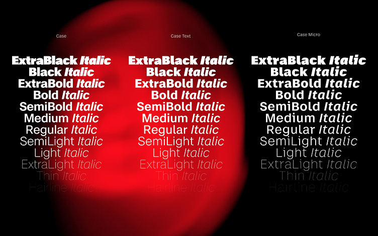
Another strength of Case is its remarkable legibility. This is mainly due to its three optical sizes: the core family which is great for most applications, especially larger use, Case Text which works well for more extensive content and Case Micro which is intended for small text. Depending on the application, it can still guarantee good legibility at a font size of 4pt; in some cases, Micro even works below this.
The secret of optical sizes lies in the possibility of making individual characters more legible, and that the desired visual impression of a font can be maintained across all font sizes. The effect in a headline is then identical to that of a footnote. Digital environments especially benefit from this adaptability as the font sizes and styles can be displayed differently (responsively) when viewed on small smartphones or large displays.
In the case of Case (sorry for that), the differences between the three family members lie in their spacing. In comparison to the two versions for text applications, the main family’s spacing is narrow, whereas Text is wider and Micro has the widest. For better legibility, both Case Text and Case Micro have an l with a ‘foot’ and slightly more open shapes than their bigger sister. The Micro has a higher x-height, more distinguishable character forms (r, i, j), wider glyphs (f, t) as well as significant contrast at the joints of the stems and bows. Strikingly, these concise forms have been the reason for using Micro large on posters or banners. Here, the flexibility of the type system is emphasized in an unexpected place.
Real italics represent brand values
The real italics are a truly unique feature. In the genre of Neo-Grotesques, they are a rare occurrence in such a concise form. Many type designers are usually satisfied with obliques, which are merely slanted italics that have not been specially designed. Yet with real italics many common brand values can be conveyed through this almost organic design, e.g. optimistic, human, lively, transparent, friendly, distinctive, creative, harmonious or elegant. The angle of inclination also supports trust in the brand, as it corresponds to that of the well-known classics Helvetica®, Univers® or Akzidenz Grotesk® (12°).
The variable fonts, which oscillate between weights and three optical sizes, also deserve attention. One upright and one italic variable font are included in the Superfamily package, at no extra cost.
Case 2.0: Doubling of design options and completion of European Language Support
With this lavish update in late Spring 2023, the number of individual styles has more than doubled, from 32 to 72. Customer feedback prompted us to harmonize both Text and Micro to cover the scope of the core family and align the x-height of Case Text to that of the normal Case. The harmonization also includes more finely graduated intermediate weights (new ones include: SemiLight, SemiBold, ExtraBold), a newly drawn ExtraBlack extreme as well as some subtle adjustments to existing weights. The range from the thinnest possible Hairline (2 units!) to the uncompromising boldness releases new creative forces, not least with the help of the all-encompassing variable fonts.
In addition, the number of characters has also doubled. Behind this enormous increase is the extended language support which now includes support for Cyrillic, Greek and Vietnamese, the support of Latin languages of Africa and the new unicase feature. Although the idea of combining uppercase and lowercase letterforms with the same letter height and no ascenders or descenders was initially conceived as a fun play on words (UniCASE), the design and engineering team quickly excelled in designing, and later the marketing team, when applying this typographic feature to the concept. To keep the extended family manageable, this design option was integrated as an OpenType feature (Stylistic Set 2).
The plethora of far-reaching revisions and extensions result in a new, exceptionally versatile and completely revamped version of the typeface that can confidently keep up with the ever-growing demands of complex branding projects. If that wasn’t enough – due to the clear, neutral design, Case offers the perfect foundation for individual adaptations and custom designs.
(Helvetica and Univers are trademarks of Monotype registered in the U.S. Patent and Trademark Office and may be registered in certain other jurisdictions. Akzidenz-Grotesk is a trademark of Berthold Types Limited registered in the U.S. Patent and Trademark Office and may be registered in certain other jurisdictions. Unless otherwise stated, the images used are subject to Unsplash licenses.)