Treffpunkt Fußball Case Study

Treffpunkt Fußball (Meeting Point Football) is a web platform sponsored by the Phillipp Lahm Foundation. Its main goal is to connect German football clubs with civil society organizations through grassroots initiatives focusing on social causes.
Brief
Philipp Lahm—a former German international football player and director of the UEFA Euro 2024 (to be held in Germany)—was looking to take advantage of the spotlight that comes with organizing a major sporting event to launch a platform that strengthened the ties between football clubs and civil society.
This platform should allow football clubs and civil society organizations to meet and discuss ideas that promote positive social change. These ideas could then be transformed into projects funded by private institutions and individuals eager to attach their names to a cause of their choice.
It was crucial for the client that the platform was easy to use, and that it reduced all friction in the early stages of ideation, but that it still promoted proper oversight and documentation of funded projects.
I was design lead for this project, overseeing a team of designers and developers at Odd Camp and working in close collaboration with the client.
Information Architecture
After sitting down with Philipp Lahm’s team several times to discuss their vision in greater detail, we got to work on strategy and planning.
We knew clarifying the core concepts early on and settling on the terminology to be used was crucial. This would put everyone on the same page from the start and reduce the chances of miscommunication later.
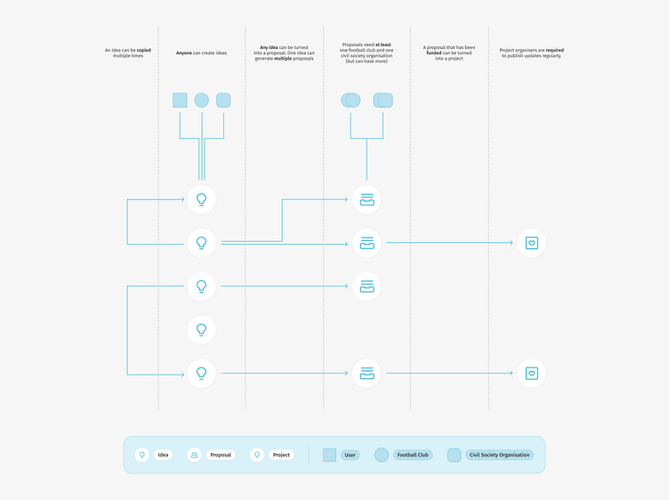
We broke the platform down into three main blocks:
Ideas for spontaneous thoughts. They require low commitment or forethought, have a low barrier to entry, and invite participation from everyone;
Proposals for ideas that evolved into structured plans. They have goals, timelines, actionable steps, and a budget. They have at least one football club and one civil society organization attached;
Projects for proposals that have been funded and are ready to be initiated. They require organizers to publish regular updates documenting the project’s progress.
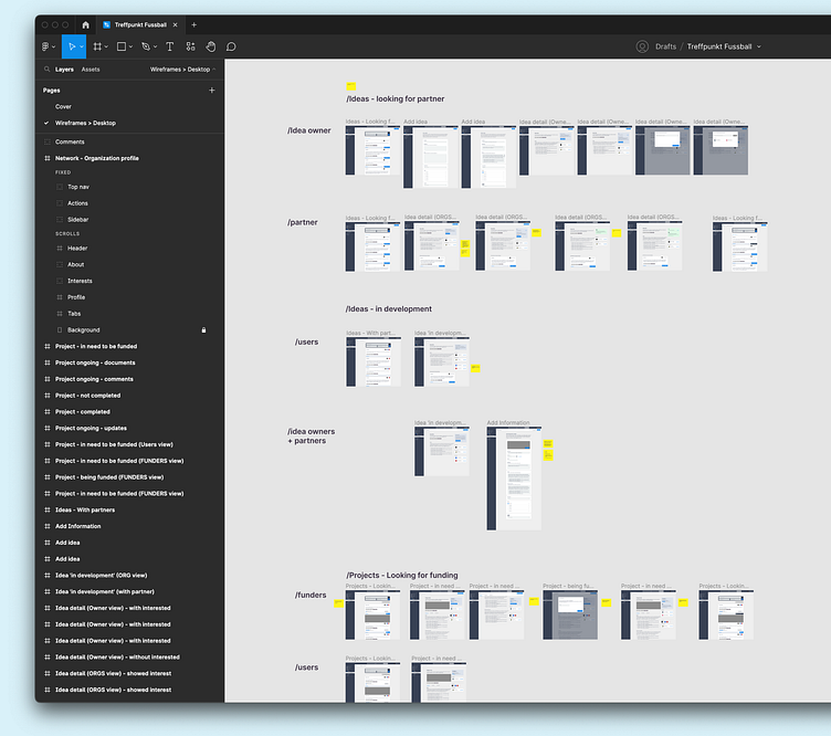
Wireframing
We started by exploring ways to optimize the user interface for all three sections according to the goals and priorities set for each one.
We put together prototypes, which allowed us to test different ways to incentivize participation in the early stages of ideation and slowly introduce accountability and oversight, as ideas move from free and open discussion into funded, well-structured projects.
We ran user testing sessions, interviewing users and collecting data on the performance of each variation. Over time, we began to understand the benefits and shortcomings of each and settled on a strategy.
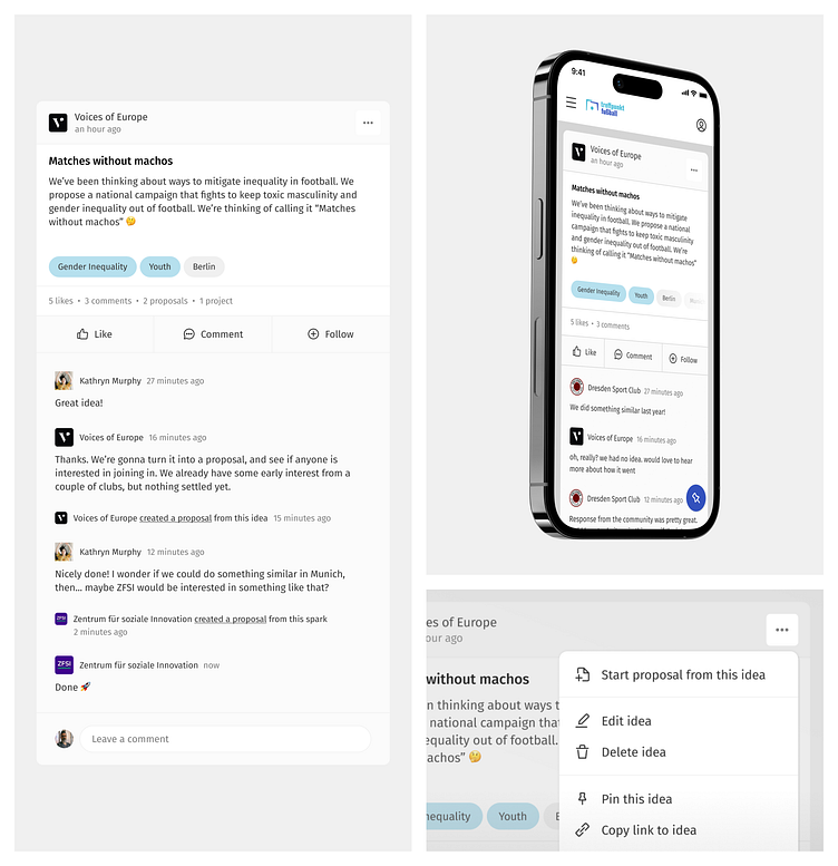
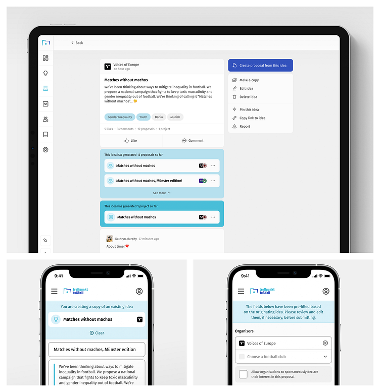
Ideas
For Ideas, we relied on a layout most users seemed comfortable and familiar with.
Because we wanted it to feel as easy to publish an idea as it is to share on social media, we modeled the interface around a cross-over between social networks and messaging boards: a card-based timeline, with emphasis on short text messages and the ability to like, comment, and follow ideas.
Idea cards are easy to scan, interact with, and pack substantial information without overwhelming users.
Primary actions (Like, Comment, Follow) are easily accessible at all times, while secondary actions are displayed via a contextual menu.
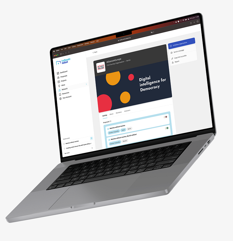
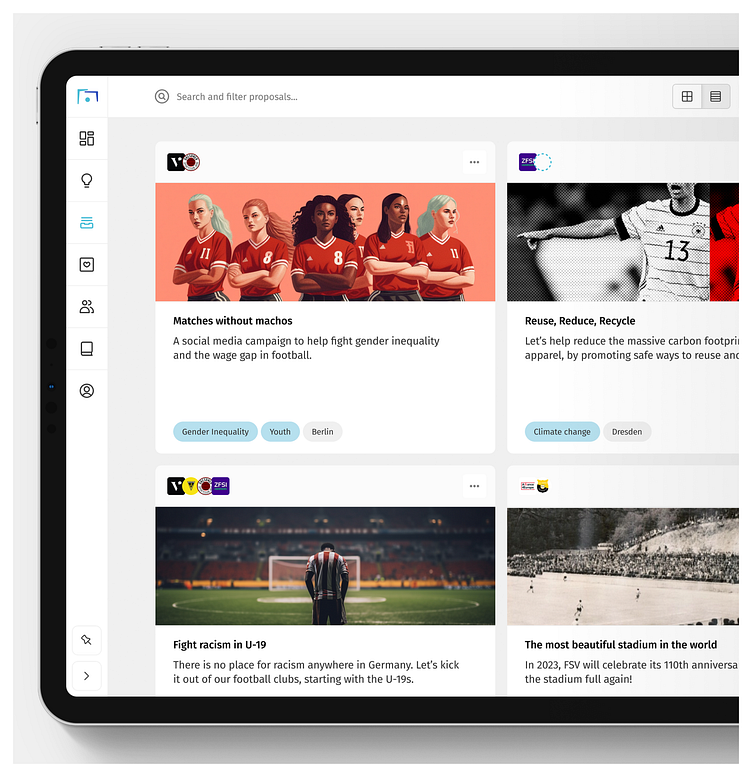
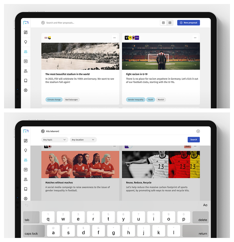
Proposals
Proposals are less about community participation and networking and more about promotion and funding.
For organizations working on a Proposal, the ultimate goal is to capture the interest of a potential funder. And for funders, the goal is to identify causes they would like to sponsor.
So, while we sought to maintain visual consistency, here we switched the timeline view for two different layouts: a grid view, which allows more customization and branding of Proposals, and a table layout, which makes browsing, sorting, and filtering easier for users.
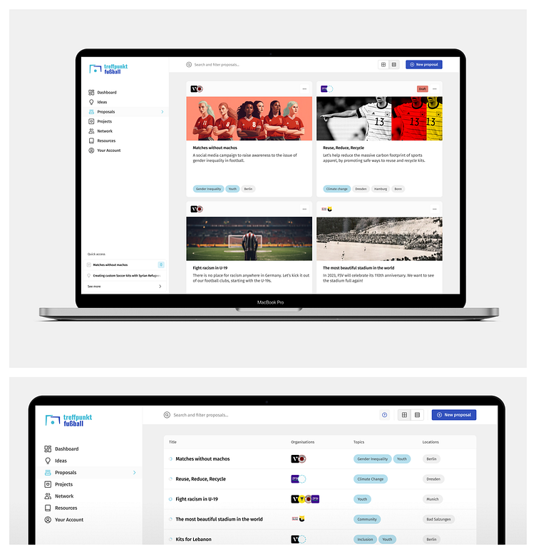
A dedicated page displays additional information about the Proposal, including a description, timeline, and budget.
Users who belong to one of the organizations attached to the Proposal can edit it, allowing organizations and football clubs to collaborate directly on the platform while the Proposal is in Draft mode.
Once a Proposal meets the platform’s criteria, it can be made public. Anyone can browse public Proposals, but most users only get access to select information. Users with a Funder account (a particular type of account assigned upon request) can see details such as the budget and the timeline. These users can also ask the organizers questions and initiate a funding request.
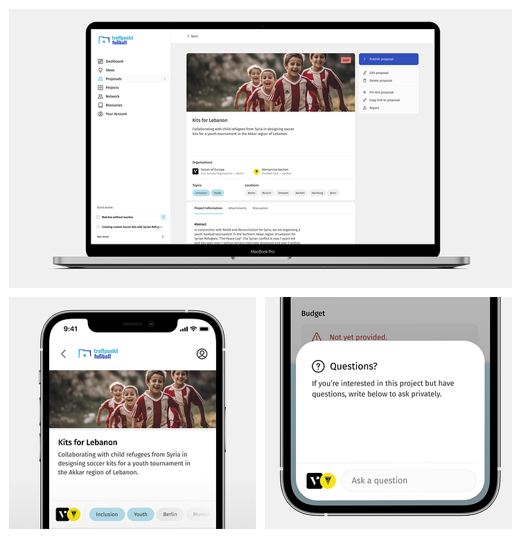
Projects
Projects share many traits with Proposals, so we decided to maintain consistency in the design across the two.
We made the grid modular, allowing the editorial team to highlight projects. We placed less emphasis on discoverability, searching, and filtering because we expect the platform to have a relatively small number of ongoing Projects at any given time.
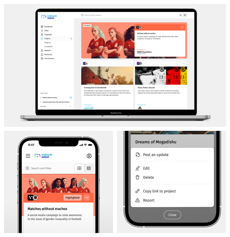
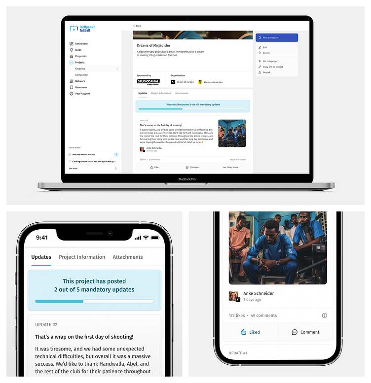
We also optimized for accountability by heavily designing Project pages around updates.
Project updates are crucial to the platform because they promote transparency for funders and allow the community to follow and influence the project’s development.
To reduce the likelihood of fraud, project organizers must publish a minimum number of updates at key points in the project’s timeline before they can access part of the funds.Updates are signed by individual members of the organizing team. Anyone can read and interact with these updates.
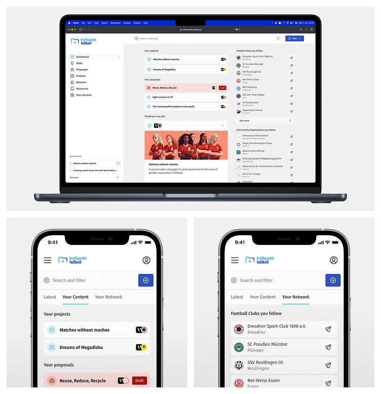
Dashboard
We designed a personalized dashboard to help users navigate the wealth of content available on the platform.
It’s the first page users see after logging in, and it offers them:
ways to explore new content on the platform (through a feed based on location, personal interests, and followed items);
quick access to their Ideas, Proposals, and Projects;
shortcuts to the users, organizations, and football clubs they follow.
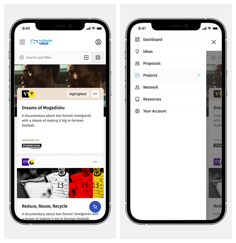
Navigation
We planned the application layout to ensure all core functionality is always, at most, two clicks or two taps away.
On large screens, the application’s chrome is split into two main areas: the sidebar and the topbar.
The sidebar provides a clear overview of the main navigation, and it can be collapsed, freeing up critical screen real estate for the content on tablets and smaller laptops.
Underneath the main navigation, we placed a simple widget allowing users to jump between different platform areas.
During user interviews, we realized most users would need to context-switch quickly and frequently. For example: when working on a new Proposal, it is common for users to jump between different Ideas and Organization profiles, comparing data between them. We realized most users in our testing group were not inclined to open new browser tabs to do this and kept coming back to the dashboard or the search bar to move back and forth between the same pages. To make this flow easier, we devised a solution that pushes all pages the user visits into a History array, which we then display on the bottom left corner of the screen.
The widget shows the most recent pages first, but the user may pin any page they want, making it sit above everything else. This can be done from the History list or any context menu.
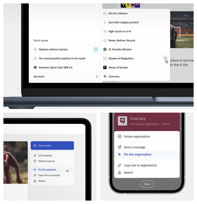
The top bar allows users to search and filter content, switch view modes for listing pages, and publish new content.
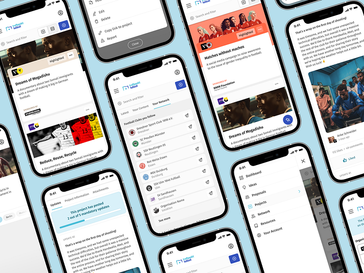
Mobile
We tried to follow the same approach for smaller screens, albeit with a more economical use of available space.
The main navigation sits behind a hamburger menu, while the top bar is displayed just below the header.
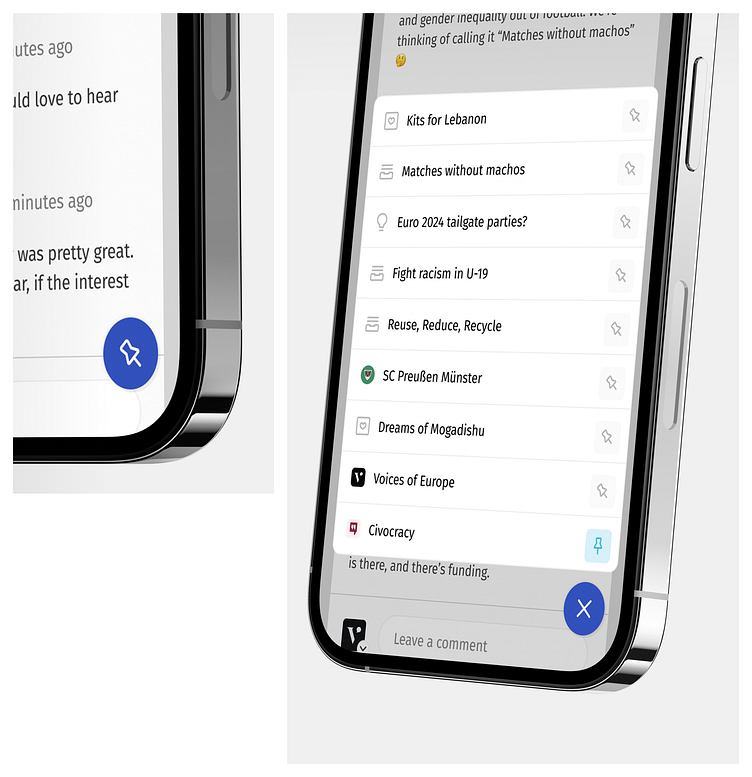
The quick-access widget button was placed near the bottom edge of the screen so that it’s always within reach of the user’s thumb.
In this mode, items are listed from the bottom up, with pinned and more recent items closer to the button (and, presumably, the user’s thumb).
Content Type Relationships
From the beginning, we knew promoting collaboration and resource-sharing across the platform was essential.
We considered this when designing every aspect of the workflow. For example, when an Idea turns into a Proposal, it’s not locked. Multiple Proposals can be created from the same Idea, by different users, and they are all linked back to the original.
If a user wants to test a slight variation of an idea, they can copy it and alter it as they see fit. The new Idea is then linked back to the original as well.We exposed these connections to the user as much as possible by displaying them on every Idea, Proposal, and Project pages.
The platform has been running in beta for the past six months. Registration is open to anyone, with the team closely monitoring usage to ensure any outstanding issues are addressed adequately and on time.
I continued to work with the team as an advisor and consultant for a brief period after leaving the project, but have recently handed over full responsibility for the maintenance of the product to their in-house team.
A comprehensive promotional campaign across major German media outlets is planned for late 2023, gradually ramping up over time as the tournament draws nearer.