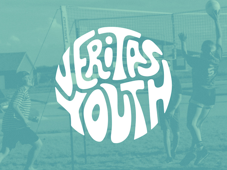
hand drawn circular logo 🔵
The Veritas Youth team was looking for a re-fresh on their ministry logo that felt more fun and inviting, and clearly spelled out "veritas youth" - other than that, the field was wide open! I've been really into curvy, chunky, retro type lately, so I seized my opportunity to play around with drawing the letterforms by hand [on my ipad with ProCreate, duh 😉].
I chose a moody teal and light sage-y mint color to tie-in with their parent organization, Veritas Church's dark green-grey colorway, but this combo is more... [you guessed it,] youthful and fun!
They also needed some new merch, so keep your eyes peeled - coming soon 👀
branding
christian
circle logo
colorful
design
fun
funky
hand drawn
lettering
logo
retro
simple
teal
View all tags
Posted on
Jun 30, 2023
More by Izzy Wootonn View profile
Like


