Frequenz Wandler©

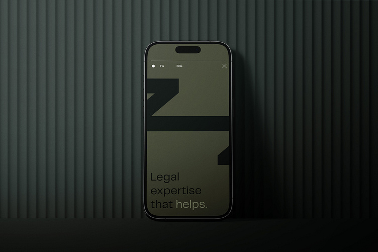
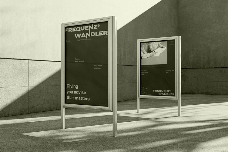
Colors play a significant role in shaping the emotional perception of a brand. For Frequenz Wandler, a sophisticated color palette featuring shades of dark and light green was chosen. Green represents growth, harmony, and balance, aligning perfectly with the firm's commitment to resolving disputes amicably. The combination of dark and light green adds depth and visual interest to the brand identity, while also conveying a sense of professionalism and stability.
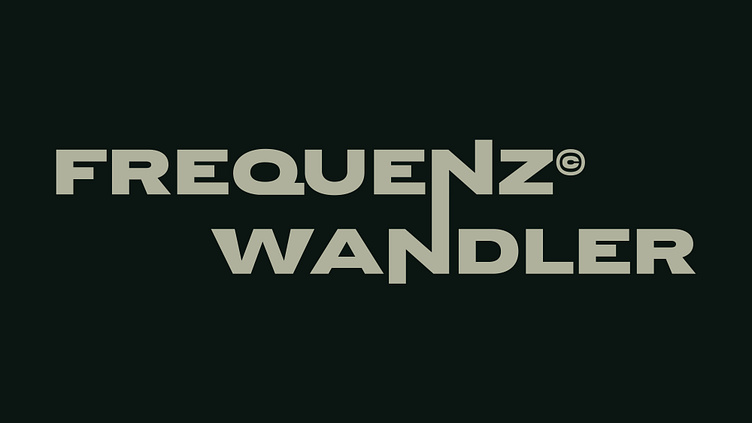
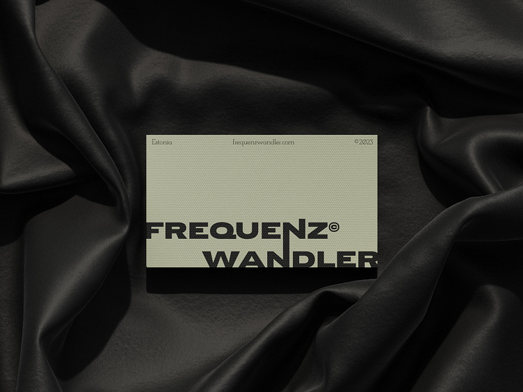
The creation of the Frequenz Wandler wordmark began with a comprehensive exploration of typography options. The primary goal was to find a font that would strike the right balance between professionalism and modernity. After rigorous experimentation, a custom typeface was developed, combining sleek, geometric forms with subtle, elegant curves. The resulting wordmark captures the essence of the firm's innovative approach while maintaining a timeless appeal.