owelti


Business Description:
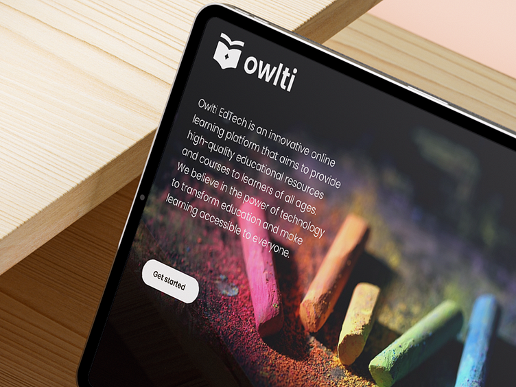
Owlti is an online education platform that offers interactive learning resources, courses, and tools for students of all ages. The platform focuses on providing engaging and personalized learning experiences to help students reach their full potential.
Design Elements:
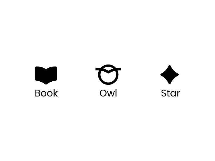
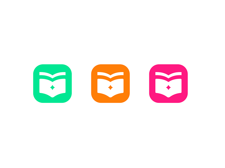
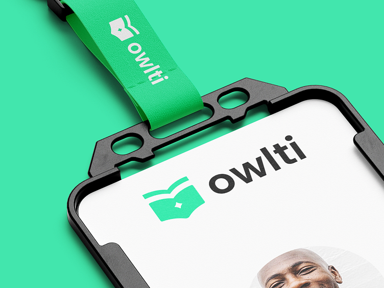
The logo features an owl head shaped like an open book, with a star in the middle representing the beak. This combination symbolizes the merging of wisdom, knowledge, and guidance that Owlti provides through its educational resources.
Owl Head: The owl head is stylized to resemble an open book, with curved edges and pages visible. It has a friendly and approachable expression, conveying the brand's welcoming atmosphere.
Star Beak: The star in the center of the owl's face represents the beak. It adds a touch of playfulness and adds visual interest to the logo. The star is solid in shape and has a subtle effect.
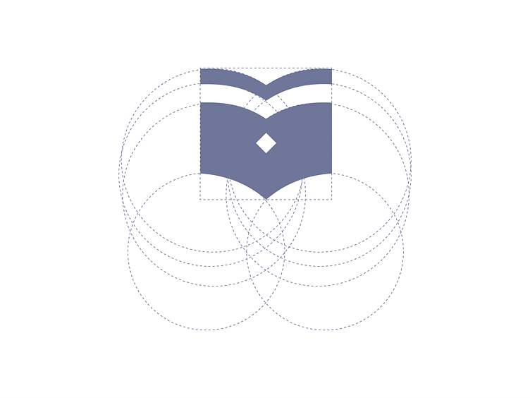
Simplicity and Versatility:
I tried to create a simple and versatile design that works well in different sizes and applications. The logo should be recognizable even when scaled down or used in monochrome formats.
Typography & colors:
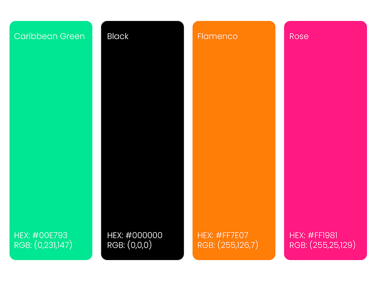
Color Palette: I consider using a combination of vibrant and friendly colors that appeal to learners of different age groups.
Using green for the icon and black for the font can create a strong and professional contrast. Green is often associated with growth, freshness, and harmony, which aligns well with the educational aspect of Owlti EdTech. Black, on the other hand, conveys sophistication, stability, and a sense of authority.
As for the additional colors I suggested:
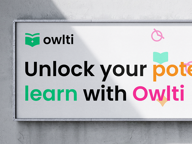
Pink and Yellow: This color combination can evoke a sense of playfulness, creativity, and energy. Pink represents enthusiasm, while yellow symbolizes positivity and happiness. It can appeal to a younger audience and convey a vibrant and cheerful learning environment.
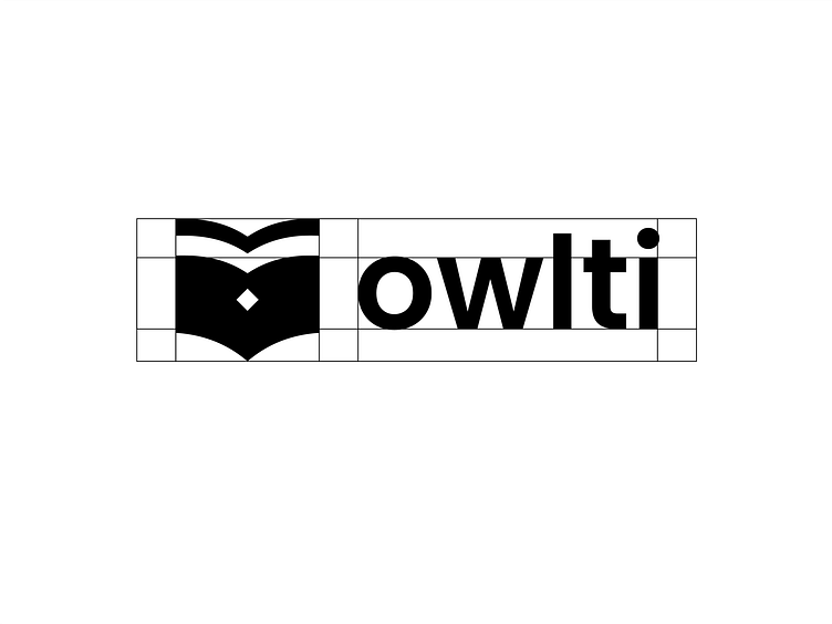
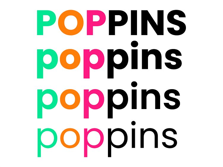
Typography:
Poppins is an excellent choice for the font in the Owlti EdTech logo. Poppins is a modern, clean, and versatile typeface that offers excellent legibility and readability across different mediums. It has a balanced letterform and a contemporary feel, making it suitable for digital platforms while still maintaining a professional appearance.
Logo applications:

as always your feedback are much appreciated!
Let's work together on your brand!
Feel free to reach out via DM or E-mail:


