


Flight ® World

Flight World's brand strategy centers around positioning the company as a leading innovator in the travel industry. The company aims to provide unique and thrilling travel experiences, making flights and vacations more exciting and efficient for travelers. The brand identity seeks to convey a sense of adventure, speed, and unparalleled enjoyment.
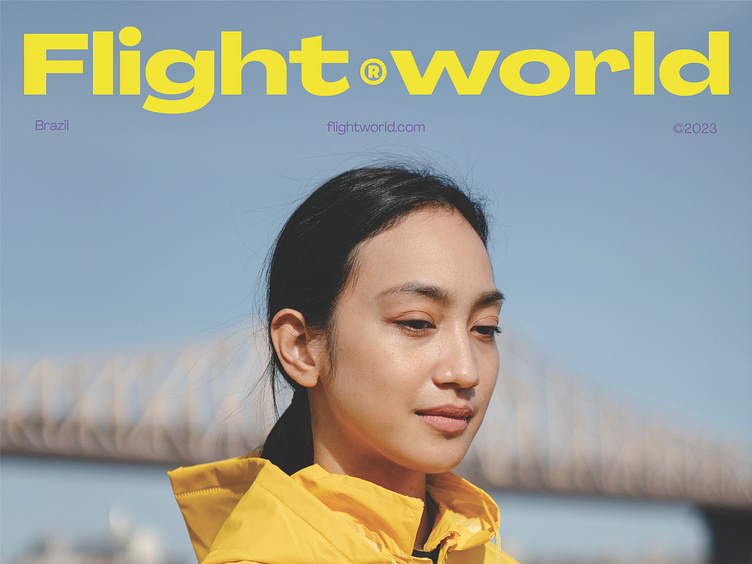
To establish a unique and captivating brand identity, Flight World has carefully crafted a visual language that embodies its mission and sets it apart from traditional travel companies. The brand's color palette plays a pivotal role in creating a bold and distinctive look. The chosen colors include vibrant yellow, energetic red, and refreshing blue, all complemented by a touch of deep blue to add depth and sophistication. This combination not only catches the eye but also evokes a sense of adventure, optimism, and thrill, setting Flight World apart from its competitors.
In designing the logo, Flight World sought to capture the essence of its services while providing a memorable symbol that resonates with customers. The logo incorporates an abstract mark that cleverly combines the letter 'F' and the iconic silhouette of a plane. This fusion represents Flight World's commitment to providing seamless and exciting travel experiences, where the company takes passengers on a thrilling journey to new heights. The abstract mark is simple yet visually striking, instantly recognizable, and embodies the brand's values of innovation, efficiency, and fun.
View complete project
—
We're available for new projects, send us a message:
or visit our portfolio


