NOT A DATING APP — Advertising

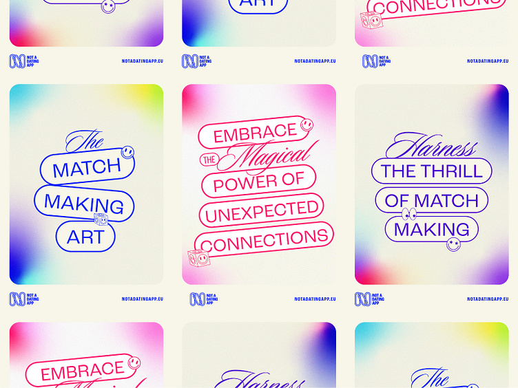
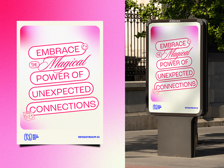
NOT A DATING APP presents itself with a palette of soft and harmonious colors that evoke a sense of serenity and openness. The selected graphics and typography accentuate elegance and clarity in communication, providing users with a visually pleasing experience.
In terms of communication, our copy reflects our philosophy of building authentic connections. We use a warm and friendly tone to invite users to explore new friendships, professional collaborations, and adventure companions. We prioritize transparency and honesty, fostering a safe and respectful environment for all our users.
Our work:
Website ➡ querubinstudio.com
Behance ➡ behance.net/querubinestudio
Instagram ➡ https://www.instagram.com/querubinstudio/