Pathway - Web application for Property Search

User journey starts from the website where search functionality is emphasised in the hero section. Animations are discreet so they don’t distract from the key messages and functionalities.
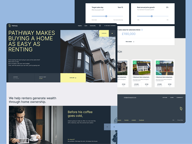
Main idea of the project “Show homes not loans” was a guiding star for decisions made in terms of the visuals and communication. Secondary colour is used to drive user’s the attention and emphasise key actions they can take. This was a way to guide the user through the concept, terminology and ideas that are new on the market and educate users along the way.

Since Pathway concept considers highly personalised offering, user journey was designed to inform them and encourage them to play around with numbers, sliders and the interactive map. Main challenge was to educate the user, explain what will be the result of their actions and how to analyse them. Another challenge was to provide enough information and yet not to overwhelm them when introducing new concepts that can’t be googled. Accordions were super useful here: key piece of the information is shown and rest of it is “hidden” at the first glance.

Professional and somewhat serious colour scheme with the modern secondary colour choices helped to leave a wanted first impression and reflects innovative idea that transform the market we know today. It’s about people, not properties. It’s about their experience, not an endless circle of debt. It’s about opening wealth opportunities to the segment which today can dream about one of the biggest investments in one’s life.


