Cybersecurity platform: The symbol design process


The Nexagon - a symbol that conveys the brand’s essence
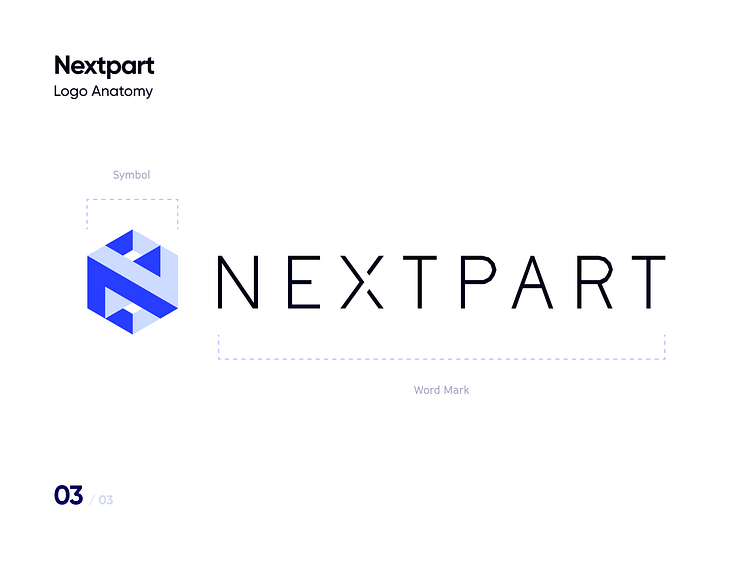
Brands have a number of key attributes that set them apart from the rest. Part of the design process is bringing about these traits into the brand’s visual identity. When crafting NEXPART’s logo, one of our goals was to embody these elements into it, and this was necessarily translated into the logo’s core visual unit: the symbol.
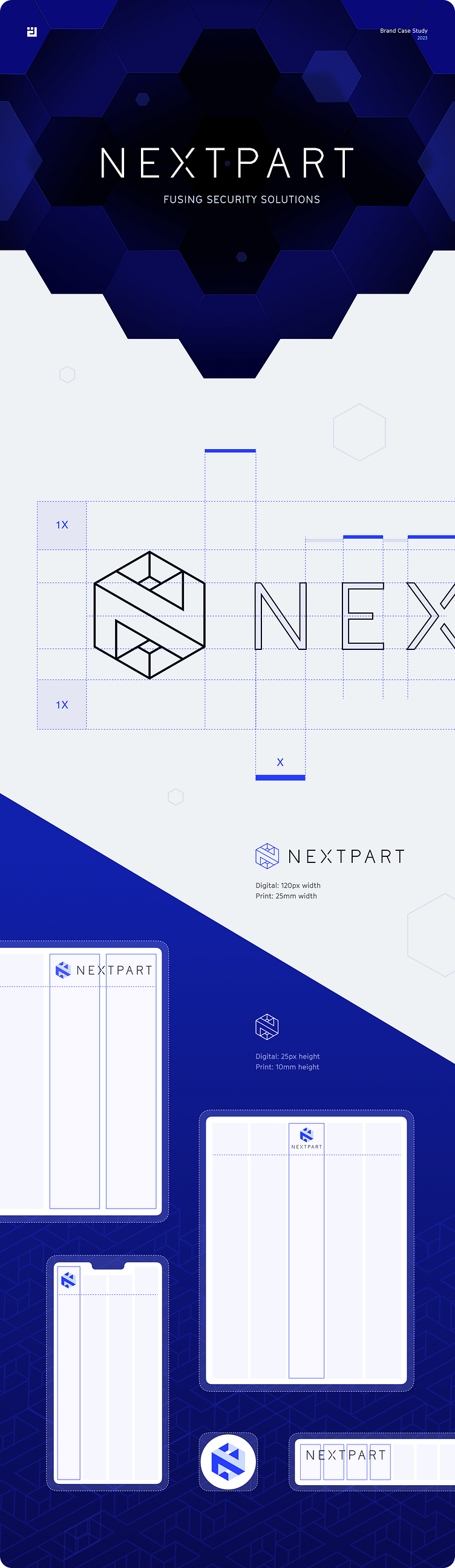
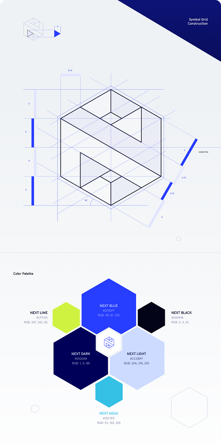
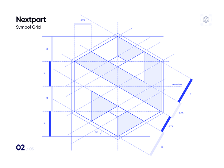
We designed the Nexagon as a reflection of Nextpart’s values: profound, harmonized, cutting-edge—literally—and synergetic, its whole structure being greater than the sum of its parts. Its graphic distinctiveness allows for it to be used independently from the word mark for maximal space optimization, and its hexagonal shape furthermore enables complementary patterns using the same shape. We completed its design with an array of formats, with different color and size variations, providing the symbol with all the necessary applications in digital and printed forms.
The Nexagon played a major role in NEXTPART’s current eye-catching logo, perfectly blending in with its personality, and reinforcing its brand presence anywhere it is displayed.