Cybersecurity platform: The wordmark design process


The wordmark puts a brand’s name on display for the world
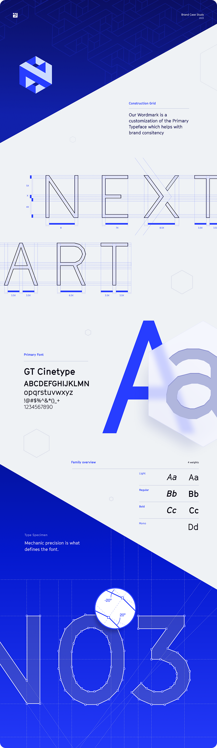
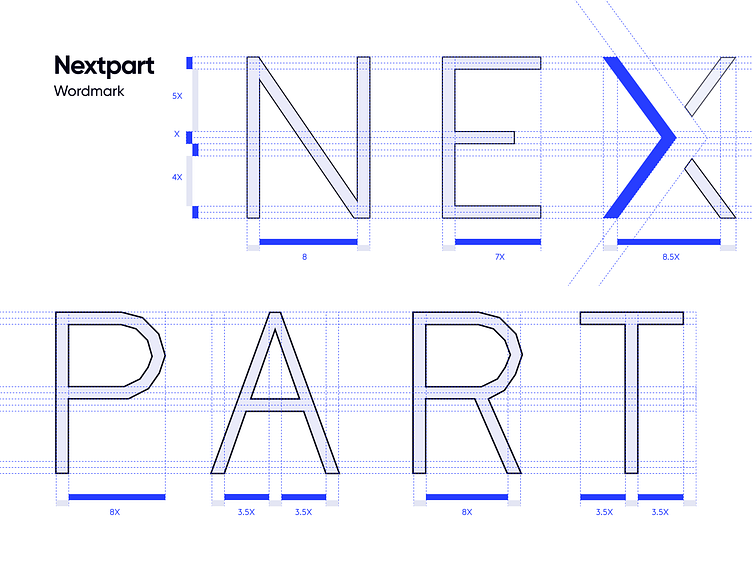
A logo's symbol evokes an immediate visual recognition of the brand, with an associated flood of emotions. It is however the wordmark that showcases the brand’s name, thereby working in tandem with the symbol to consolidate brand awareness.
For NEXTPART’s wordmark, we customized its Primary Typeface: GT Cinetype - a bold and modern typeface with clean lines that embodies strength, professionalism, and a forward-thinking approach. As an essential modification, we introduced a negative space in the letter X, which served a double purpose: it provided a distinctive element from the font, and represented a forward arrow pointing to the right, thereby symbolizing ‘next’ within ‘NEXTPART’.
With this approach, the wordmark not only exhibits the brand’s name, but also enhances visual recognition alongside the symbol, for an even greater brand personality.