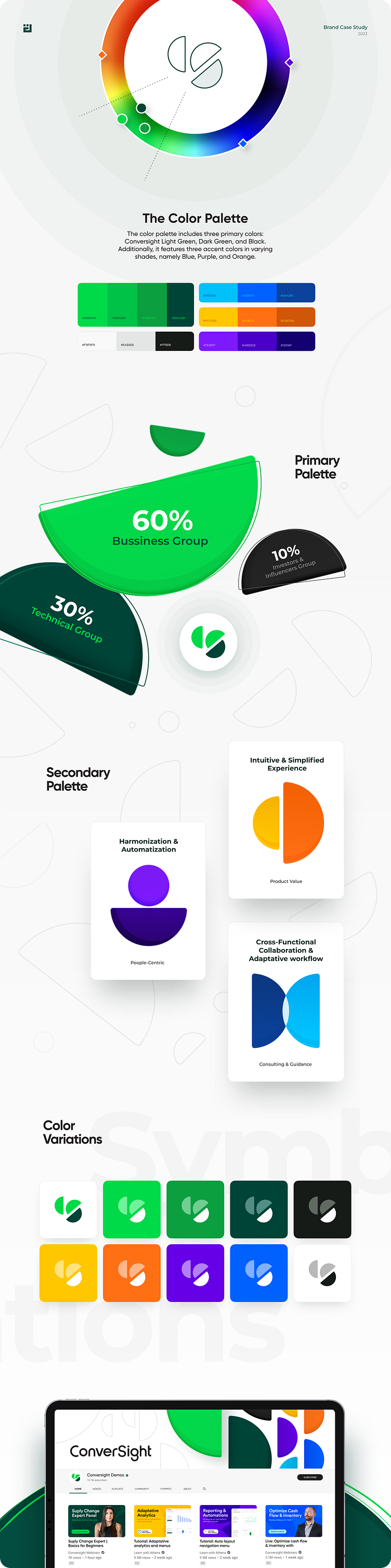
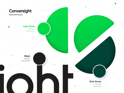
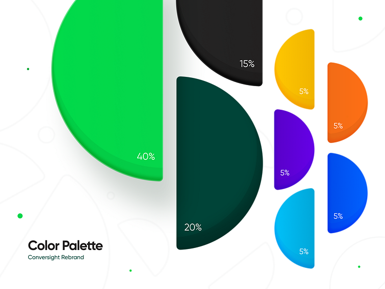
ConverSight’s rebrand: The color palette


A successful rebrand allows to stay ahead of the curve
Our Branding Team faced the exciting challenge of redefining ConverSight’s brand identity, and creating an attractive visual experience that reflected ConverSight’s technical industry and forward-thinking approach, while ensuring user-friendliness.
To amplify ConverSight's impact, we revamped their color palette, infusing it with a sense of energy and differentiation. We identified green tonalities as the most prominent amongst competitors and went forward with them as the primary palette.
As in any rebrand, the color palettes played a fundamental role in establishing the branding guidelines, and providing with multiple variations for logo and other design assets.