Case study: Shuddle Design System for Scaling Design Systems

The challenge
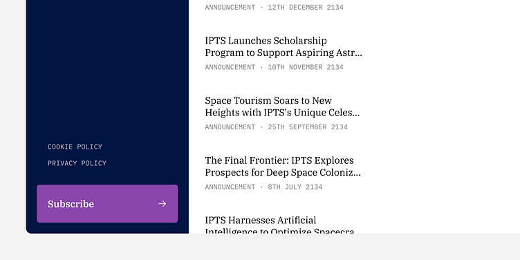
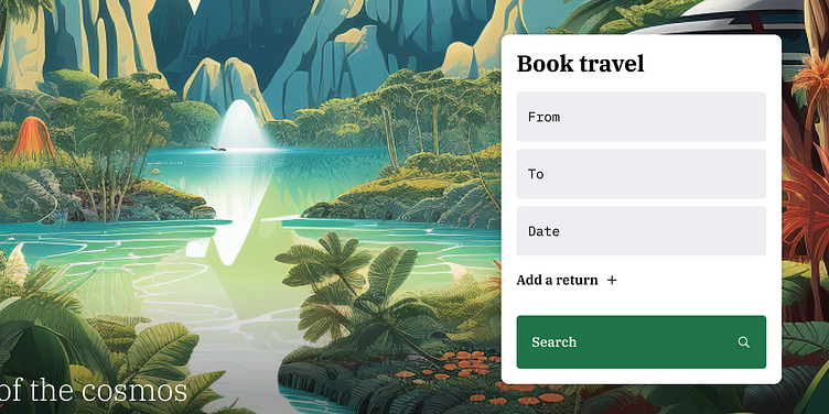
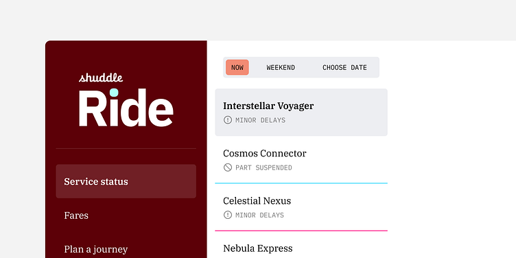
As part of Dan Mall’s Scaling Design Systems course, we were set the task of designing three websites for the fictitious company IPTS – the Interplanetary Travel Syndicate.
Given the focus of the course, the real challenge was in creating a design system to support these sites. This included not just a component library but also documentation to chronicle our design decisions.
Getting started
Rather than beginning with the system, I started by designing out the sites themselves, meaning I could constrain the scope of the design system to include only what I actually needed.
This was a great learning from the course – in the past I’ve absolutely been guilty of designing out ‘foundational’ components before we had a real need for them. For a design system to be successfully adopted it needs to meet the needs of the products it supports.
Scoping out the sites
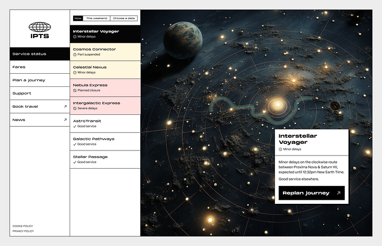
We were given a loose description of what each of the three sites would do, so step one was to narrow down the scope of these sites. The content itself wasn’t the focus of the course, so I just did some quick desk research looking at similar sites to give a little inspiration.

Rough designs
With a scope in mind, I jumped into some low fidelity designs.
My focus here was mainly to nail down the basic layouts of the sites, but also to start to highlight where there may be a need for reusable components. You can already see from these sketches that there would likely be a consistent navigation bar, some buttons, and input fields.
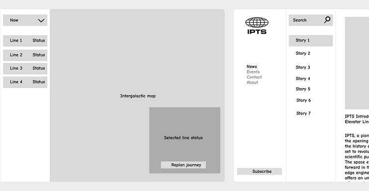
I progressed these designs until I’d landed on some high fidelity layouts. I intentionally kept things a little loose here – my goal was to quickly get to a point where I could be confident of the needs of each product.
Auditing
Since I’d been freestyling things up until now, I’d avoided creating any colour tokens, text styles, and I’d only created a small number of local components to help put each page together.
But now I’d fleshed things out it was time to audit.
I looked at three categories here: text, colours, and components.
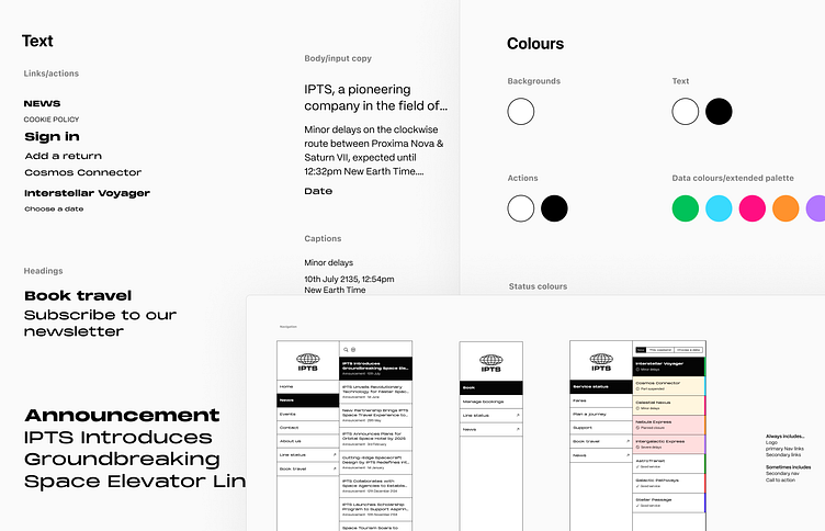
Within each of those categories I took a copy of every unique instance across the three pages I’d designed out and organised them semantically.
Although I expected the components to be the messiest part, the text styles were the most complex to untangle. Look how many different styles I’d used for links & actions over just three basic pages!
Tokens & components
My goal here was to get down to a list of text styles, colours, and components to add to my design library.
For text and colour styles, this was a case of understanding the number of ways I needed them to function (a text style for a headline, for body copy, for an emphasised link…) and then consolidating the styles I’d used down into this system.

However, for components, I needed to work out which would have enough reuse-potential to justify being centralised in the library. The rest would be kept as local components.
This was simple enough though – as I had three pages, if a component cropped up in each of those pages, I took that to mean it should be part of the library.
The output of this step was a list of the tokens and components I intended to create, and some ideas as to what functionality would be needed in those components.
Integrating the system
With my library created, I just had to hook it up to my original design file and drop in those components and styles.
Here's one example of how that changed things.
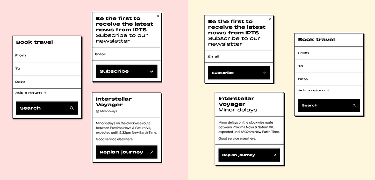
See if you can spot the differences. They’re subtle, but overall there’s more consistency in the details – particularly when compared across the three variations.
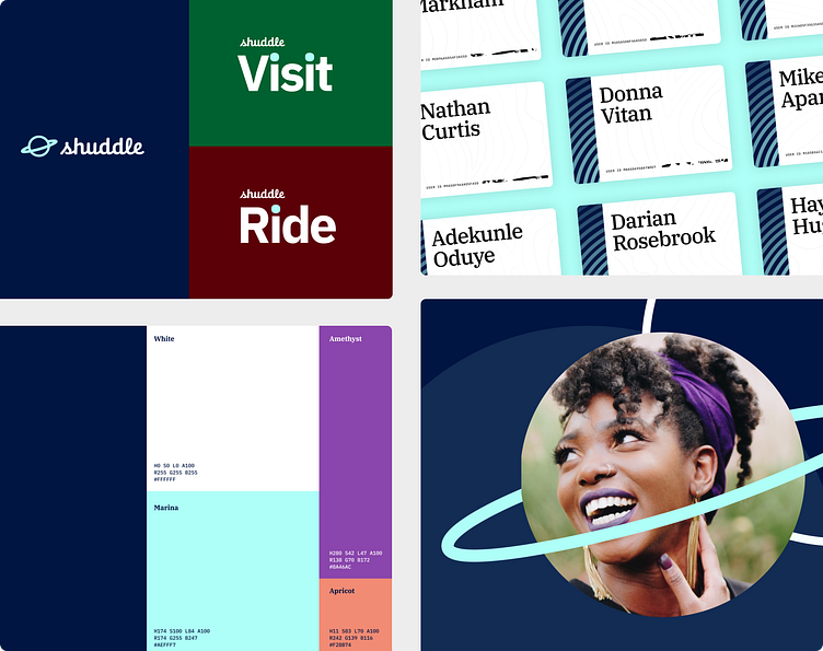
The inevitable rebrand
At this point I was in a pretty good place. I just needed to document the system and I was done.
But then there was a spanner in the works… We were told mid-project that IPTS would be rebranded to Shuddle. Whilst the original brief had been left open, this time we were given a variety of brand assets that we would have to work into our system.
My process was much the same as before:
Explore the new visual styles in a loose way to nail down how I wanted to apply them
Audit my three pages and gathering together all the tokens I’d used
Map those against my existing tokens to work out where I could update my token model, and where I needed to expand it
Update the tokens and components in my design library
Apply these to my existing page designs
I won’t go into all the details as this was mostly a repeat of earlier, except for…
Theming
One of the added complexities was that the three sites now needed a colour theme of its own. I’d set up my original IPTS system to work only with a single theme.
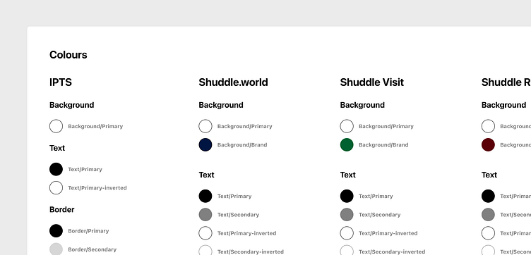
The colour tokens of the new sites were almost aligned, other than a difference in their primary brand colour, but since my IPTS theme was so monochromatic I had to add a few new tokens for new uses like secondary text.
This was a great chance for me to explore Figma’s recently released Variables feature, and I took the opportunity to set up each theme as a different mode, meaning I could swap a single page to any theme with only a few clicks.
An alternate approach to documentation
Rather than take the traditional, more technical, way of documenting my system, I went for a slightly different approach. One of my takeaways from the Scaling Design Systems course was that design systems should be chronicled, not documented.
In practice this means guiding readers through practical use cases rather than meticulously documenting each technical capability.
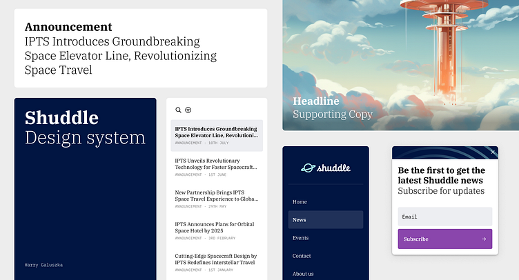
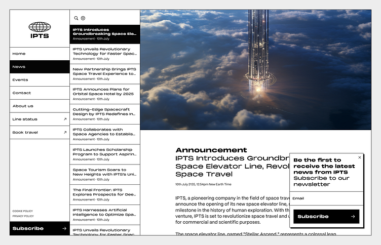
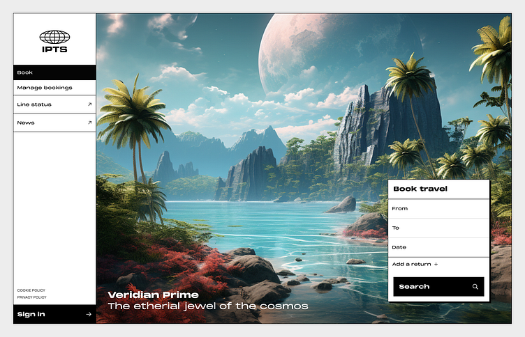
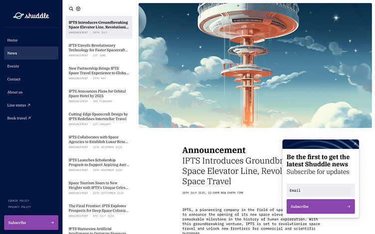
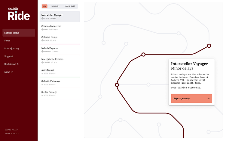
The final outcome
After going back over my designs and adding in the newly tweaked components and tokens, these are the final Shuddle pages:

Closing thoughts
This project was a great way to round off the Scaling Design Systems course. I learnt a tonne of small things along the way that made a real step change to my overall approach to design systems, and this final project allowed me to put them into practice.
With many of the complexities of real-world work out of the way, some of the biggest challenges were in the more technical side of the system – namely how to handle multiple themes. This ended up being the kick I needed to have a good dig into Figma’s Variables.
But ultimately the biggest learning I got from this was actually how non-technical a design system can be. It taught me how not to over-engineer things, and not to overthink the needs of a component, or making sure we have a colour token for every possible eventuality.
It felt like so much more of my time could be spent designing rather than managing the system. And that’s the biggest thing I’m looking forward to incorporating into my future work.


