Redesigning the Lorry Interface in Vahak App: A UI/UX Case Study

1. Introduction
The Vahak app is a popular platform that connects truck drivers and lorry owners with potential customers for goods transportation.
In this case study, I had focus on redesigning the user interface (UI) and user experience (UX) of the lorry-related features within the Vahak app. The goal was to enhance usability, improve efficiency, and provide a seamless experience for lorry owners and drivers.
2. Understanding the Problem
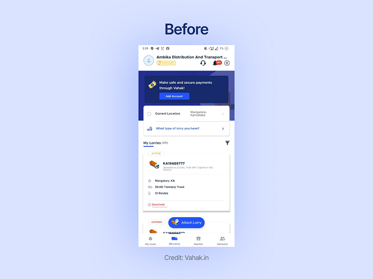
The current UI design of the lorry section in Vahak app lacks clarity and intuitive navigation, leading to frustration and reduced productivity for users. Key challenges identified are:
Complex Navigation:
Users struggle to find essential functions related to managing their lorries, such as updating availability, viewing bookings, or editing vehicle details.
Limited Insights:
Lorry owners lack visibility into historical data, performance metrics, and customer reviews, making it difficult to make informed decisions regarding pricing, service quality, or identifying areas for improvement.
Outdated Visuals:
The existing UI appears outdated, lacking modern aesthetic elements, and fails to provide an engaging user experience.
3. Research and User Analysis
To gain insights and understand user pain points, I conducted interviews and surveys with lorry owners and drivers using the Vahak app. Valuable user feedback and observations were gathered, including their expectations, frustrations, and aspirations when using the app's lorry-related features.
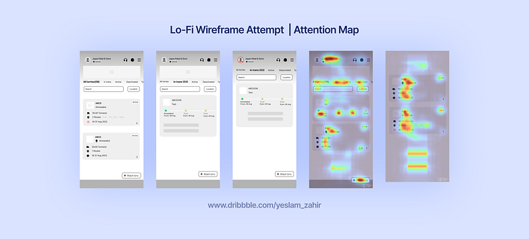
Based on Research and User Analysis I have designed couple versions of wirefame and checked attention map as below.
Final Design Recommendations
Based on the research findings, I proposed the following design recommendations to improve the UI/UX of the lorry interface in the Vahak app:
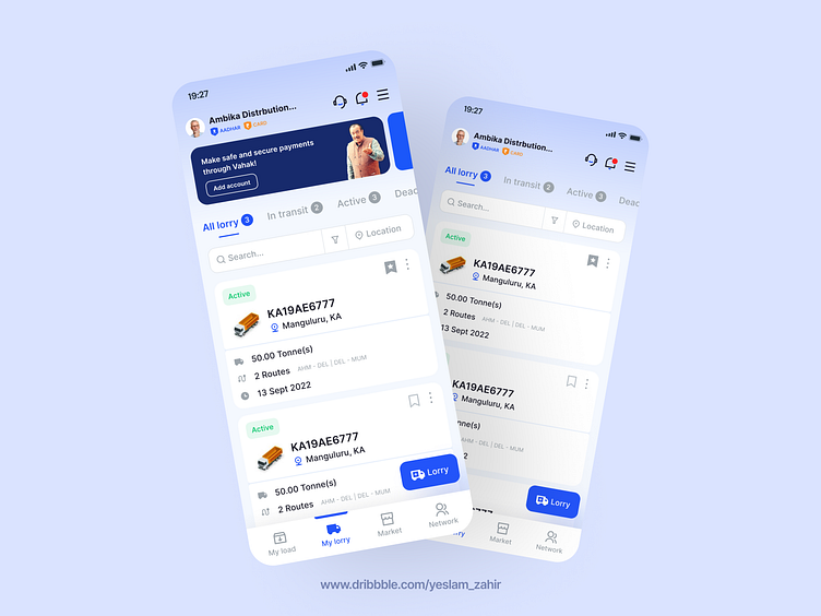
A. Streamlined Navigation:
Simplify the app's navigation by reorganizing the lorry-related functions into logical categories. Implement a bottom navigation bar with clear labels for easy access to essential features.
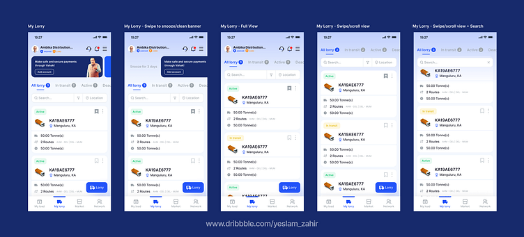
B. My lorry Overview:
Created a visually appealing dashboard that provides lorry owners with an overview of their vehicle's live details, current bookings, lorry list with filters. Include present historical data and current data of lorry.
C. Visual Design Overhaul: Revamp the visual design of the UI with a modern and clean aesthetic. Use a consistent color palette, legible typography, and intuitive iconography to enhance usability and create a visually pleasing experience.
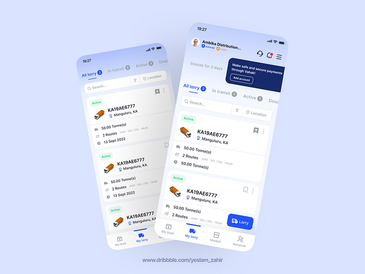
Here are other list of improvement that I'd designed,
Badges: It would be beneficial to introduce badges that indicate the user's achievements or verified information, such as Aadhar verification and payment verification. These badges can enhance trust and credibility within the platform.
Notifications: Implementing notifications for load/lorry status updates, payments, and other important events would greatly improve user engagement. For instance, users could receive notifications when their load is posted, when there are idle periods without posting, or when there are new advertisements available.
Hamburger Icon and Tertiary Content: Consider incorporating a hamburger icon, typically represented by three horizontal lines, where tertiary content is hidden. This icon can reveal additional options like settings, language change, app sharing, and logout. By organizing these options under a hidden menu, you can declutter the main interface and prioritize core functionality.
Banner for Conversion and Profile Completion: Use banners strategically to encourage users to take specific actions, such as completing their profiles or engaging with educational materials. These banners can provide incentives or rewards to motivate users to improve their profiles or explore relevant educational resources.
Lorry Filter and Status Filter: Introduce filters that allow users to search for lorries based on specific criteria, such as availability, capacity, vehicle type, or location. Additionally, implementing status filters, including options like Active, In-progress, In-Transit, and Completed, would enable users to track the progress of their loads or find suitable lorry options efficiently.
Lorry Card Redesign and Improved Card Experience: Enhance the design and user experience of the lorry cards displayed in the app. Ensure that the essential information is easily visible, such as vehicle details, contact information, pricing, and any additional relevant data. A visually appealing and intuitive card layout will help users make more informed decisions.
Lorry Placement Improvement: Explore ways to improve the lorry placement process. This could involve optimizing the matching algorithm, providing suggestions based on user preferences or historical data, or offering additional assistance during the placement process.
Conclusion:
By redesigning the lorry interface in the Vahak app, we aim to provide lorry owners and drivers with a more intuitive, efficient, and visually appealing experience. Through user-centered design principles and iterative testing, we strive to enhance the usability and overall satisfaction of Vahak app users, ultimately driving increased usage and improved business outcomes.
---
Hit "L" If you like it ❤️
Please check and download my recent freebie at https://gumroad.com/thezpdesign
Follow for more freebies and design update
Feel free to connect at www.linkedin.com/in/zahirabbasbadi


