Samsung Notes App - Redesign Concept


Hi Dribbblers! 👋
Today, I want to show you my version of the Samsung Notes app.
I believe it's much more intuitive, utilizes available space better, and aesthetically looks much improved.
Let me know how you like it.

My point of view on current app
In the current version of the app, I feel like it was made in just 16 minutes. It seem that app only exists so they can say they "have it".
Users prefer to download other apps to manage their notes rather than using the original app.
So, I decided to add some features and remove unnecessary ones, all based on the research I conducted and user feedback from portals, Google reviews, and Trg play app itselft.
Goal
The goal was to simplify the process of adding, searching, sorting, and viewing notes to the maximum extent. Here's how I achieved it:

Layout
Inspired by the Bento app's elegant layout, I applied a similar design concept to the notes, resulting in a visually appealing and cohesive interface.
The new layout guides users through the app, making it easier to navigate and interact with their notes.

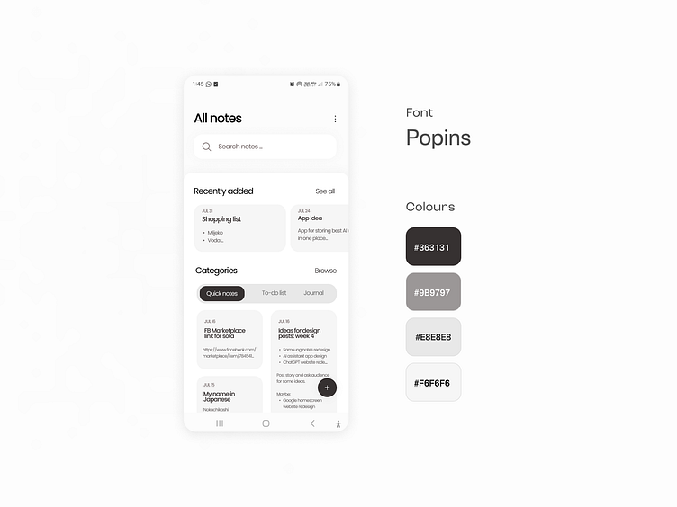
Typography
In pursuit of clarity and legibility, I replaced the font with Poppins, ensuring a smooth reading experience for users of all ages. ć
Clear typography plays a vital role in ensuring users can effortlessly consume and interact with their notes.
With all the shortcomings in mind, I've created a much more intuitive app that I'm confident Samsung users would not have complaints about, unlike the current version.
The absolute focus was on addressing the issues that users regularly highlight, combined with a touch of modern design, resulting in this version.
Let me know how you like it.
------------------------
If you have any projects in mind, contact me at email: itspetar.ui@gmail.com


