UI Component - Radio Button | Uzence

🔘 Radio Buttons: Tune into Seamless Choices! 🔘
Explore the harmonious world of radio buttons, where user choices take center stage! 🚀 Here's a glimpse into their enchanting universe:
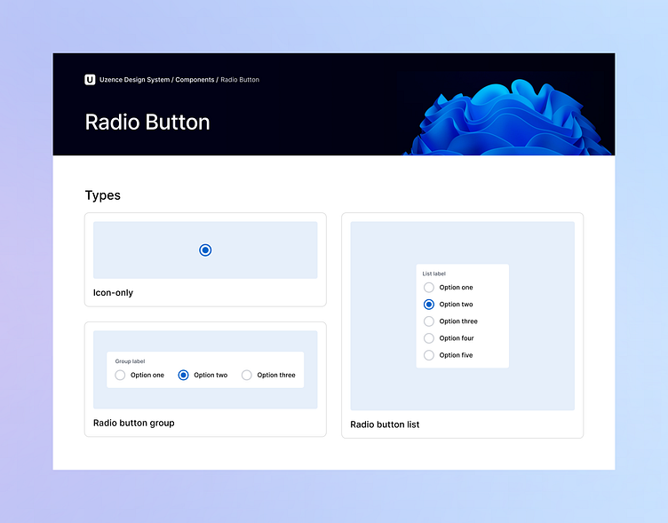
🔤 Types: Diverse melodies! From icon-only radio buttons that speak through symbols, to radio button groups and lists that orchestrate user preferences.
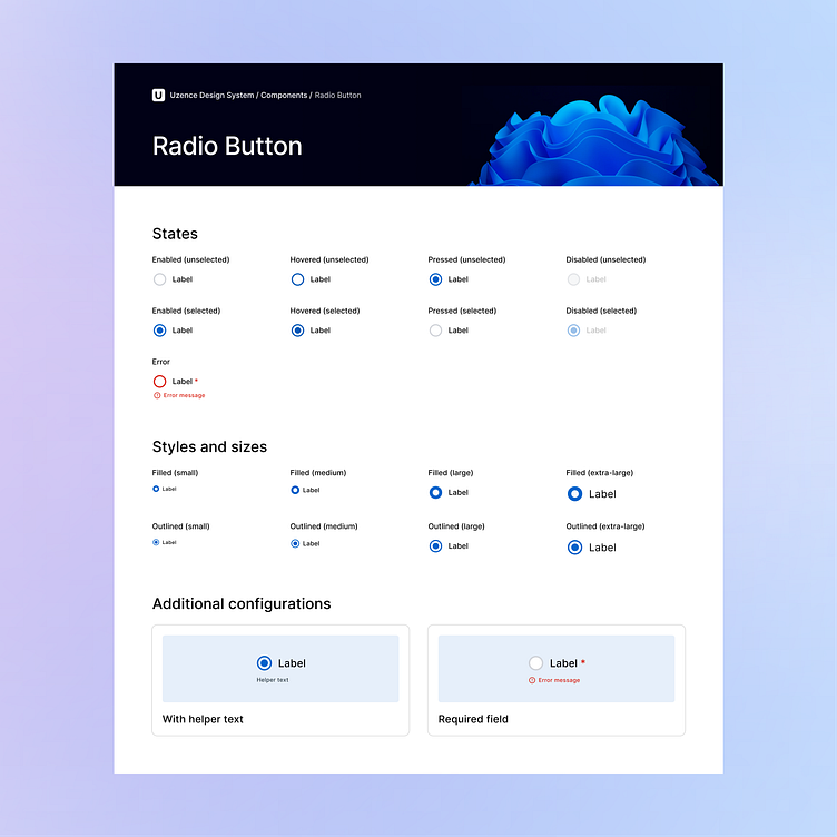
✨ States: Dance of interaction! From unselected to selected, and even hover, focus, and error states, each portrays the journey of user engagement.
🎨 Styles & Sizes: Palette of preferences! Choose from filled or outlined styles, accompanied by small, medium, or large sizes, resonating perfectly with your design chorus.
⚙️ Additional Configurations: Crafted to perfection! Adorn radio buttons with or without helper text, and mark them as required for a seamless, tailored experience.
Let's harmonize user choices with design elegance! Stay tuned as we explore more UI components of the Design System. 🎵✨
💖 If you're loving this exploration, hit that 'Like' button and share your thoughts. Happy designing! 🎨✍️
Got a project? Let's talk.
Ready to create unforgettable experiences together? Schedule a call with us for exciting projects and collaborations! Let's shape the future of design, one masterpiece at a time. 🎨🌟
To learn more about us, visit our website at uzence.com
Don't miss out on the creative inspiration and updates! Follow us on LinkedIn Instagram and Facebook 🌈🌌


