Les Pétroliers De Laval – (1 of 2)

Les Pétroliers de Laval is a franchise of the LNAH, a professional Canadian ice hockey league.
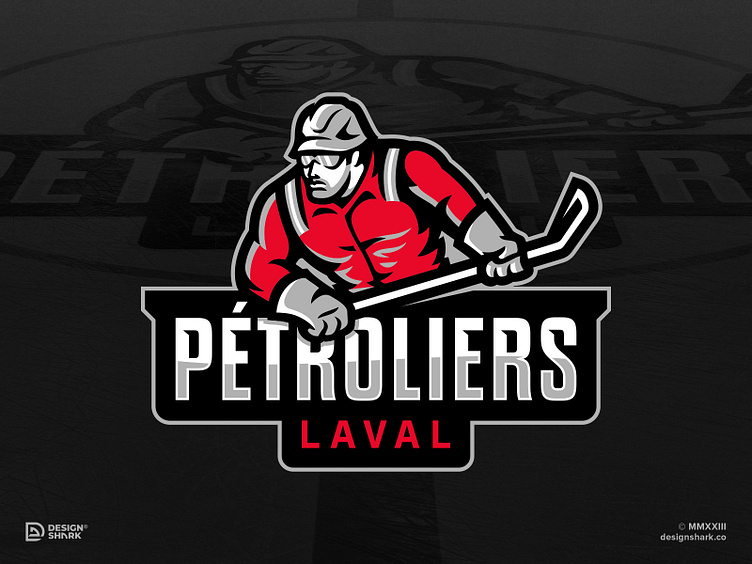
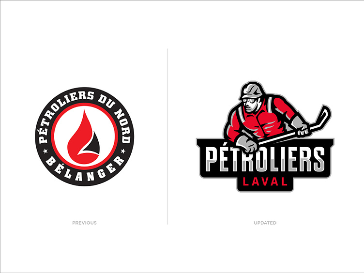
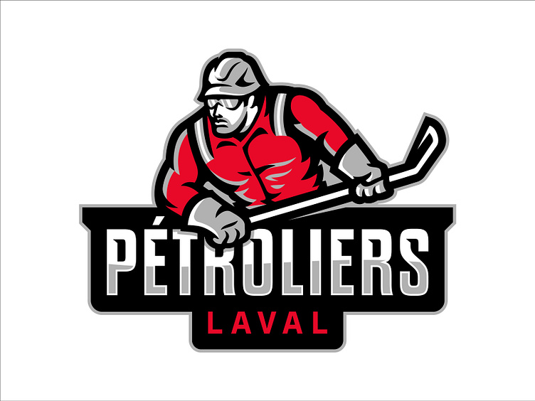
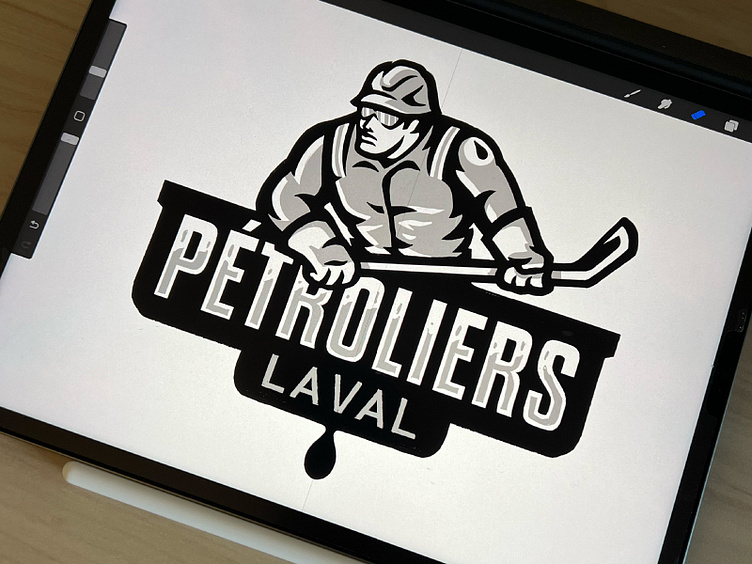
The primary objective was to create a logo that was more visually representative of their hockey team as currently the team uses the corporate logo of the former owner’s oil business.During the discovery phase, we discussed ideas of a mascot for the team and we brainstormed oil tanker ship and truck but settled on a fit oil rig worker as it was important to show toughness and strength.
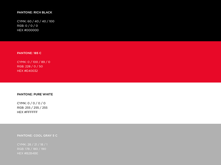
The team’s color palette carried over from the previous ownership but we solidified consistency by establishing color values for the red while introducing a grey Pantone to the color system.

Ready to give your brand the look and feel of a big time sports organization, league or team? Kickoff Your Project


