restyling of the «Optima» logo

Restyling
This is a change in the logo and corporate identity of the company, taking into account the existing identity. During restyling, the concept and meanings of the brand remain unchanged: the logo, corporate colors and fonts change, new corporate identity elements can be added.
Many restylings remain underestimated precisely because their essence is not explained to the audience. When you read news about an identity change, you expect a description of the new positioning there, but it is not there, because restyling does not imply a change in the semantic content of the brand.
In the case of Optima, it is necessary to work with an already existing identity, with reality, with what is already there: change the logo and corporate identity, but maintain continuity. You need something simple and familiar that will be familiar to regular customers and pleasant to attract new ones. It is also important that the new design is functional.
Рестайлинг
Это изменение логотипа и фирменного стиля компании с учётом уже существующей айдентики. При рестайлинге концепция и смыслы бренда остаются без изменений: меняются логотип, фирменные цвета и шрифты, могут добавиться новые элементы фирменного стиля.
Многие рестайлинги остаются недооценёнными именно из-за того, что аудитории не объясняется их суть. Когда вы читаете новость об изменении айдентики, то ждёте там описание нового позиционирования, а там его нет, потому что рестайлинг не предполагает смену смыслового наполнения бренда.
В случае с «Оптимой» необходимо работать уже существующей айдентика, с реальностью, с тем, что уже есть: изменить логотип и фирменный стиль, но сохранить преемственность. Нужно что-то простое и привычное, что будет знакомо постоянным клиентам и приятно для привлечения новых. Также важно, чтобы новый дизайн был функциональным.

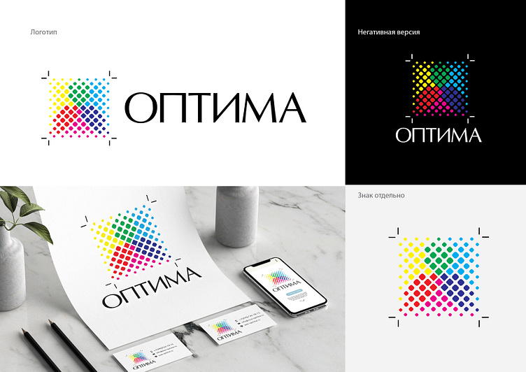
FEATURES OF THE NEW LOGO
When updating the logo, it was extremely important to preserve all the meanings and recognizability inherent in it, making it light and reflecting all modern trends.
The main version of the logo has become clearer with simplified shapes. The main graphic element used in the mark is CMYK print calibration elements with offset marks.
A whole new image of technology, they add purposefulness, reactivity and progressiveness. The sign has become more open” due to scattered dots, which indicates the openness of the Optima company and interaction with customers, as well as readiness for change.
The typeface used is display antiqua used for headings or short texts. The nature of such a font is more pronounced, which is manifested in more visible graphic elements.
The semantics of the logo refers directly to the practical activities of the Optima company.
ОСОБЕННОСТИ НОВОГО ЛОГОТИПА
При обновлении логотипа было крайне важным сохранить все заложенные в него смыслы и узнаваемость, сделав его легким и отражающим все современные тренды.
Основная версия логотипа стала более ясной с упрощёнными формами. Основным графическим элементом, использованным в знаке, элементы калибровки печати CMYK с офсетными метками.
Весь новый образ лога, добавляют целеустремлённости, реактивности и прогрессивности. Знак стал более открытым” за счет рассеяных точек, что говорит об открытости компании «Оптима» и взаимодействии с клиентами, а также о готовности к переменам.
Используемая шрифтовая гарнитура дисплейная антиква используются для заголовков или для оформления коротких текстов. Характер такого шрифта выражен ярче, что проявляется в более заметных графических элементах.
Семантика логотипа адресует непосредственно к практической деятельности компании «Оптима».
#logo #brand #brand #design #trends2023 #logoinspiration #logodesign #graphicdesign #branding #logodesigner #logomaker #restyling #logocreation
If you want to see more of my designs, please visit my Behance
I accept orders for various works! For cooperation, write HERE
Instagram: @samson_fm
Telegram: @SamsonFM


