Case Study: NFT Marketplace App

TL;DR
I recently completed Dribbble’s UI Design 101 course. In just 5 short weeks, I dramatically improved my skills in visual design, became an autolayout junkie, created a working component library, designed 5 screens with a unique visual language, and prototyped my first flow. It was both exhausting and thrilling.
The brief
The assignment was to create an NFT marketplace app for a fictional company called Planet at a brisk 5 week pace. Here’s a rough outline of the project timeline:
Week 1: Onboard, review course content and initial lectures on visual design fundamentals
Week 2: Research existing competitors in the NFT space, create two moodboards encapsulating contrasting visual aesthetics, begin initial visual explorations
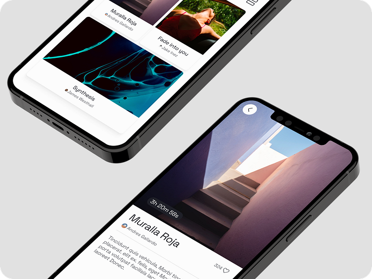
Week 3: Select a visual direction and scale it to across 5 different screens
Week 4: Refine designs, develop components and variants in a UI library, and start a working prototype
Week 5: Finalize designs, polish prototype, and create this case study!
Research
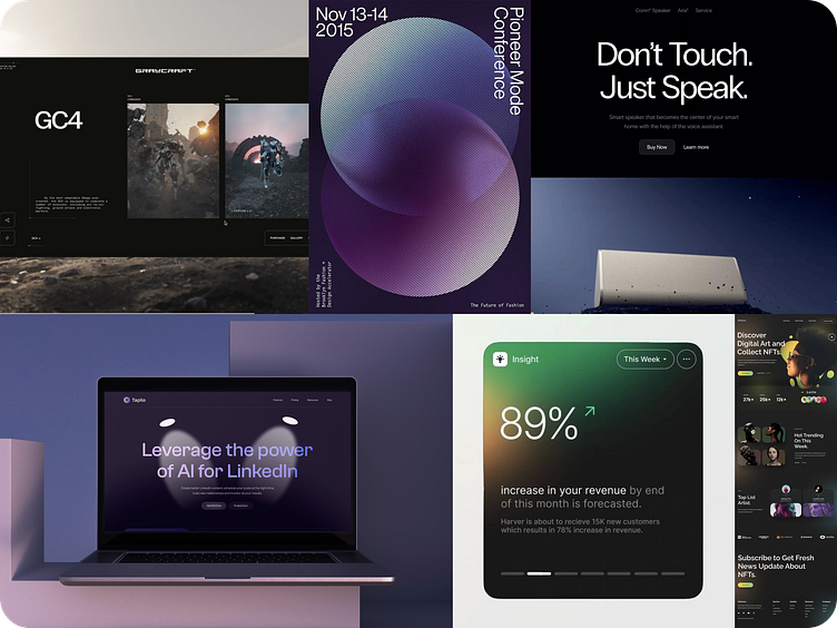
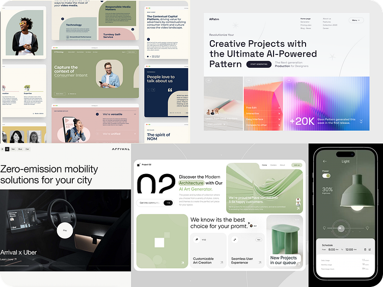
When I researched competitors in the NFT space—and work outside of NFTs—I found two distinct visual themes.
Dark theme moodboard
This theme was by far the most common. Most NFT-related services used a dark theme with gradients and glassy background blur buttons and modules. I was really inspired by large, thin typefaces that conveyed a sense of authority and confidence.
Light theme moodboard
Once I saw how common the darker aesthetic was, I sought out examples that were lighter and more airy. I added a few examples that conveyed a sense of confidence and minimalism. The Polestar website really nailed this.
Exploration
Next, I came up with two different visual directions inspired by these moodboards. Looking back on these now, it’s hard to describe just how embarrassing I find them. I suppose that’s the mark of progress? Hopefully?
Dark theme
My first idea was to create a version that encapsulated the gradients, dark backgrounds, and thin typography that I’d seen in my research.

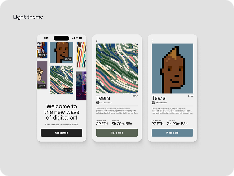
Light theme
My second idea was to go against the grain and make something with a subtle background color and some bright and colorful buttons. Later I found that pulling back on the color dramatically improved the design.
Refining
After exploring, I was unsatisfied, but I felt there were a few small things that were coming together. I liked the thin-ish typography and the off-white background color. I realized that I needed my design to not distract from the artwork itself. I went back to basics and designed a few cards. Things started to click.
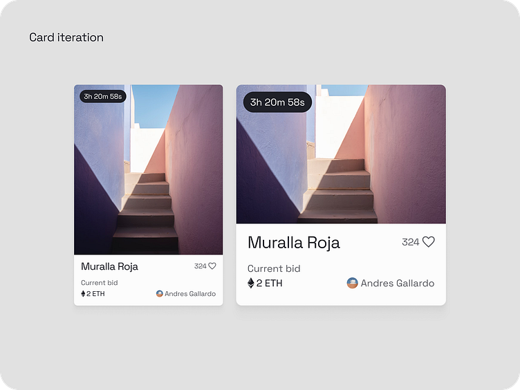
By exploring this practical application, I was able to zoom out and simplify the colors, artwork, and typography for the entire system.
UI library and prototyping
Once I figured out the card above, the system started to come together. I scaled it across the 5 screens I was assigned to design.

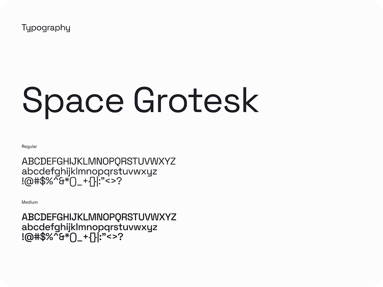
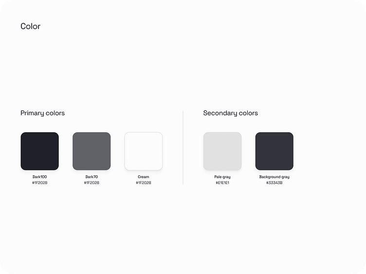
While I did this, I continuously tweaked my work-in-progress components and styles. One huge tip here was to review the designs on my phone with Figma’s mirror feature to see how well they held up on smaller screens. I used this to finalize my type, color, and UI styles.


Final prototype
For the final step I had to give myself a crash course in prototyping. There’s so much more I could do here that it was hard to stop! I’ll definitely continue to dig into prototyping, especially with variables.
~Fin~
Thanks for reading. And special thanks to Balazs, Ravi, Christin, Rachel, Brian, Bruce, Eric, Jacob, Matt, Evie, and everyone else who helped me along the way!
***All NFT art is credited with their actual artist name and handle from foundation.app****


