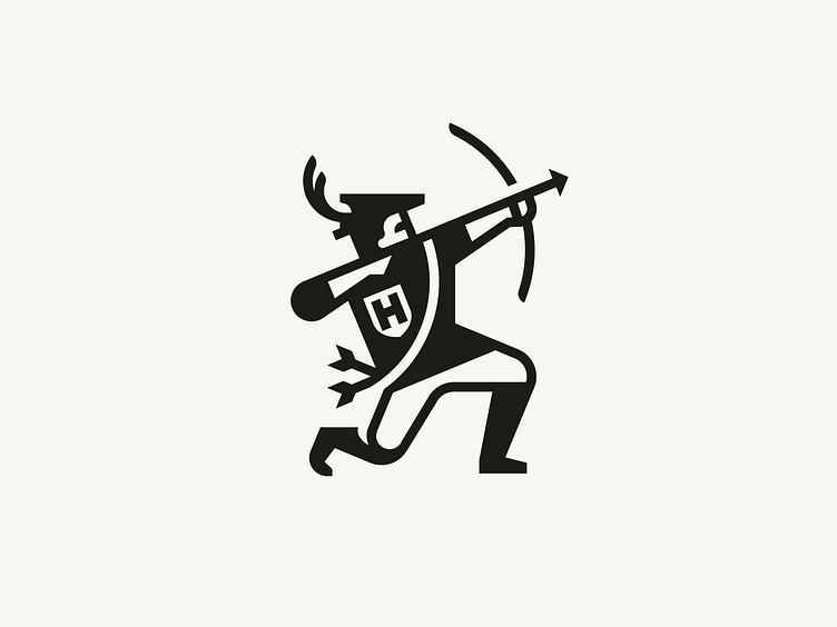
Archer

Posting some older stuff found in the depths of my hard drive.
This archer was made for a brewery.
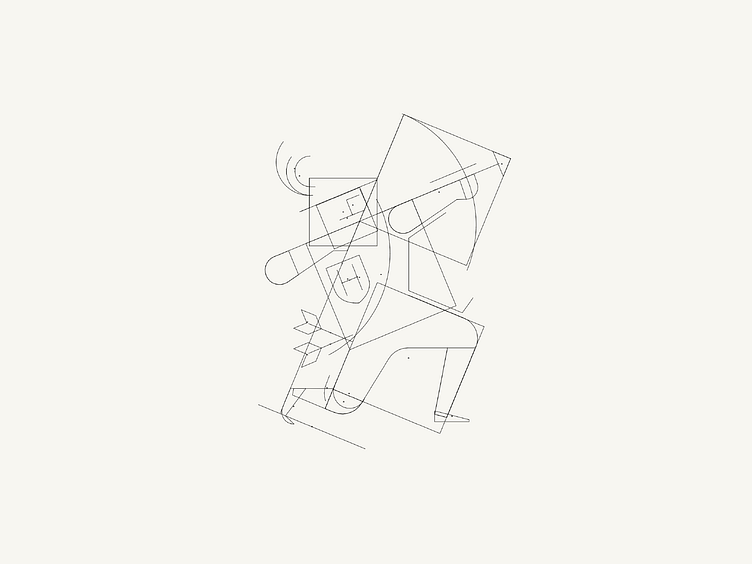
I found the challenge with this one was getting the figure to look visually harmonious as a logo. I ended up using a lot of repeated shapes. Eg. the stacked squares that make up the legs, torso, and bow arm; the bow is repeated in the quiver strap; the "H" emblem is repeated in the face.
The repetition is maybe not so obvious in the final logo, but I think it helps in giving structure to the overall shape of the archer and make this graphic more logo than illustration.


