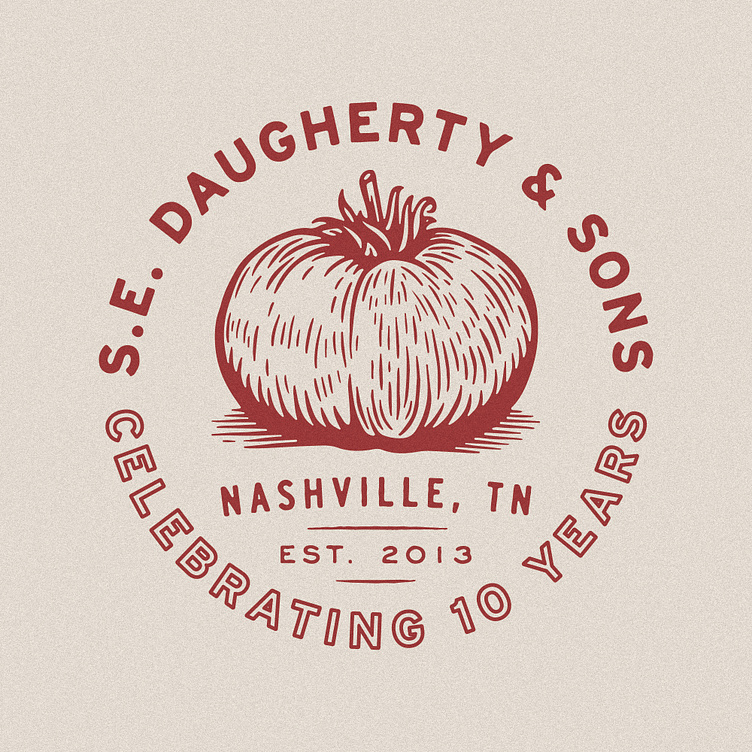
S.E. Daugherty & Sons

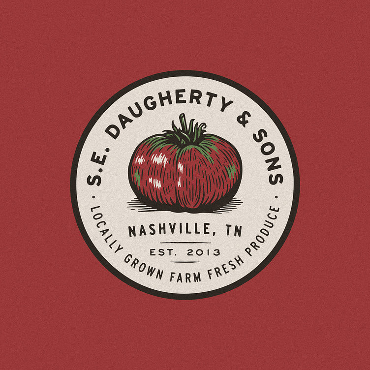
Recent brand mark refresh for S.E. Daugherty & Sons Farm in honor of their 10th anniversary. I love producing this type of artwork — a timeless, heritage feel; a handmade, woodcut-esque illustration; and a worn-in, timeless color palette. Grateful to Erica and Shaun for commissioning the work and trusting me to filter their brand through my lens.This artwork is a reinterpretation of their established logo, along with a 10th anniversary edition for the 2023 season. Look for it on produce boxes, signage and merch at their farm stand, the Nashville Farmer's Market, and more area pop-ups.
The logo system is flexible, accommodating different fruits and vegetables to highlight the best-selling produce in each season. More to come!