Linkedin Logo Redesign Concept

Hi Everyone!
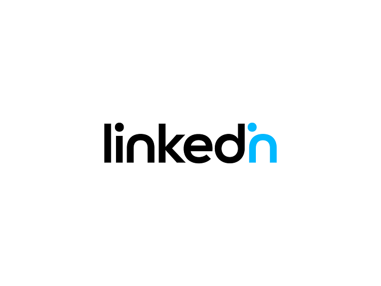
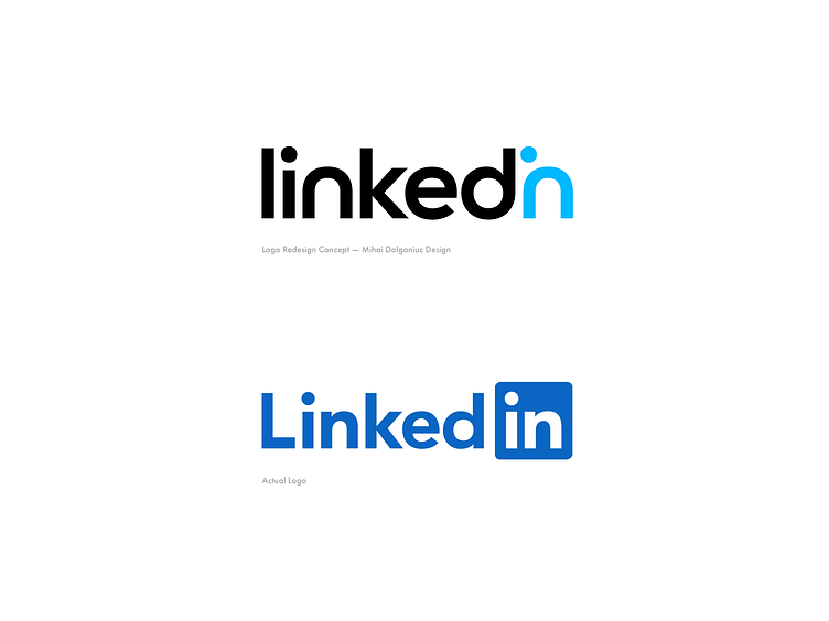
A few months ago I had some free time from client work and started working on an idea I had for a concept redesign for linkedin.
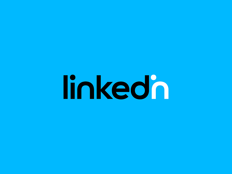
I kept the same clean and professional approach seen in the actual logo but decided to combine the letter i and n into one symbol, making the dot from the i act as a notification symbol and also accenting some more on the concept of linking and connections.
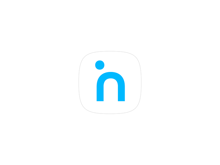
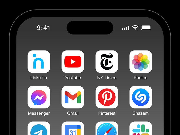
The in symbol of course will serve as the app icon making it recognisable given the design approach that was adopted.
Your thoughts are more than welcome!


Projects 📩
Let's Connect 👋
All images, artworks in this post are not to be used or distributed without the consent of the designer.
© Mihai Dolganiuc Design 2023. All rights reserved.


