On the Move: Intuitive Vehicle Management UX/UI design

Embarking on a European fleet management project, my primary task was to optimize the user interface for managing a multitude of vehicles, streamlining interactions across 180,000 petrol stations, and enhancing management of the fleet. The focus was on developing a user-friendly map and vehicle navigation system that would seamlessly integrate complex data, ensuring it was accessible and actionable for all stakeholders.
My approach, based on design thinking, aimed to create a top-tier UI/UX, adhering to industry best practices. I established a scalable Atomic design system, fortified with comprehensive guidelines, and created user interface that ensuring a harmonious and consistent user experience across all digital touchpoints.
Let’s explore the key screens designed, each pivotal in the user’s navigation through the fleet management system:
Key Screens Designed:
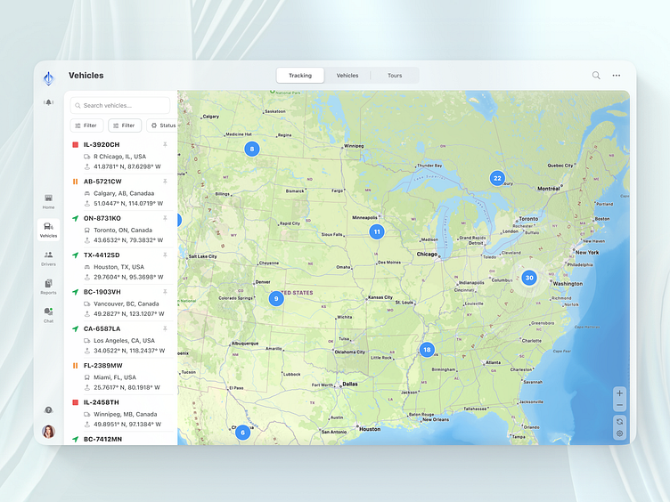
Map & List Screen:
The main interface showcases a comprehensive map where vehicles are grouped together, giving a holistic view of the entire fleet's location.
Alongside the map, a sidebar provides a scrollable list of all vehicles. Each listing might include basic information such as vehicle number, type, and current status.
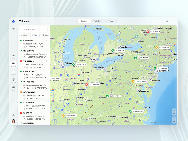
Group Selection Screen:
Upon selecting a group, the map dynamically adjusts to show individual vehicles from that chosen group.
Each vehicle is visually differentiated based on its status: active (perhaps indicated by a green marker), paused (yellow marker), or stopped (red marker).
Moreover, icons or subtle design variations represent different vehicle types, ensuring clarity at a glance.
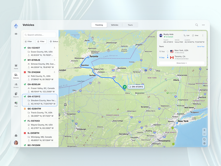
Vehicle Selection Screen:
A closer look at a particular vehicle is achieved by selecting it. The map zooms in, highlighting the vehicle's route, showcasing the path it's taken or will be taking.
Pertinent details about the driver, such as their name, contact information, and perhaps a profile photo, are displayed. Additionally, snippets of the route's information, like distance covered or time taken, might be shown.
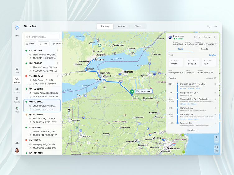
Detailed Info Screen:
This screen offers a deep dive into the selected vehicle and its operations.
The route's breakdown might include waypoints, estimated times of arrival, fuel consumption, and any stops made.
Detailed profiles of the driver might encompass their history, ratings, feedback, and any certifications.
Comprehensive information about the vehicle, such as its make, model, maintenance history, and fuel efficiency, is provided for a thorough understanding.
Employing design thinking, I developed a UX that streamlines fleet management, ensuring a user-friendly journey from a general fleet overview to specific vehicle details. The UI was then crafted, incorporating motion and micro-interaction animations, to enhance this experience, providing a clear and efficient interface with dynamic map adjustments and instant access to vital data. The harmonious integration of UX and UI, enriched with engaging animations, significantly elevated user engagement and optimized fleet management operations.
Feel free to reach out to me at oleg@symonik.com or connect with me on Instagram and Behance to see more of my work.


