Wiggin(x)

wiggin(x)® is a division within Wiggin and Dana LLP, designed to meet the needs of emerging and high-growth companies, their investors and their founders.
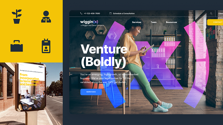
As the venture-focused segment of a larger firm, we felt there should be some rational relationship between the parent organization logo and the subsidiary mark. Since their clientele would most likely be younger; less established companies, we recommended a lightly modified version of Futura Bold in lowercase to complement the more formal Wiggin and Dana mark in all caps Futura.
While the name began as WigginX in the creative brief, the text construct wiggin(x) came to life as an identity concept where x represented a variable; for whatever your need as an early or late stage company, wiggin(x) has the expertise and scaled service model to help you along the way.
Graphically the (x) mark could serve as a large super graphic emblem, or as a window whose interior could be filled with patterns and textures created using lines and arrows (e.g. movement/growth).
Thanks to Mark Myrick (Creative Direction) and Digital Surgeons for the opportunity to work on this identity and design system.