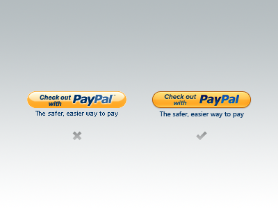
Updated PayPal Check Out Button


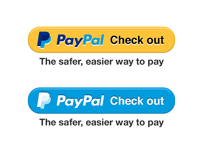
I was part of a team that designed and tested our checkout buttons this year. We started with messaging tests which brought us to using a single verb or action as the label, replacing the wordy 'Check out with' label. Once that variable was isolated, we put out several incrementally different options to isolate the effect of color, dimensionality, and shape. Our classic "pill" shape was shown to be very recognizable and "ownable" so it stayed. Amongst all of the options tested, these two outperformed the existing button in clicks and conversion so they have become the new baseline upon which we launched our new buttons.js platform. Moving merchants to a fully coded button will allow us to continually test and optimize this buttons so that it never again looks ten years out of date.